FAT MARGARET MUSEUM AND VISITOR CENTRE
Architecture, reconstruction: Raivo Kotov, Andrus Kõresaar, Indrek Mikk, Ingrid Viskus, Anu Ahi, Lea Laidra, Eleriin Tekko, Raili Paling, Liis Lindvere, Kadri Kaldam, Sten-Mark Mändmaa, Jaanus Männik, Kristo Rämson / KOKO architects
Interior architecture, exposition: Helen Oja, Raul Kalvo, Artur Staškevitš, Lauri Läänelaid, Andrea Miku / Inphysica
Exposition curators: Priit Lätti, Feliks Gornischeff, Teele Saar, Mihkel Karu ja Urmas Dresen (head curator)
Commissioned by: SA Eesti Meremuuseum
Museum project managers: Heinu Klaas, Hene-Riin Männik, Karen Jagodin
Construction: Acres
Net area: 1600 m2
Project: 2017–2019
Constructed: 2018–2019
Could a space be experienced before its completion? The authors of the interior architecture of Fat Margaret museum discuss how they used photogrammetry and virtual reality technology in the design process and how it facilitated the communication between the various project partners.
Fat Margaret is undoubtedly one of the symbols of Tallinn Old Town. Constructed in the 16th century as an artillery tower near the Great Coastal Gate, the building’s vibrant history also includes prison functions and even an arson. Since 1980s, it has been operated by the Estonian Maritime Museum. After yet another reconstruction project, Fat Margaret was opened in 2019 as a modern museum and visitor centre telling the story of Estonian maritime culture from the Middle Ages to this day that so far has not been featured.
The aim of establishing a contemporary visitor centre in this environment posed several challenges that at first sight seemed to be related with space (poor lighting, low ceilings and narrow passages, height differences between the volumes etc). However, it soon transpired that information exchange had become an even greater and more fascinating challenge: how to communicate between the various parties as effectively as possible. We searched for ways to include the ideas of the interior architects, curators and the museum in the project as precisely as possible, present them to the National Heritage Board in plain intelligible language and also get concrete responses from the latter.
An exposition-oriented concept
The main aim was to provide the space with maximum exposure, give it more light, organise it and make it accessible to everyone. Naturally, we also wanted to highlight the contrast between the old and the new. That’s how the exposition transformed into a light space between heavy limestone walls marked by a modern level of abstraction and clear structure. It lends a mellow and neutral background to the exhibition which includes around 700 historical objects describing the medieval sea trade and contemporary seafaring as well as 50 hands-on and digital solutions.
Besides providing a framework for the exposition and the lighter spatial effect, we also wanted to consider various target groups—to make it a family-friendly environment that can be accessed also by disabled visitors. So, in the design we paid further attention to the details of the exposition furniture, the height of the displayed and used exhibits, visibility and tactility (texts in Braille, tactile models).
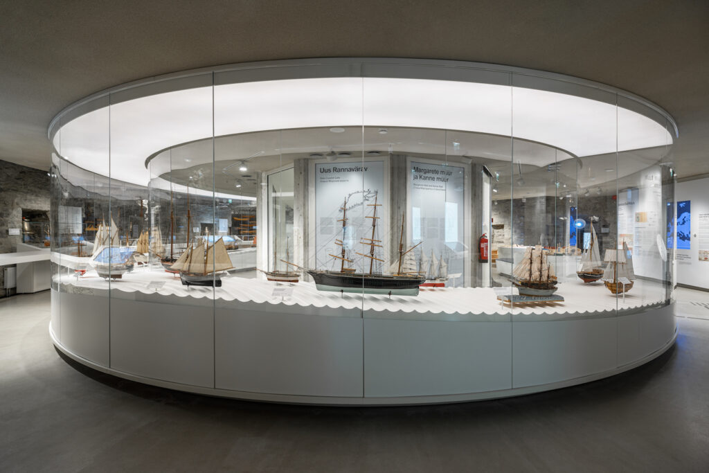
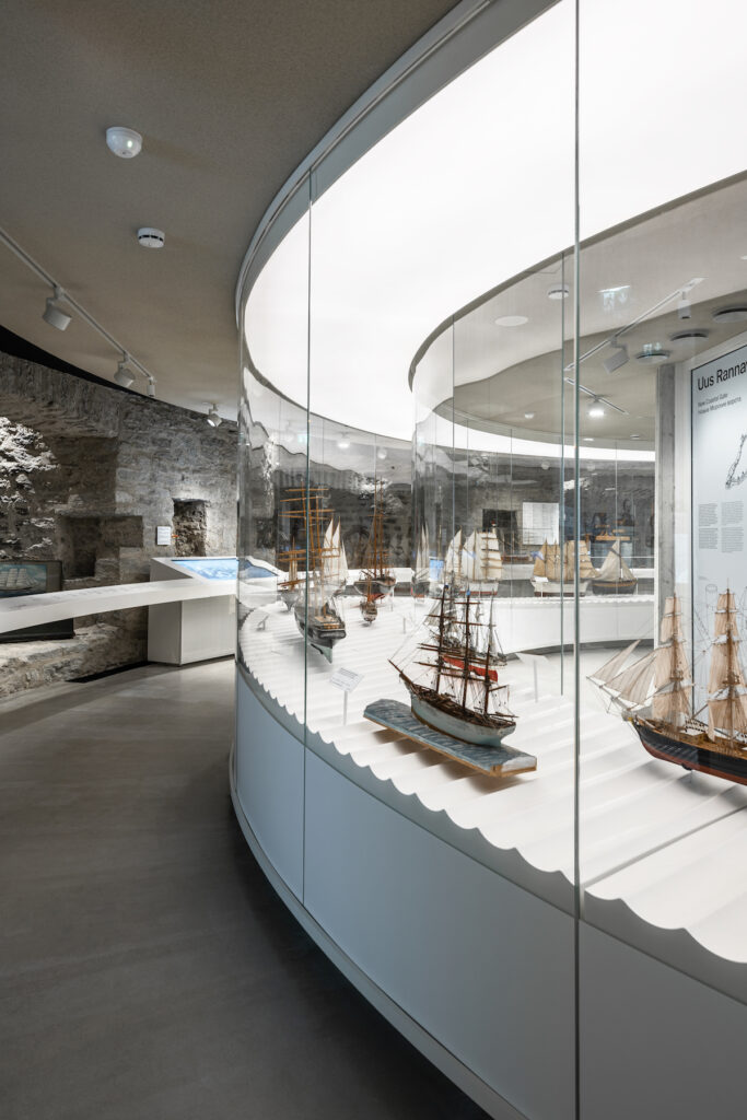
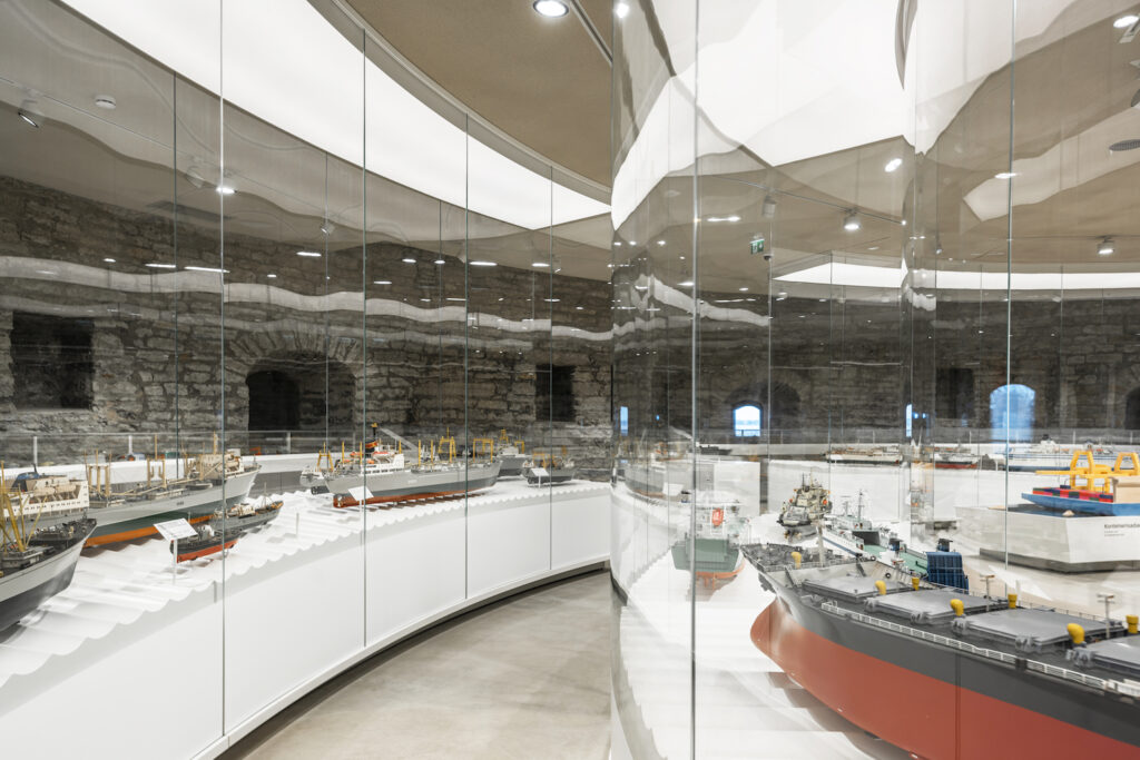
The focus of the exposition is on the rich ship model collection of 70 models. We placed them in long arched showcases in the middle of the exposition halls on three floors of the museum to stress the round geometry of the artillery tower. To maintain the integrity and observability of the space, the arched glass displays of the models can be viewed from all sides.
Digital technologies
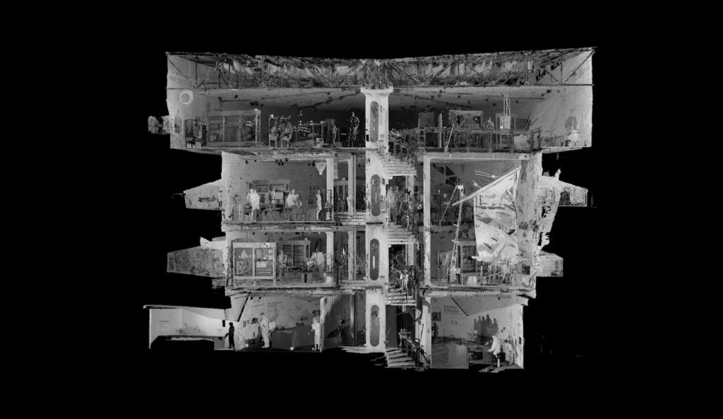
The Fat Margaret tower as well as the adjacent complex of various buildings are marked by unique historical architecture making the interior design process somewhat more complicated. The diameter of the tower is 25 metres with the wall thickness varying in stages between 5.5 and 2.25 metres. The tower’s multilevel cylindrical geometry with uneven surfaces proved to be a challenge for the traditional architectural presentations. In designing and presenting such a space, plans, sections and views often came across too formal. In addition, a considerable part of the designed space remained underground or hidden behind something until the beginning of the construction work. Several new parts of the walls unexpectedly emerged at places where we had envisaged an empty space. For the given reason, many parts of the project were quite speculative and several solutions had to be redefined according to the eventual position of the walls and ceilings.
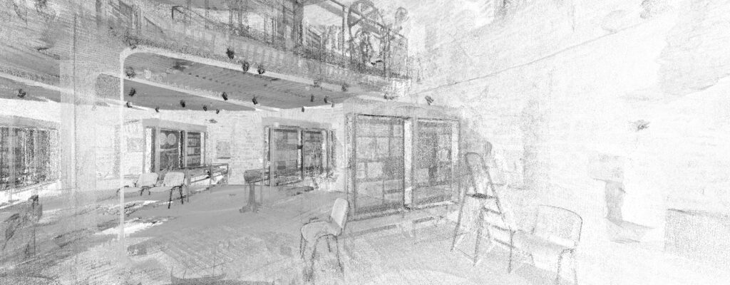
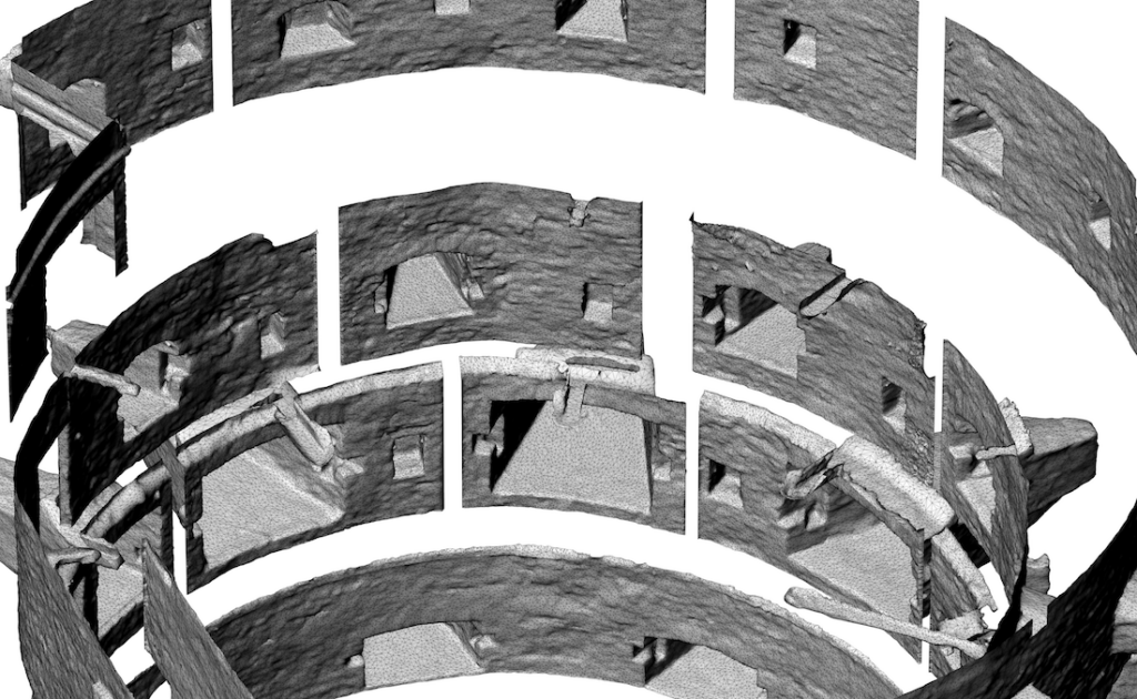
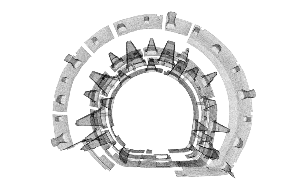
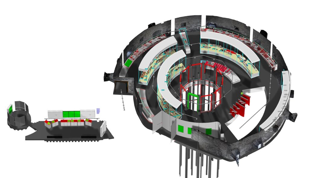
We understood quite early on in the process that we needed a detailed spatial model with a flexible structure. The core of the architectural project of the complex was a simplified BIM model based on accurate laser scans (Figures P7, P8). However, a BIM model with the standard abstraction level may not be sufficient in case of a historical building, and in the light of the highly detailed specificity of the interior architecture project, something else had to be used for the improved monitoring of the design process.
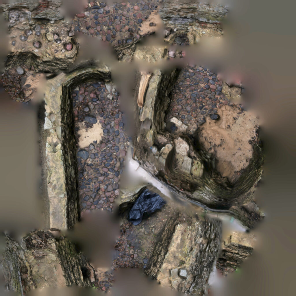
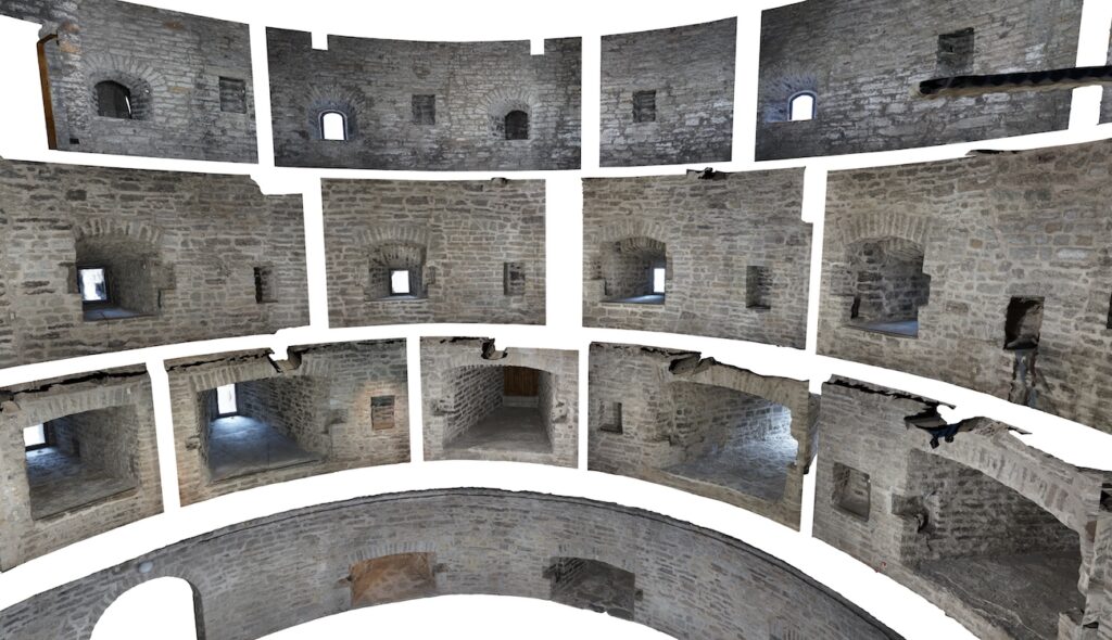
As we had to retain all historical limestone walls with their every block telling its own story, it seemed reasonable to create supplementary models with realistic texture of the zwinger or the outer defensive wall by means of photogrammetry techniques1 (Figures P14). This way we could make sure that the accuracy of the underlying geometry is always in keeping with our needs. Also the texture of the masonry units formed a firm anchor for checking the scale of the interior design and the exposition. The model supplemented with photogrammetry established a very good background for the design process making it site-specific. It also gave us, the interior architects, the certainty that we can adapt to or even avoid any unforeseeable problems. For instance, in defining the inclination of the new ramp along the zwinger wall and the location of the viewing platforms, the realistic geometry of the historical limestone wall played a crucial role. With the accurate and clearly legible base model, it was possible to assess and test the solution somewhat more adequately. The photogrammetric model requires considerably less computing power than a laser-scanned point cloud of the same information level. The model thus became an effective design and communication tool between all partners (curators, museum representatives, architects, heritage protection officials, furniture manufacturers).
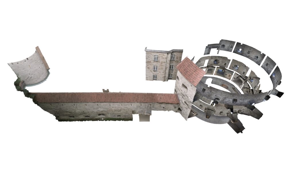
P.14 Photogrammetry of the tower and the zwinger wall with texture.
Communication
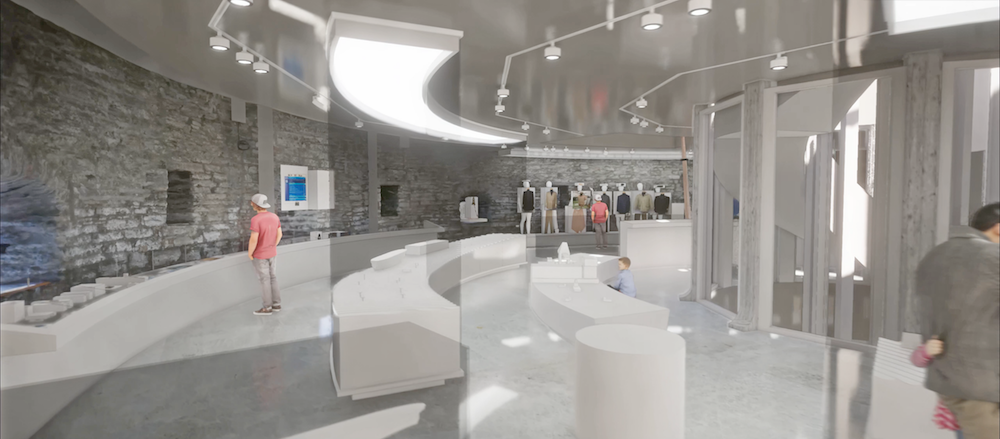
During the design process, we wanted to feature the interior architecture in several ways. Among other tools, we were excited to try out virtual reality (VR) technologies in order to get a sense of the space as effectively as possible and thus provide ourselves as well as the curators and museum employees with an adequate understanding of the scale of the space. The daily work of the curators is not usually related to spatial thinking, then again, they play a crucial role in the project with their full command of the exhibits, content and the comprehensive narrative of the exposition. Therefore, it was highly important to make sure that the people creating the content of the exhibition speak the same language throughout the process, i.e. are included in making decisions about the space. At the same time, while testing and implementing VR solutions, we were constantly in race against time and the requirements of standard project documentation, so at one point we decided to focus on selected snapshots and their accurate visualisations rather than on the interactive model.
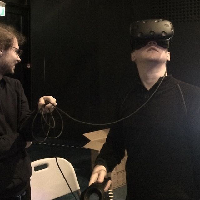
At present, the VR hardware2 has reached a certain level of maturity with higher resolution, wider field of view, better lenses and wireless devices, but in the early stages of the project in 2017 it was all still a rather cumbersome process3. The VR model could be viewed only by one person at a time making it difficult to introduce any changes and document the user experience during the meeting. Nevertheless, we understood the great potential of VR technologies as more or less the only real way to experience the exhibits, furniture and environment in a realistic scale before its final completion (and namely experience, not just see!).
In the early stages of the project, in parallel to testing the VR options, we also began publishing a weekly overview of around sixty 3D images featuring the interior architecture solutions as well as the structure of the exposition. In addition to its use within the team, it also allowed the museum and curators keep themselves informed of the latest developments and enhanced the communication with cooperation partners.
In maintaining the exhibits, a central role in our workflow was played by a Google Drive worksheet accessed by us and the curators and featuring the latest state of all exhibits. It allowed to send the latest information on their measurements, technical requirements, display, location of showcases etc. directly into the 3D models (Figure P18) and 2D drawings. Some important artefacts which played significant role (e.g. the cog, the mast of the sailboat Triin etc.) in exhibition required more precise representation therefore we built detailed 3D model or used pointcloud representation in case of ship models. In the course of the process, we developed and added all the necessary information into a 3D model that became the digital twin for the designed space. We made the digital representation of the current space and the interior design project so precise that all parties had no doubts about the size, location and volume of the objects. From that point onwards, it was already reasonable to make all more specific decision in situ.
If the communication with the client and curators is mostly conducted by means of visuals, models, worksheet tables and plans, then the construction of the exposition furniture requires that the information is translated into a language allowing initial budgeting and a rational production process. For instance, in case of the curved displays, it was rather doubtful if the drawings could be presented in the traditional trio form of views, sections and plans. So, we proceeded from the logic of production and installation rather than the visual appearance. In addition to the drawings, we also provided the manufacturers with the unfolded surfaces, assembly diagrams and 3D models allowing them to understand the precise structure of the displays and furniture and thus avoid potential problems later on site.
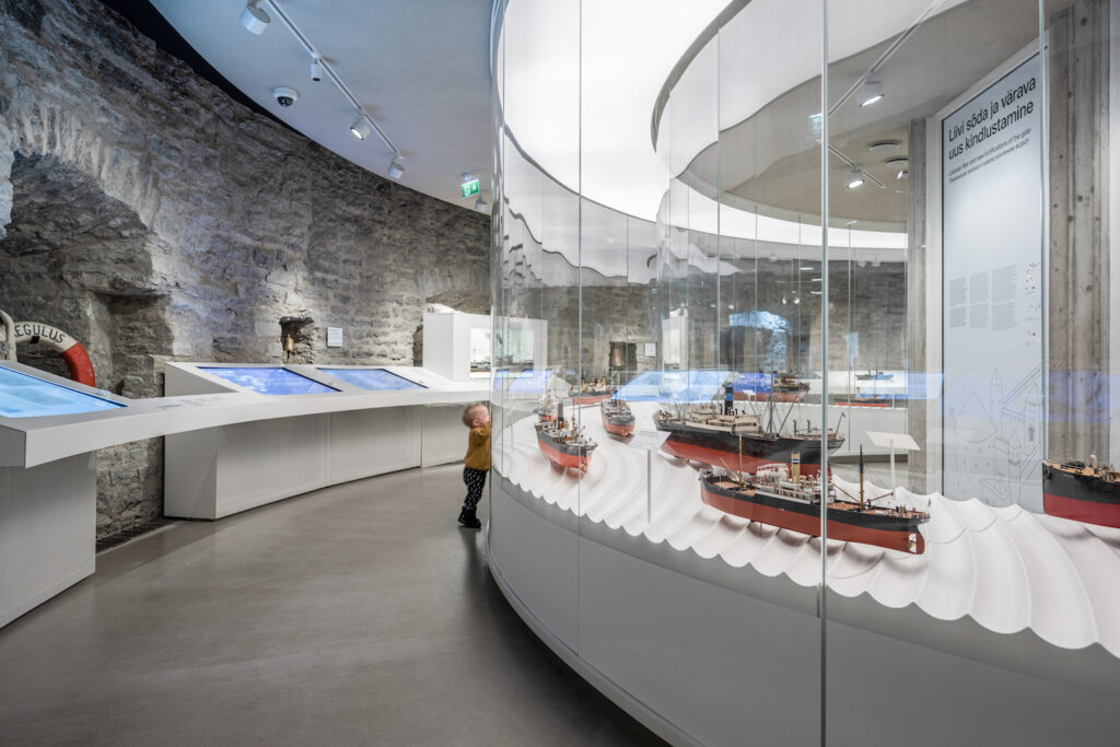
Our aim in the design process was to come as close as possible to all parties of the project and talk about the spatial decisions in a comprehensible language. This way we could focus on more complex and problematic issues and avoid their ‘discovery’ at a later stage. It was important for us to communicate in a straightforward and detailed manner and this way adequately envision the final results. The aim here was not only the translation of each design decision into an appropriate language but also the constant stimulation of the feedback and communication between various parties.
Working with technologies beyond the customary level of precision allowed us to represent spatial ideas during the various stages of the project—using either VR models, animations, renderings and parametric designs of the exhibits for particular target groups. And all these in addition to the plans, sections and other traditional means. This way, all partners could deal with the solutions in a comfortable environment suiting their needs which, in turn, allowed them to focus on their most important task: transferring their knowledge.
Fat Margaret was somewhat more specific than a typical interior architectural project, however, we can now state that the design project does not necessarily benefit from one central platform (either a file format or software). It can be more efficient to agree on rules in the course of the project and exchange information through various platforms. The rules are specific to the given project (based on the context, layout, parties etc.) with no particular fixed standards.
Although most of the design team can manage with a 3D model and 2D drawings, the design process should not rule out other platforms—alternatives could turn out to be handy and more suitable for partners outside the sector. If a person feels comfortable working either in Excel or Word, it is important to synchronise it with other design processes. This way, the same information can be presented simultaneously in a table, model or some other format—the only challenge here is the mutual synchronisation and interpretation. As a result, all parties can work in their favoured platform and contribute to the development of the project as effectively as possible.
RAUL KALVO is an architect, founder of Inphysica and a lecturer at the Estonian Academy of Arts.
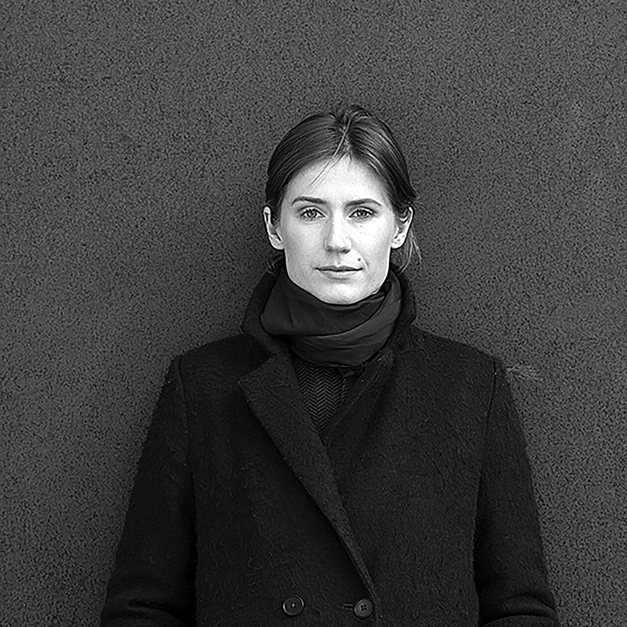
HELEN OJA is an interior architect and head of the advisory board of the Estonian Association of Interior Architects.
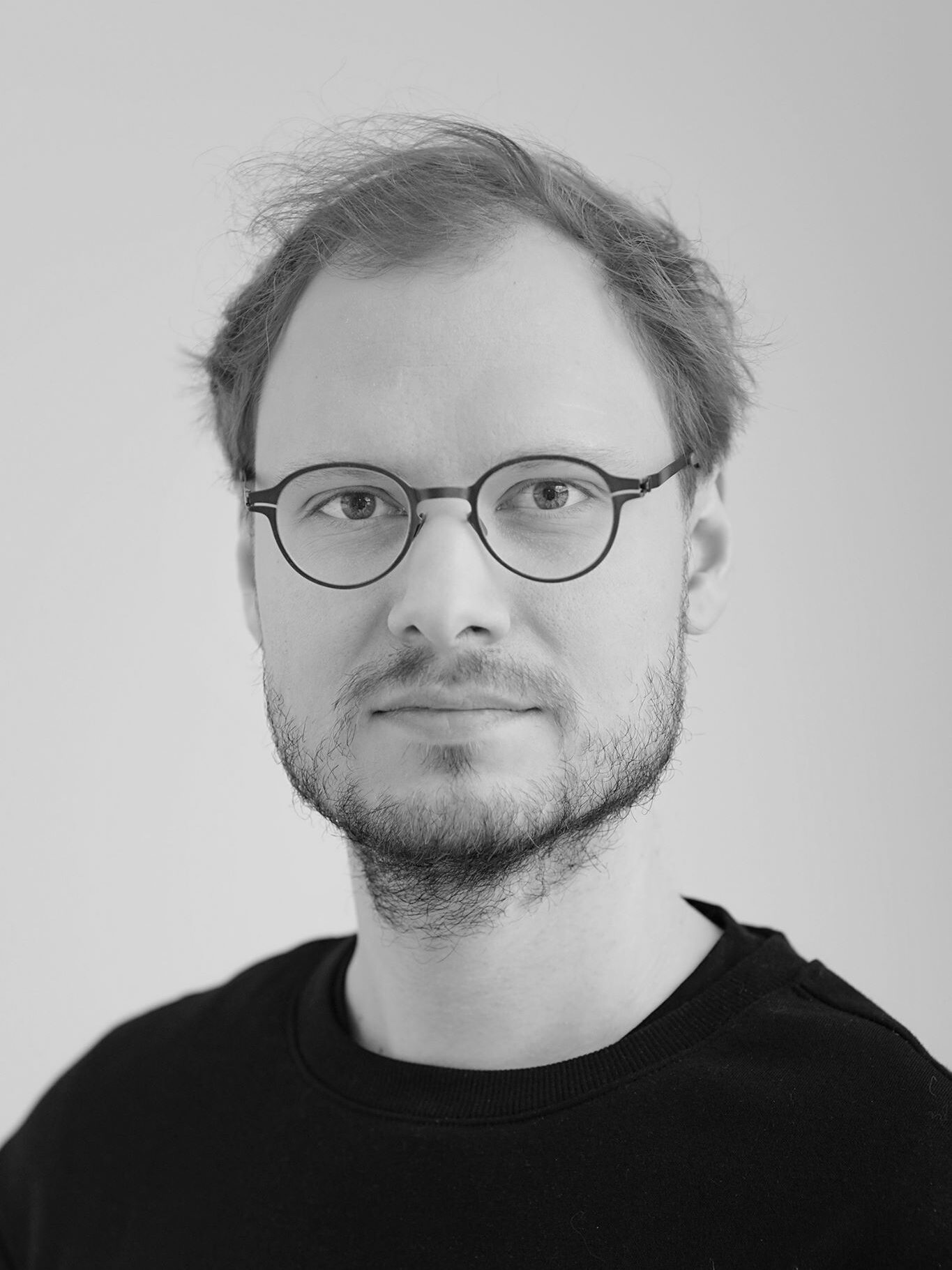
ARTUR STAŠKEVITŠ was awarded his MArch degree at Studio Hani Rashid, University of Applied Arts Vienna. He works as an XR specialist at the Mektory Innovation and Business Centre and supervises the vertical studio of the VR Lab at the Estonian Academy of Arts with Johanna Jõekalda.
HEADER photo by Tõnu Tunnel.
PUBLISHED: Maja 101-102 (summer-fall 2020) Interior Design
1 A method for creating a three-dimensional model of a static object based on images. It requires the object to be photographed from various angles in a similar light conditions. This allows to calculate the locations of the camera and the three dimensional shape of the photographed object.
2 Valve Index and Oculus Quest.
3 We used one of the first consumer VR sets HTC Vive in the project.

