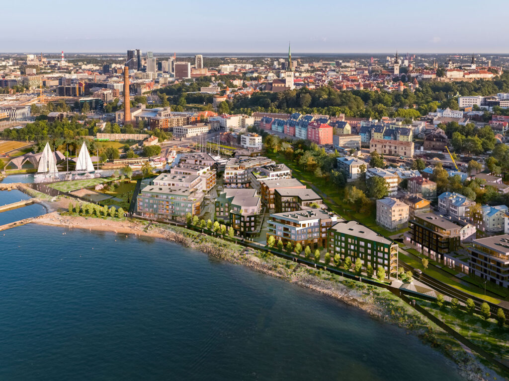
The Kalaranna development in progress was preceded by a controversial, landmark planning process lasting from 2008–2016, during which the Telliskivi Society and a large variety of urban activists stood for the spatial qualities and interests of the seaside promenade and the popular ad hoc sea-bathing spot. The urban space and architecture that took shape as a result is reviewed by the capital’s city architect of the time, Endrik Mänd, who was directly involved in the processes.
As the new head architect for the City of Tallinn, I comprised a concept proposal for approval by the city council in 2007 to open the city to the sea. Although that fairly succinct document mainly focused on the immediate vicinity surrounding the City Hall, it became the impetus and direction for the seaside planning and development work that ensued in the years that followed. The ‘spine’ of the concept was an uninterrupted coastal promenade that had had its first mention in the so-called general plan of coastal areas imposed in 2004.
15 years later, I am able to acknowledge that the long-awaited and popular talk of the town, the sea promenade, is indeed a tangible reality you can set your foot on. Rotermanni Quarter, the Culture Hub, the Maritime Museum, Noblessner, the Beta promenade, the light traffic lanes of Kalaranna Street, the promenade on Reidi Road, the new Cruise Terminal of the Port of Tallinn, the pedestrian bridge over the canal of the Admiralty Basin, and the public space solutions around Terminal D—are all projects that have taken the city a step closer to the sea and opened up new possibilities to use the seaside area. It is quite contradictory that the immediate area around Tallinn City Hall be the most lagging in this context as it was the opening and focal point of the concept of openness to the sea.
At the moment, the last link in this seaside pearl-chain is the first construction phase at 8 Kalaranna Street, developed by Pro Kapital Eesti in Kalaranna Quarter, that should be completed this spring. The architects of the residential and commercial quarter are Mihkel Tüür and Ott Kadarik (Kadarik, Tüür Arhitektid) and landscape architecture is by Maarja Tüür and Kerttu Kõll (Sfäär Planeeringud).
In reality, the genesis of Kalaranna Quarter has been long and rocky, beginning more than twenty years ago. So much so, that the recently opened temporary exhibition titled ‘Kalarand—the third coming of the seashore-for-everyone’ (curated by Teele Pehk) is dedicated to it. And it is no wonder, because as the exhibition displays, throughout this time communities have formed, societal values shifted, and new planning traditions taken root. The developer, city officials, and the public have all had to re-evaluate their goals and positions, and in conclusion we might say that this could be one of the most iconic processes in our planning landscape so far, as we have been striving towards good spatial design.
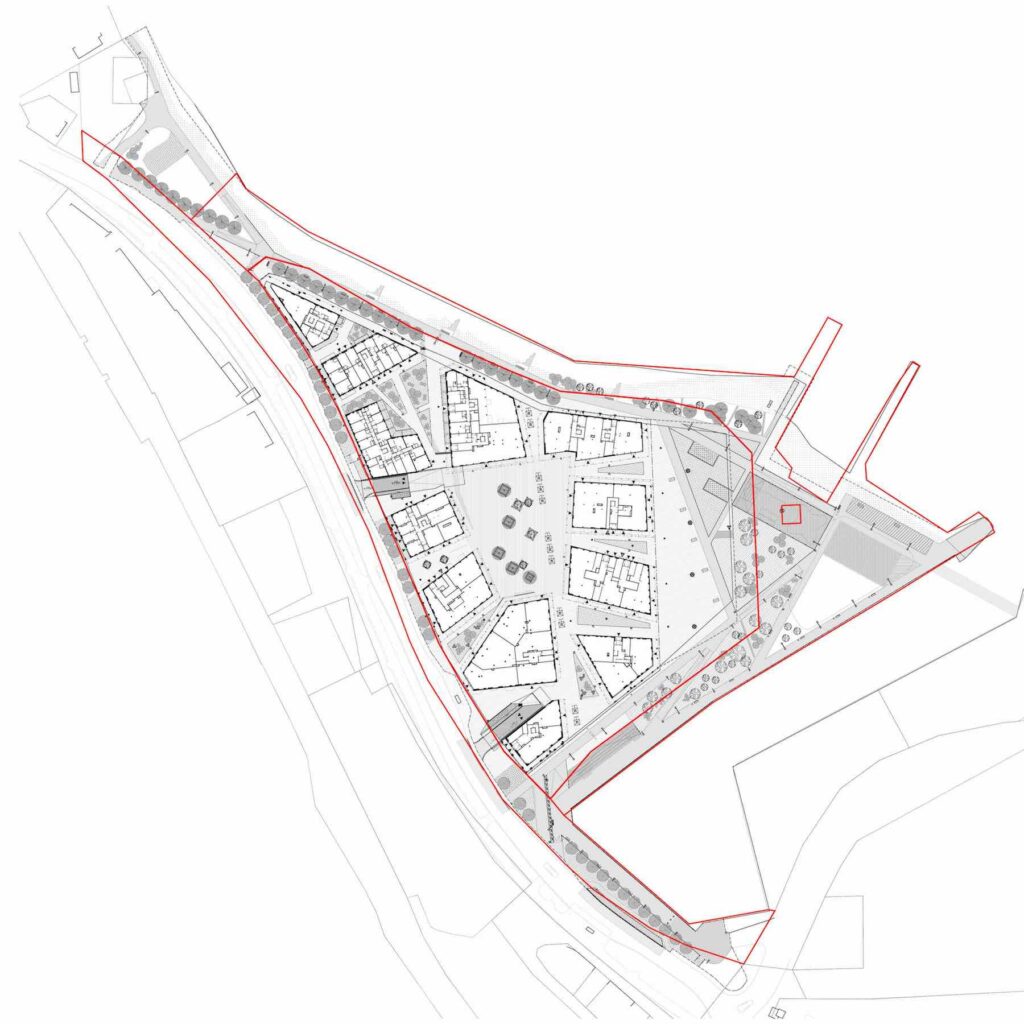
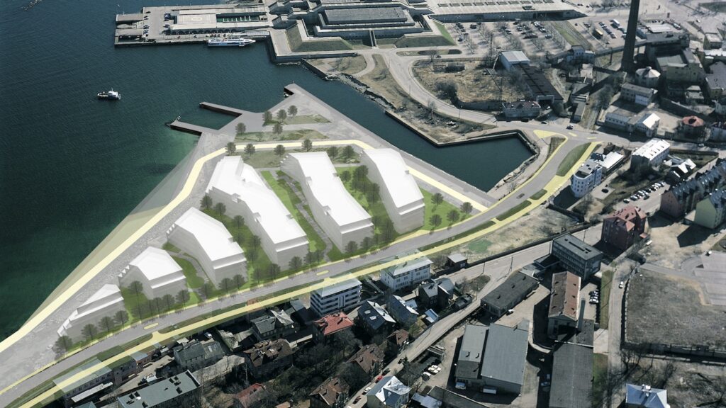
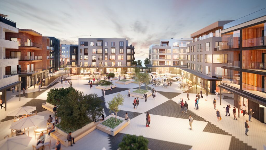
The architectural and urban space solution of Kalaranna Quarter stems from the winning entry ‘Kesk-Küla’ [transl. ‘Mid-Village’], authored by Mihkel Tüür, Ott Kadarik, Viktoria Andrejeva, Marleen Stokkeby, Harri Kaplan, Kristi Truumann, Katerina Veerde, and Raul Kalvo. To my view, the main strength of the winning project was the central urban square that brought public space into the quarter, and between the buildings. Alongside the Venetian arcades (alright, not exactly arches, but who cares!) the massive residential quarter was turned into multi-layered urban space where cosily moving about and leisure is inscribed all round. At the same time, contextualising the solution for the beach promenade was still a work in progress to find better balance between the downtown-y pier structure and the Kalamaja-esque shoreline.
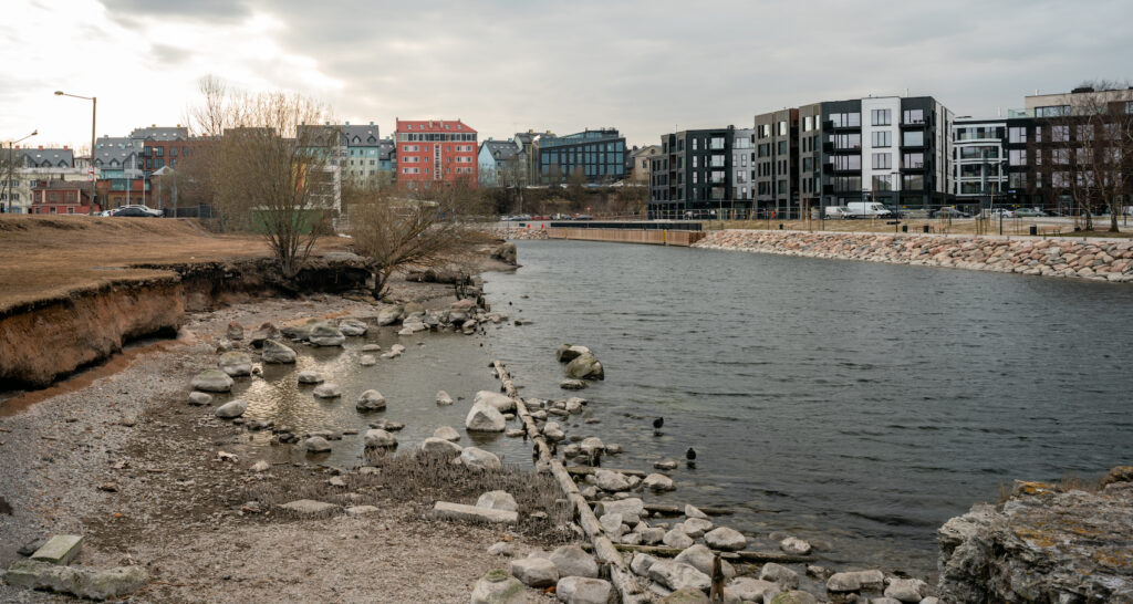
A few weeks ago on a lazy sunny morning, my spouse and I took our dog for a walk at Kalarand to become better acquainted with the residential quarter being built and find emotive to write this piece. Although what I encountered stirred a dualistic response in me, I would like to rush to elaborate that the general impression was definitely one of joy. Still, approaching the quarter from the Kalaturg area, the first thing I noticed was a security fence from the time of construction surrounding the already completed pier area. For a second, I felt the spite: fences and constraints, lurking around and climbing over them basically came to symbolise the process of spatial design in the area and not in a good sense. Fortunately, it turned out that despite the unfinished buildings, the beach promenade portion is essentially completed and access to it ensured from several points of entrance. Furthermore, many people were there with us strolling on the new promenade, enjoying the sea view, or exploring the newly arising buildings, and it seemed many of them were not there for the first time.
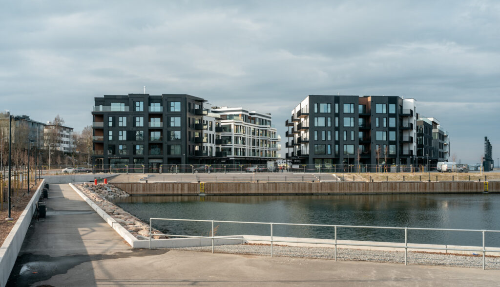
Tentatively, we can divide the seaside public space into two parts—the coastal promenade and the park area situated on the NW pier of the aquatorium of Kalasadam. The landscape architects have thought the park area through well: in addition to higher and lower density planting and benches, there are several ‘nests’ for more active leisure, such as table tennis, various ballgame and other courts, or a slackline for balancing exercises.
Active and recreational areas have been articulated using landscaping to offer shelter from the sea winds, which can be quite bleak depending on the time of year. Maintaining connection between the history and present day of the area has been achieved by founding a viewing platform on a barely surviving former bit of seawall that leads to a gradually decomposing wreck of a fishboat in the shallows. High hopes have been invested in the tribune-stairs by the Kalasadama aquatorium. Fantastic views of the sea, the Patarei barracks, the City Hall, the Old Town, the high-rises in the Maakri district, as well as the residential houses towering along Suur-Patarei Street open from the park and the beach promenade. It is this visually perceptible height modulation of the buildings together with the immediate vicinity of the seawater that creates a sense of some kind of vulnerability and a potent intuitive premonition of the lurking presence of a powerful nautical element. If during the time of generating the plan and maybe even during the jurying phase of the entries of the architectural competition I may have been a bit concerned about whether or not it is possible to harness this vast empty space, then by now I am fairly certain that it is namely the public space and landscape solutions that will be the creators of the urban spatial identity of Kalaranna Quarter. No doubt, it is highly important that the commercial spaces on the ground floors of the buildings support and amplify the active functioning of the public space even more.
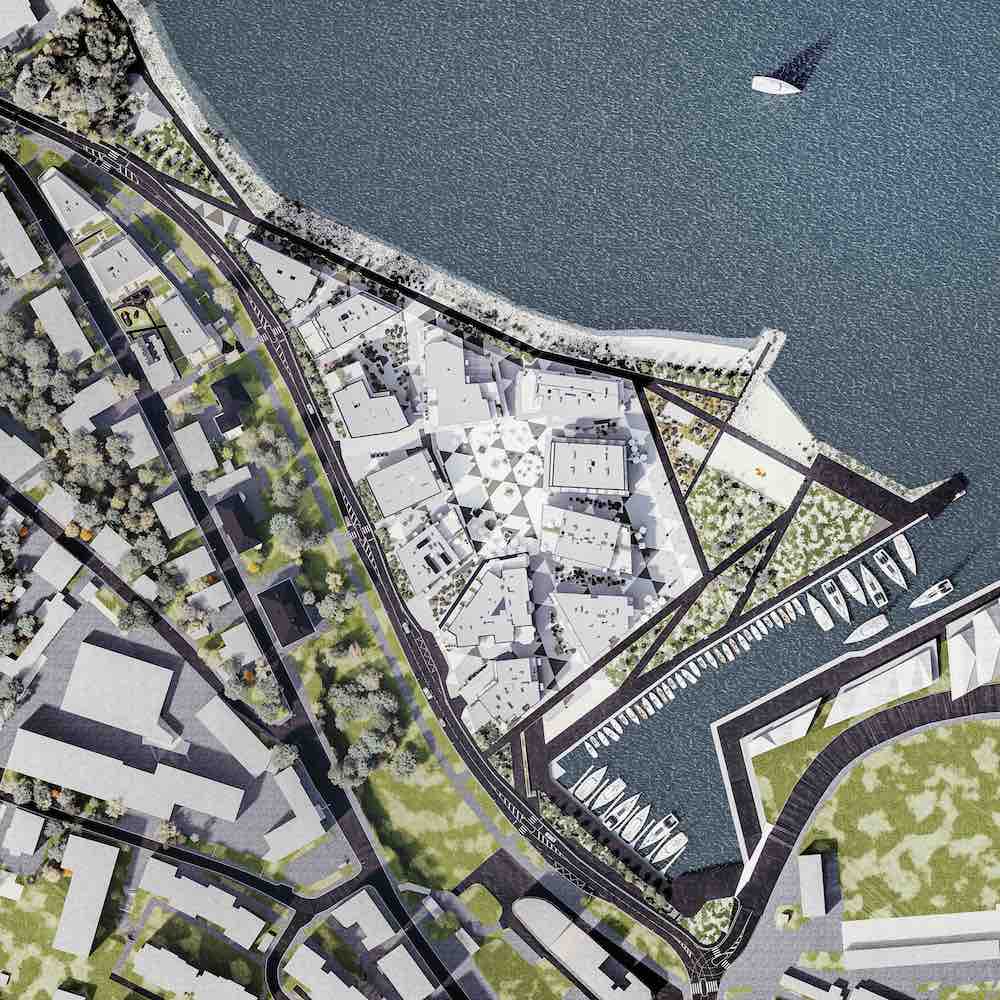
It seems that the task to solve the northern beach promenade has proven to be somewhat more challenging for the architects and landscape architects. Hardship was foreseen by a nautical expert included in the jury work of the architectural competition, who drew our attention to the natural fact that the part of the coastline under question is quite open, which calls for strong protection of the shoreline from the NW and N winds. Since the local community did not wish to see a classical quay structure all throughout the promenade and valued intimate contact with the water and preservation of the semi-natural beach sand, the compromise entails a rather high bulwark made of natural stone where periodical narrow descents lead to the waterline. The salvaged sandy beach strip we see today is quite meagre, but hopefully cooperation between the sea and the local community manages to morph the present coastline into at least as usable and enjoyable a place as it used to be in the ‘good old days’ when Kalaranna beach was still wild and free.
This spring, the first construction phase sees the completion of eight southern-most buildings of Kalaranna Quarter and a large part of the central square of the quarter. Unfortunately, the latter is currently a large construction site, and it is therefore hard to evaluate the final image of the urban space. Hopefully, it will be possible to enjoy commotion there this summer and indulge in an afternoon espresso in the comfy shades of the colonnade in the corner of the heated plaza. This imagery of a miniature San Marco Square in Tallinn that I find wrapped in my mind is something that is still pending confirmation or rejection, but it is definitely the fate of this square that will determine the success or failure of Kalaranna Quarter from an urban spatial perspective.
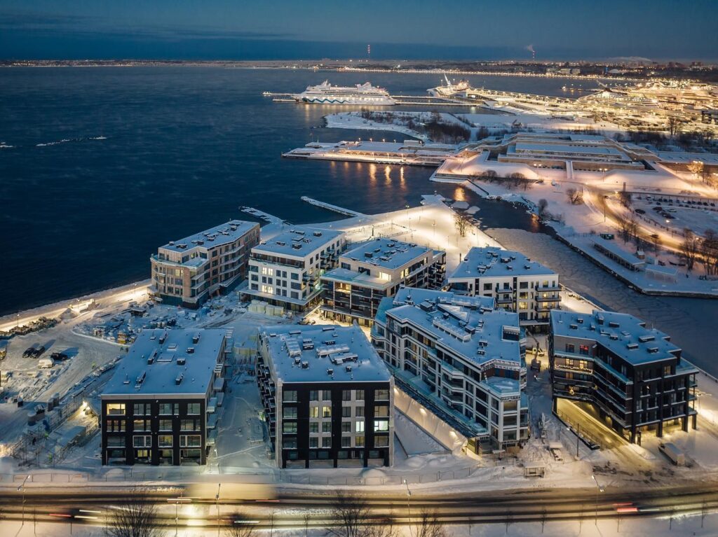
The first buildings accommodate 240 apartments, and I am rather convinced that they will receive a warm welcome from individuals whose urbanisation level is above average. We usually tend to over-romanticise the allure of seaside living, and a whip from an icy squall can give us a harsh reality check, but architects have used foresight to tame the beast at Kalarand. The facades are in rotation in relation to one another and are heavily indented with balconies which helps to break the main wind corridors. The room between the buildings is rather narrow compared to regular standards and takes on wedgy shapes, which creates an urbanistically intriguing rhythm of contractions and expansions in the space. Pedestrian level is public and accessible to all, forcing private public space mainly into the balconies which, in turn, have been designed rather generously—also a downtown solution and completely justified in the area.
Although the narrow spaces between the buildings remain mainly in the shadow, the buildings are situated so that the sun’s rays reach there at a specific time of the day. The same applies to the balconies, each seems to have its own ‘time’ out of the circadian cycle and at times they seem so close to each other that a question about the applicability of safe social distancing may arise. At the same time, the romanticism, enchantment, and potency of urban life is found in these close distancing scenarios. Hope remains that enough flexibility has been programmed into the selection of apartments, to see to a broader slice of society in the clientele, and that affordability (or rather, lack of it) would not become an obstacle to creating a home here.
Coming to the architecture of the buildings is where I find myself stumbling on what I think is the core problem with developments of this kind. Not that I have any complaints to the architects about their work, but to me a city is a process where the strata, styles and construction techniques piled on top of and in the middle of each other, and the mixture of the glorious gloss of new housing and the esteemed patina of senior buildings are what create a sense of safety and credibility of life’s continuance and the sustainability of culture.
Despite the fact that the architects have, in both form and material, given each building a unique image, it is also one that is consistent with the remainder of KTA’s portfolio. This unity of distinctness and sameness is simultaneously soothing and irritating, and a constant reminder that we are looking at a new development on an empty beach, not a case of evolutionary (urban) spatial design occurring over a long period. The same ‘problem’ is not only evident in Kalaranna Quarter but prevalent in other similar developments as well. For example, the advantage I can highlight from Noblessner are the multiple limestone factory buildings that have been preserved in the area, the renovation of which helped to stretch the new urban fabric onto a larger timeframe. Rotermanni Quarter managed to create urban diversity over a relatively short period of time by organising architectural competitions for discrete buildings, since the creativity of different architects reflects back from their designs and is thus perceivable in the urban space it encapsulates.
The same applies to contemporary facade materials. Although the facades of the buildings of Kalaranna Quarter are characterised by a wealth of materials and abundance of finishing techniques, the general impression still remains somewhat ‘thin’. Of course, the impression is augmented by the fact that the use of ‘sticker’ finishing materials on the facades of unfinished buildings is very conspicuous and might remain barely noticeable on completed buildings. Using these types of materials always hides the risk of straying to the wrong side of the expensive-cheap / authentic-fake diagram, depending on construction quality. On a more optimistic note, a more distinguishable attribute than the choice of facade and fencing material is the versatility of window types. This gives character and autonomy to the buildings and pleasantly compensates for a monotony otherwise present in quarter developments.
But enough with the whining! Peeking behind the decor, what I see is inarguably high-quality architecture. As stated earlier, the layout of the buildings is smart and volumetrically well composed, appearing smaller than they actually are with their four-to-five floors, filling and intensifying the surrounding cityscape which is a highly important facet of active use of public space. I commend the architects for achieving such an effect because wasn’t one of the concerns of the local community that the seaside development would seem closed and too massive next to the neighbouring Kalamaja area. Walking around in the quarter leaves no doubt that you are in Tallinn downtown. Search for—and successful locating of—this kind of urban build duality is what the title of the architects’ winning project is about, in my opinion.
For nearly 15 years I have had the privilege of being part of processes that have shifted the city closer to the sea and opened the seashore to the citizens. Situations of all imaginable kinds emerged while in these processes, where ‘the good I felt and shame as well’, as sung by the musical group Kukerpillid who recently celebrated their 50th anniversary, among whom another former city architect of Tallinn features, Mr Ike Volkov, a former participant in similar processes. With the completion of Kalaranna Quarter, the shoreline will assume a piece of the city, and the city a part of the sea, and everyone may think what they will—but I for one am not ashamed when looking at the final result! On the contrary, the next time I go there for a walk, I will take my children with me in addition to my spouse and our dog. Maybe even my mother-in-law who placed an order for a sightseeing tour around Tallinn for her birthday. And I am fully convinced that there will be plenty of other people strolling there.
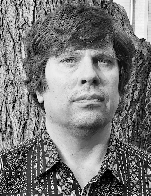
ENDRIK MÄND is an architect and urban planner. After his years in office as the city architect of Tallinn between 2007–2019, he is active as an architect and consultant in matters of spatial design, urban planning and building in the enterprises Puusepp & Mänd OÜ and architectural office PEA OÜ. Endrik is member of the Estonian Association of Architects and Estonian Association of Spatial Planners.
HEADER: Visualisation of Kalaranna Quarter. KTA, 2019
PUBLISHED: Maja 108 (spring 2022), peateema Opening Tallinn to the Sea

