PEDESTRIAN AND BICYCLE PATH CONNECTING MÕISAVAHE STREET AND THE CITY CENTRE
Commissioned by: Tartu City Government
Location: Tartu, Estonia
Landscape architecture: Terje Ong, Robert Kähr (Tajuruum)
Engineering: Keskkonnaprojekt
Project: 2016
Construction: 2016-2017
Constructor: Teearu Grupp OÜ ja Kivipartner
Total cost: ca 1 800 000 EUR
Infrastructure and landscape architecture in Annelinn
Almost one-third of the inhabitants of Tartu live in Annelinn. The cycling and walking path that connects Tartu’s city centre with Mõisavahe Street in Annelinn is an important infrastructure object in the university town’s network of light traffic roads. Ensuring a fast, uninterrupted connection creates good prerequisites for people to opt more for light traffic and public transport instead of travelling by car.
The guidelines1 of Helsinki Transportation Department state that the aim of designing the network is to achieve a continuous, logical, hierarchically structured and safe network that serves and supports the surrounding social structure and encourages physical activity. The main light traffic roads have an important role in the city’s infrastructure as a whole and at the same time on the local and city district level.
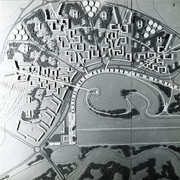
The completed pedestrian and cycle path in Annelinn is an important axis of local life. Annelinn is a district that was designed from 1970-1980 by Mart Port and Malle Meelak. One of its principles was a carefully thought out network of pedestrian roads. The two micro-districts are located alongside the main walking paths, which the authors call walking rays. The rays were designed as the shortest roads to the centre and bus stations and even an artery of social life, where according to the authors’ vision “intense, vital activity lasts from early morning to late evening”.2
In Port and Meelak’s design, the walking rays intersect with the walking arch, which is also meant for light traffic only and was the forerunner to the completed pedestrian and cycle path. Annelinn has a relatively clear and logical structure, but the area has not been fully built up yet. Today, the walking rays are still in bad condition and the leisure programme planned for the rays has not been fulfilled. Yet there have been some developments in recent years – a central square was built on the crossing point of the walking rays and the arch, the local stadium has been restored to good order, a visionary competition launched a debate about how to enrich the leisure programme, a union for local inhabitants has been created and more. A fully solved cycling and walking path therefore has important meaning, contributing to designing a functioning public space and shattering the negative image of Annelinn.
Creating space and communication
In terms of outdoor space, more specifically public space, the basis and expression for constructing a place can be aesthetics (design), program (giving sense), the target audience (user), physical parameters or something else. The landscape architect as the designer of public space creates a framework for the functioning of the place, but its actual life appoints a user who reads, interprets and adjusts the place. There is certain communication between the space and the user – part of it is unplanned, while part is consciously written by the designer. The easiest explanation is that communication is the movement of information from A to B.3 Physical elements are the tools used when designing a public space; they are the means that convey the desired message.
The visual identity and integration of the new pedestrian and cycle path
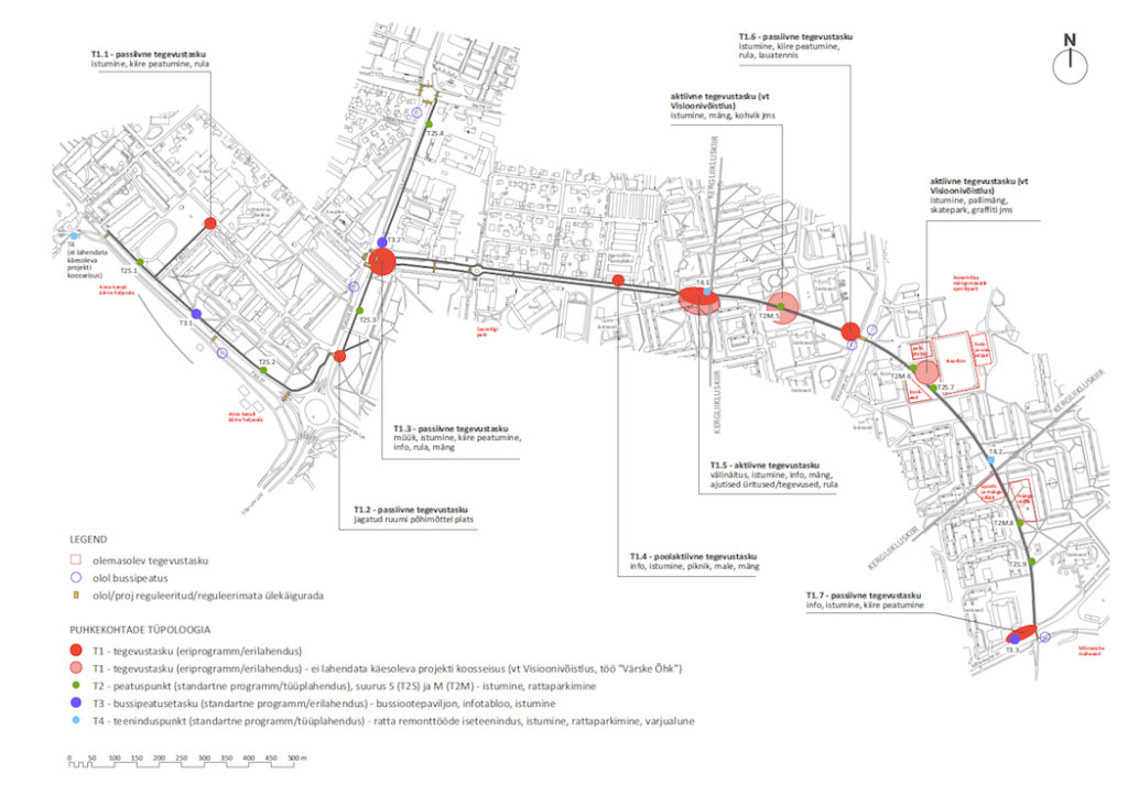
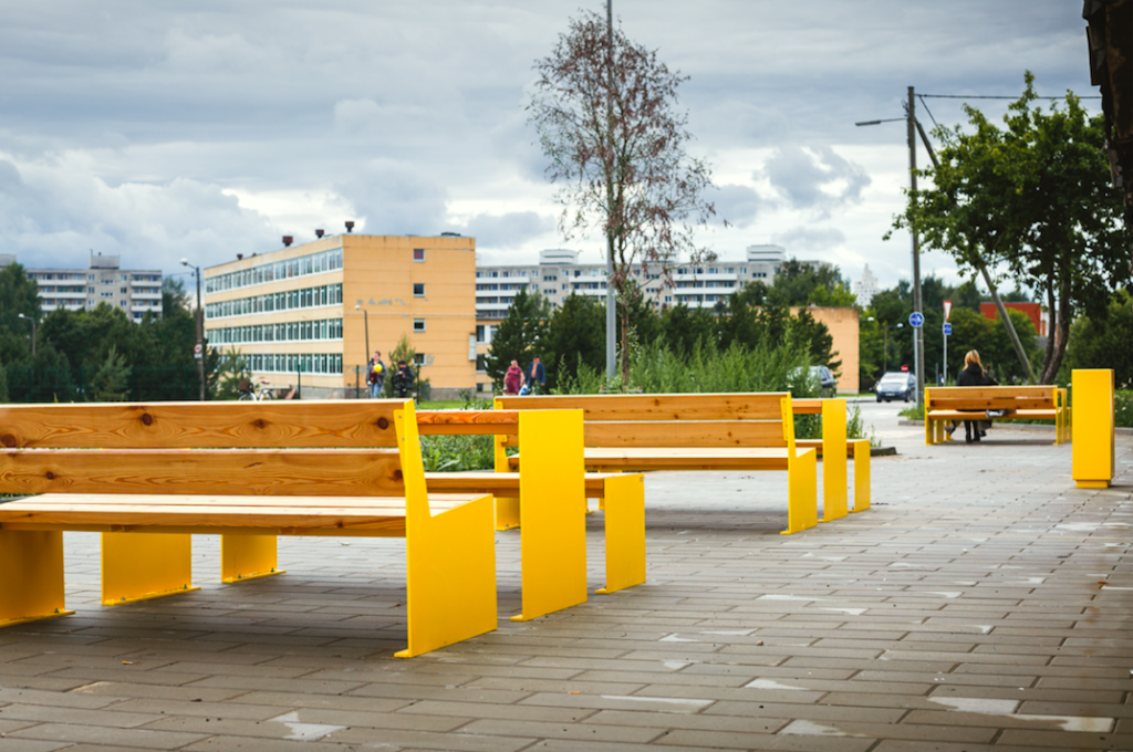
The entire trajectory of the cycling and walking paths was designed to form an integrated whole. The journey is enhanced with various resting places: spots enabling people to stop quickly, bus stop pockets near bus stops, self-service points for bicycle maintenance and activity spots for various purposes. All of the squares, smaller stops and resting spots were created in a unified manner – the same surfacing materials, curb stones and outdoor furniture are used, and the landscaping principles are also the same. On the one hand, this ensures the wholeness of the linear space, yet at the same time small forms give the area a special feel of its own. The bright yellow outdoor furniture, with a uniform design and uniqueness appropriate to Tartu, stands out and helps to create the area’s identity.
There is an important spatial change happening on Anne Street: car traffic disappears and the path that continues further is meant for cyclists and pedestrians only. The initial walking arch and rays also cross at this point. The square, which has a very important meaning, therefore features design elements that cannot be seen anywhere else on the trajectory. The letter-shaped bicycle holders form the word “annelinn” – a trick that is successfully used in the centre of Tartu. In addition to outdoor lighting that use LEDs, the square also has effect lighting: the activity areas are marked with spotlights. Further, the square has a designated place for Tartu’s infographics.
A space dedicated to different users
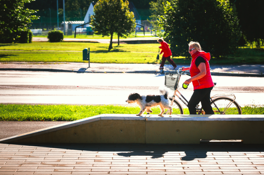
One thing that is shattering Annelinn’s negative image is the “switching on” of spaces that to date have gone without a programme. A good example is the square in front of the garage complex on Anne Street, which flirts with its old image but also with new values, acting like a buffer between different ways of thinking. It is not clearly defined what kind of activities or target audience the stops and rest spots should accommodate – there is a certain flexibility, various methods of use and room for interpretation. The same applies to the concrete outdoor furniture designed specifically for the site: the concrete modules allow you to sit, skateboard or play and can, at the same time, act as mere architectural objects or space borders. All of this is up to the user to interpret and discover.
Tactile communication
People with mobility and visual impairments, and why not also people with skateboards, scooters and strollers – which is to say all light traffic target audiences – should be considered as equal. The main bottleneck, considering the practice in Tartu, is the lack of a systematic approach. Different target groups may be taken into consideration, but how this happens is often for the designer to decide. One rule or a certain logic may apply to one building site and be different in the area next to it. This pedestrian and cycle path project sought solutions to the following topics: separating pedestrians and cyclists; developing principles of shared space at the crossing points of the roads; and making it easier for visually impaired people to orient in the space. To discuss the latter, in addition to familiarising ourselves with foreign guidelines, we organised a meeting with the South Estonian Blind People Association to find out how the solutions that have been applied work in urban space and what could be done differently. The trajectory that has been built is definitely a pilot project in this field and there are no perfect solutions. However, we have tried to take a step towards creating a good public space for everyone.

TERJE ONG is a landscape architect and one of the founding members of the landscape architecture office TajuRuum. She graduated from the Estonian University of Life Sciences, has studied in Norway and has trained in Switzerland. She is a passionate wanderer, mainly designs public space and her special interest lies in finding solutions that encourage people to move and be creative, including designing skateable architecture.
HEADER image by Erge Jõgela
PUBLISHED: Maja 91 (autumn 2017) with main topic Shared Space
1 Designing roads for pedestrians and cyclists Guidelines of Helsinki Transportation Department, 2014.
2 Meelak, Malle. “Two new residential areas in Tartu and Tallinn”. Ehitus ja Arhitektuur, 1973.
3 Fiske, John. Introduction to Communication. London, New York: Routledge, 1991.


