We have gained an unprecedented amount of trust from our employers. Work has suddenly become dispersed, taking place asynchronously at different locations and different times. One gets a sense now of deeper reflection on how companies should organise their work and inspire their workers. This has led to a shift in understanding—what takes place within the environment has begun to affect the environment itself and its fundamental idea, which in turn guides the aesthetic decisions on space.
The following retrospect of the development of work environments in Estonia draws on the author’s personal experience and involvement in creating work environments. My own working life began after acquiring a master’s degree from Helsinki University of Art and Design in 1995. The topic of my thesis was office environment and furniture of the near future. By “future”, I meant the following 10-15 years, up to the distant year of 2010. The thesis was set in the context of Scandinavia of the 1990s, so the frame of reference was very different from the situation in emerging Estonia of the time. Topical issues were well-being, enhancing collaboration, the freedom provided by mobile technologies and the flexibility of space to support it, as well as reducing organisational hierarchies and removing them from space. The typology of work environment was believed to be moving in the direction of traditional British clubs, where space is dedicated mostly to being together and doing together.1 In regard to technology, people were pondering over the influence of personal computers and the resulting limitations: everyone has their own hardware, their own personal window, which is not conducive to collaborative work. For instance, in 1994, Apple introduced the conception of groupware-operated touchscreen tables. Electrically adjustable desks had already entered the market. There were discussions about the feasibility and potential shape of home offices. It was thought that computer monitors and office corners as such should be hidden away in enclosed closets, because computers and particularly monitors would not be suitable for home environment. Today we know that all of these issues have quietly smouldered on the background ever since, and in the last year and a half, they have become a genuine and overt concern for every company. We have already adopted the essence of new work into our behavioural patterns, but we still have to rethink the ways in which companies organise their operations, what kinds of rooms this requires, and what kind of interior and mentality should fill these rooms. But let us begin by looking back.
For an overview of the last decades, I chose to examine only the objects that were already highlighted by architects and interior architects at the time. This encompasses all of the office architecture that has been featured in the 105 issues of Maja; the nominees featured in Ruumipilt, published by the Estonian Association of Interior Architects since 2005; and also the winners of the annual awards of the Cultural Endowment of Estonia.
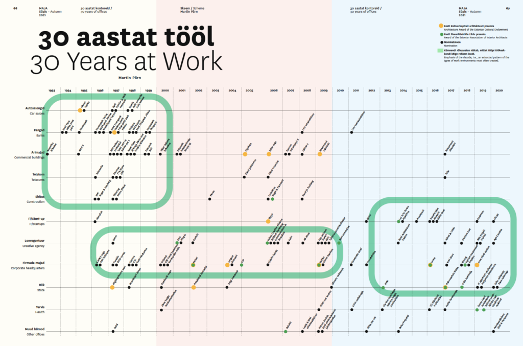
From this selection of architecture and work environments, a clear pattern emerges, thus letting us differentiate each of the last three decades from the others. The ‘90s were an era of new money, when banks, car showrooms, offices for telecom and construction companies kept sprouting up. The ‘00s brought to the forefront companies that had decided to brand themselves via physical landmarks, and built their organisations comprehensive work-worlds. The last decade was more about people. Leading trend-makers were IT and startup companies. The state also entered the picture—initially with small and likeable ideas for areas outside of Tallinn, and not yet with huge ministries and offices that draw together hundreds of civil servants. Quality was guaranteed by architectural competitions, where longer-developed and better thought-out ideas vied for the prize. Construction in the healthcare sector also gained momentum, but will not be examined here.
The ‘90s were an era of new money, when banks, car showrooms, offices for telecom and construction companies kept sprouting up. The ‘00s brought to the forefront companies that had decided to brand themselves via physical landmarks, and built their organisations comprehensive work-worlds. The last decade was more about people. Leading trend-makers were IT and startup companies.
The ‘90s—an era of new money
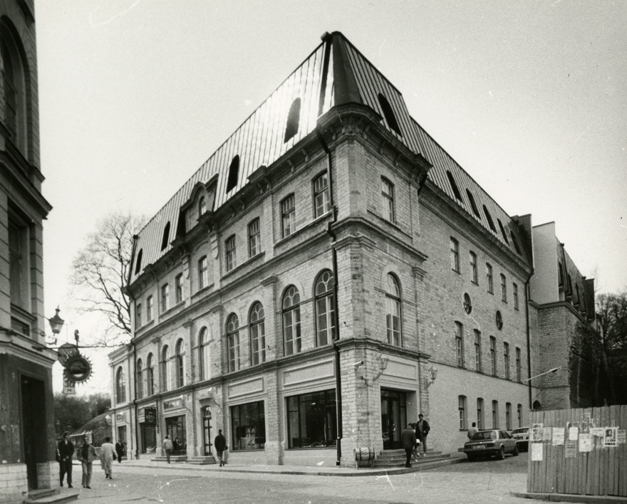
The new world of increasing openness is exemplified by the American Business Center, situated at the beginning of Harju street in Tallinn (1993, architect Aiki Lepik). In the course of the old building’s transformation, which was highly symbolic and hotly debated at the time, a Soviet-era variety theatre was cleared out, and the worn-down space was filled with an embodiment of vigorous new capitalism. The stately walls of the repurposed building had the effect of making it look desirable, expensive and capitalistic, which was not easy to achieve with the cheaply built new buildings of the time. The era can be understood more intimately by reading a review by Krista Kodres from 1994, where the author highlights two new central themes of the time—openness and kaleidoscopicity.2 Both keywords mark a clear turning point. Before, interiors had generally been designed in a uniform way: organisations were large, identity and differentiation were not considered important, people were treated as anonymous and hidden away in closed rooms on two sides of a corridor. The new kaleidoscopic approach enabled to pack several different worlds (i.e., businesses) into a single building—in form, function as well as aesthetic. By now, this approach has become a tacit norm.
Construction sped up in the second half of the decade. The most vigorous builders were banking companies with their headquarters in Tallinn and many branch offices from Tartu to Narva. Another prominent category was car showrooms, followed by telecom and construction companies with their headquarters.
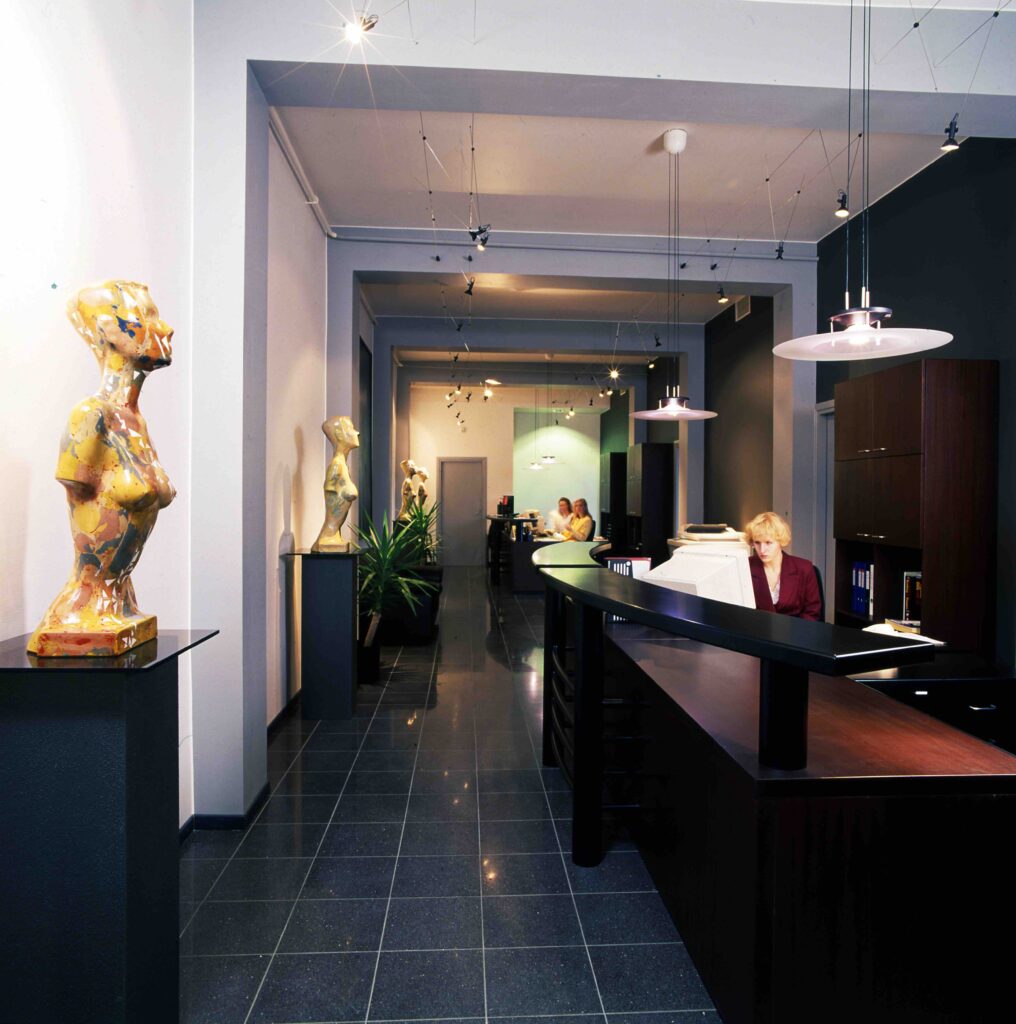
The work environments of the time, however, were not easily opened up—exposing the workspaces was not considered important. The latter consisted mostly in pairwise and face-to-face L-shaped desks in austerely furnished rooms. Soviet-era offices were replaced by small departments with 4-8 employees. Workspaces were strictly for working, and all the workers were treated in a uniform way. Emphasis was often placed on nifty, sleek foyers and terrazzo staircases, which were made even shinier by stainless steel railing. If the building did not have stairs, this architecton was added as a sculptural form (the first expression of “percentage art”?). Such early games with form, which were easy to implement and visually striking, underline the notion that facades represent their owners, and a more general increase in the importance of image. They suggest a growing need to stick out and present oneself as a full participant in the new, transformed world. Employee-centric view and reflections on better work practices were nowhere to be found yet. These were the years of rapid development, characterised by growth and expansion.
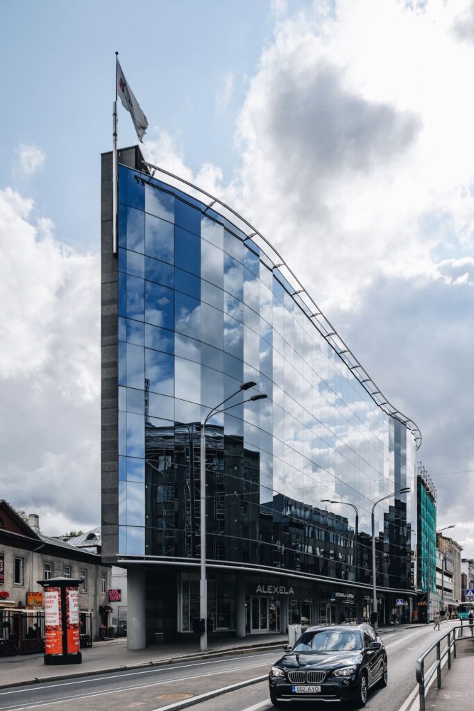
Commercial buildings of the new era also started to rise. Kawe Plaza (1997, architect Henno Sillaste) at the beginning of Pärnu hwy in Tallinn has an elegant wavy glass facade that reflects its surroundings and still appears fresh today. The building has a relatively narrow plan with a pointed end, offering possibilities to create spacious open work environments. However, the very concept of open office was still alien at the time. Instead of wide open surfaces, the building was shot through with dark, meandering corridors reminiscent of a cruise ship. Back then, building meandering hallways was a common method for soothing the drywall-enclosed world, moving away from the past, and adding some modern playfulness.
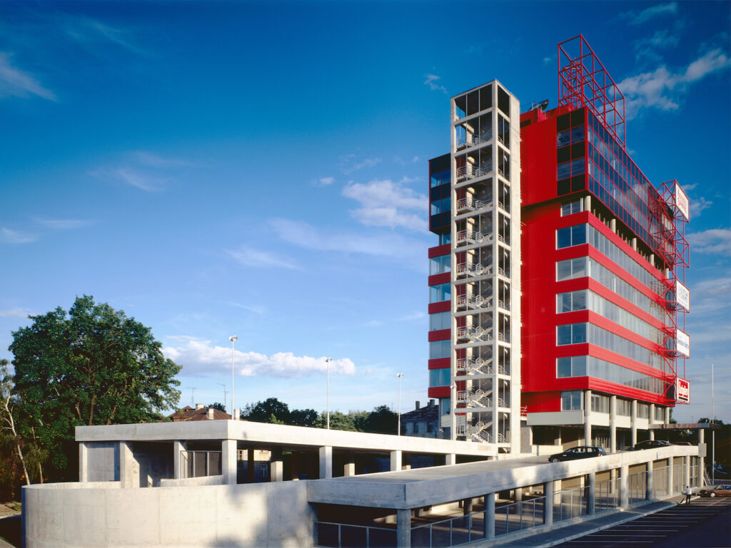
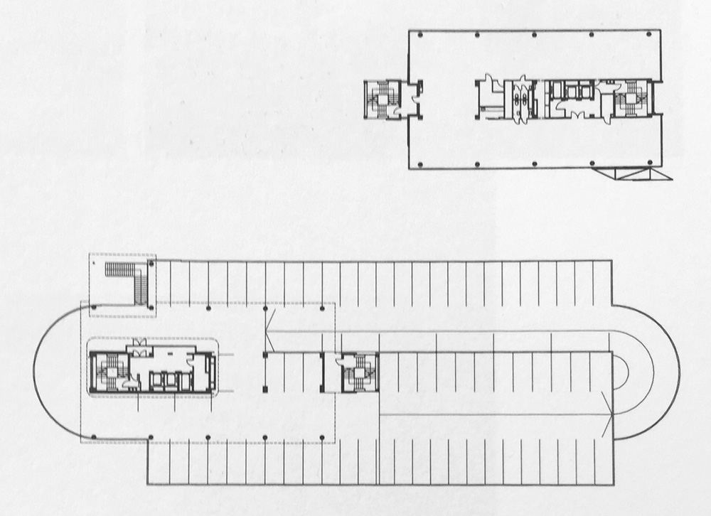
Techno-optimistic Punane Ärimaja (1998) by Künnapu and Padrik near the Pärnu hwy overpass appeared quite progressive in its time. The two lower open floors for parking create an azure and technicist look, which is amplified by advertisements on the facade. According to the architect, floors were planned as empty plots that could be filled with different kinds of office landscapes, all the while avoiding long enclosed corridors.3 This mentality fit well with the energetic editorial office of the financial newspaper Äripäev. Due to the nature of their working practices, media companies were the first to apply open space solutions for fostering collaboration. Then again, the building also exemplifies how the faith in progress and car enthusiasm of its time have acquired a new and not-at-all-progressive meaning in the last twenty years.
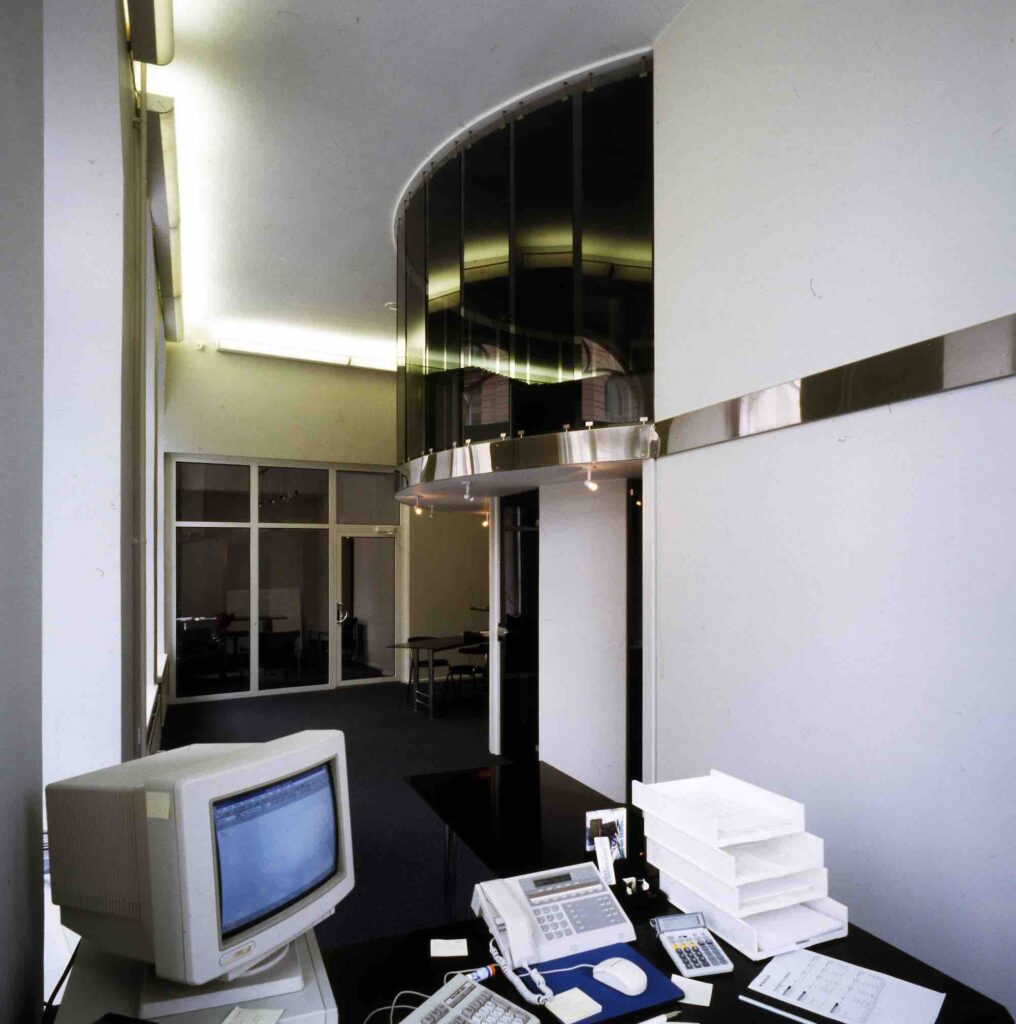
While many of the office buildings in the selection can appear rather anaemic today, the Prime Minister’s Office in Stenbock House (1997, Alver Trummal Architects) with its round, barrel-shaped meeting room has a distinctively fresh, sincere, ascetic and slightly robust feel. It is interesting to note that the only state-commissioned building projects in Estonia that were covered in architecture publications up to the year 2004 were namely the renovations of Stenbock House and the Office of the President.
The ‘00s—from corporate image-building toward creative hubs
New century brought new goals. Once companies had established themselves, they seemed to get a greater urge to perpetuate themselves, and also began reflect on how we spend our time and work inside our apparent shells. Several trends could be distinguished. First, let us look at the embodiments of corporate identity.
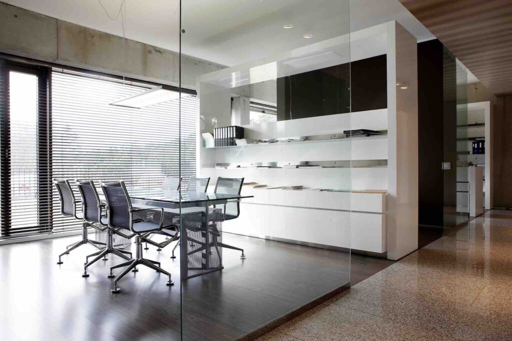
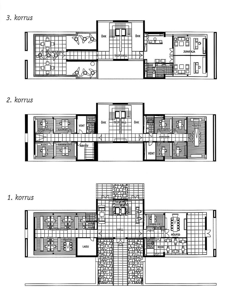
One example would be Elion headquarters’ floor at Endla street, where you enter a tranquil white building and suddenly find yourself in a physical and living embodiment of a brand. A more architectural example would be the main office of the construction company TTP in Pirita (2005, architect Meelis Press). The building is a forceful realisation of the developer’s dreams; a proud and precise concrete monument to corporate culture—mighty, perfectionistic, cold and distant to the rest of the world. It received much acclaim at the time, but its corporate statement is quickly losing its substance and becoming estranged from contemporary values.
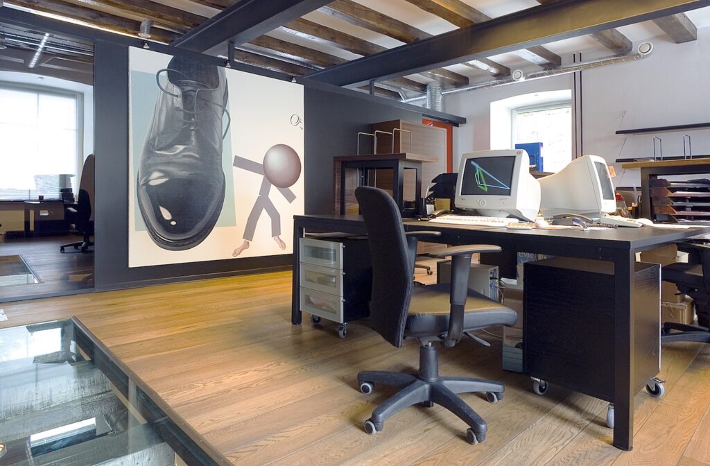
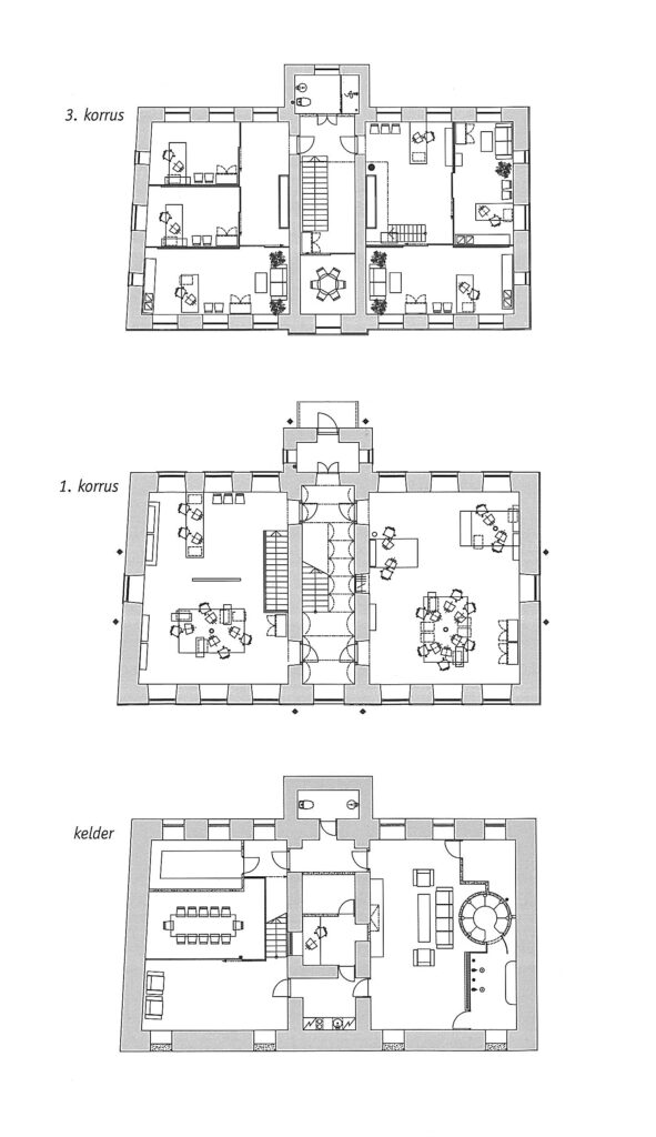
The kind of corporate architecture that I find more likeable is represented by another company with award-winning interiors—Jungent (2004, interior architects Jan & Ken), who has managed to conciliate its creativity-oriented image with a sales- and market-oriented worldview. Jan & Ken have provided the renovated building with a chic and distinctive set-up. The result appears both respectable and trustworthy, but also playful and forward-looking.
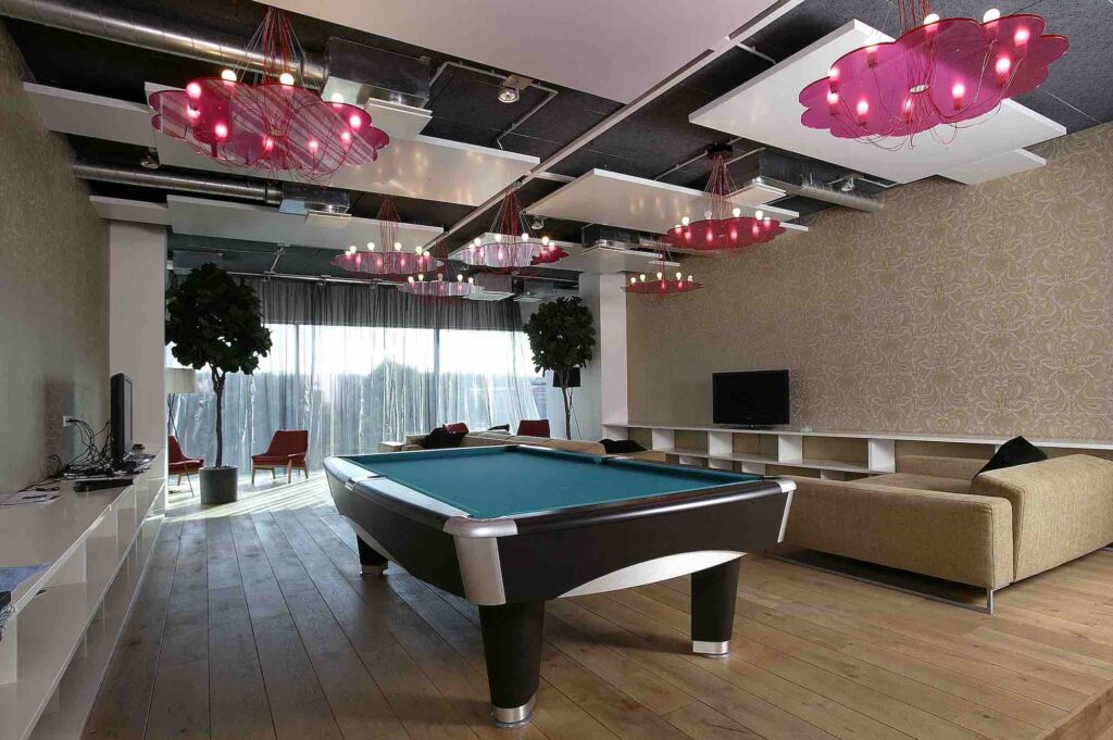
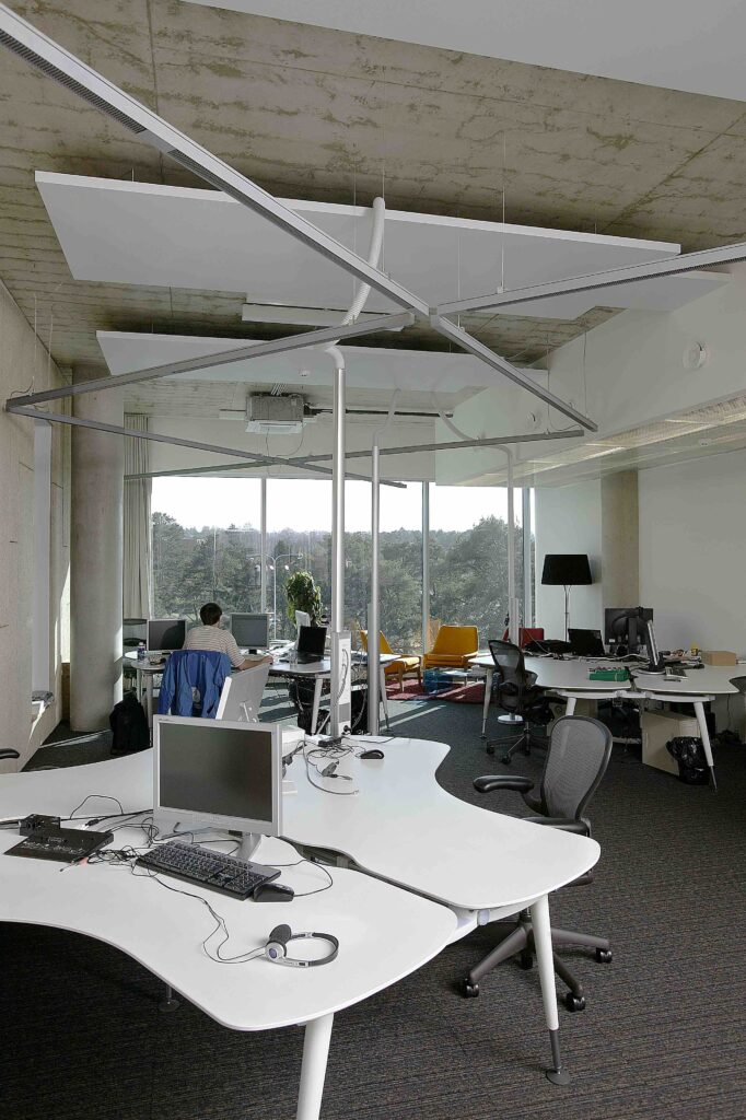
Another, soft-power type of approach was introduced in the corporate domain by Skype and Tarmo Piirmets (2006). Skype has its office in a modest, neutral-looking office building (architect Andres Siim) at a practical location on the edge of TalTech campus and Tehnopol in Mustamäe. The interior lining of the building is distinctive—aesthetically playful, colourful, inviting and homely, thus enabling Skype to play with its brand and corporate image on a wholly new level of meaning. The culture of a company, and thereby its (brand) experience, is made by the mentality and manner of the team. The rooms have lost their hierarchy and turned into an open, free and creativity-promoting environment. Collaboration and co-creation are at the heart of everything. Skype is sometimes described as the first homely office—a home office for 300 people.4 Its many different functions for being, working and relaxing support different kinds of work and enable one to keep one’s senses alert throughout the day. The booths at Skype were ahead of their time, given that they were introduced as a separate product by the Finnish start-up Framery only in 2010. Even though the conference room contains a 4x9m table with a huge engraved Skype logo, and the cloud design of the logo also appears in the form of floor carpets, the brand is still embodied mainly in the values and spirit filling the room, rather than pushed on us physically. The storey has a clever platform-and-staircase solution in the centre that joins the people working on two different levels into one community. Skype’s conception has strongly influenced later approaches to work environment and become an example to many—especially other technology companies.
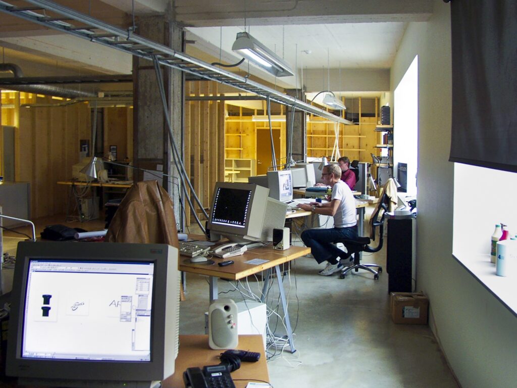
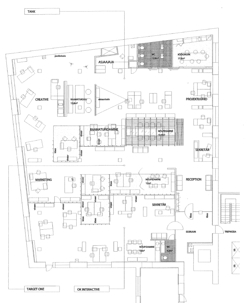
A topic of its own would be creative agencies in the field of advertising, marketing and design. The gauntlet was thrown down by the advertising agency Tank with its office at Narva hwy (2001, Lauri Laisaar, Margus Tammik). The latter’s approach to freedom is reminiscent of an art student’s spontaneous studio in some squat. One can sense a drastic and conscious opposition to any seemingly compulsory correctness. Dropped ceilings and whole-floor carpets are ruled out; minimalistic political correctness is avoided. The main approach has been collage. The resulting interior forms a rich and colourful background, where open and seemingly messy surfaces are interwoven with elements that tell different stories, thus becoming part of the work that is hatched and produced in these rooms. Such an animated interior creates good conditions for more immediate human relations.
A more refined approach is exemplified by Age McCann agency in the Rotermann Quarter (Tomomi Hayashi, Kerli Valk Kukuhaus, 2009). The process of how its interior architecture was created demonstrates the client’s ability and experience in doing creative work on a daily basis, thus making them perhaps an ideal partner for the architect.5 The interior architecture solution was born out of mutual amplification of each other’s ideas; the (interior) architect had no need to sweat over his own artistic conception and then sell it to the client. The goal was to create a workplace that would be inviting and motivating. With the Age McCann office, this has certainly succeeded. The blocks of the exterior facade of the building are roundly cushioned on the inside, creating a flowing landscape-like feel with distinctive niches. The whole space is an integral landscape that can be criss-crossed without running into any dead corridors.
The decade concludes with the repurposing of Baltika production plant in 2009 by 3+1 Architects and Stuudio 3. Telliskivi Creative City had not yet become what it is today, while Kultuurikatel was still just a dream. Baltika went knowingly after the creative elites of the city. The renovated building featured intellectual contributions from several advertising agencies, architects, a design centre and creative incubator. In order to counterbalance its teeming inner life, the building was modestly designed, forming only a discreet framing and giving the leaseholders the freedom to design their own worlds. The rooms of the clothing brand Baltika itself on the upper floors were skilfully joined together with a three-step intermediate room. This created interesting perspectives within the rooms, but more importantly serves as a unifier of an organisation that is split between different floors. Open space is divided with white furnished walls into small orderly studios, thus giving every creative cell its very own spot. The laconic form organises and tempers the lofty mess that is involved in creating a clothing brand. New kinds of cross-use are enabled by fashion stage with a movable staircase at the other end of the building.
The ‘10s—empowering the employee
Looking at the offices of the last decade, one gets a sense of deeper reflection on how companies should organise their work and inspire their workers. This has led to a shift in understanding—what takes place within the environment has begun to affect the environment itself and its fundamental idea, which in turn guides the aesthetic decisions on space.
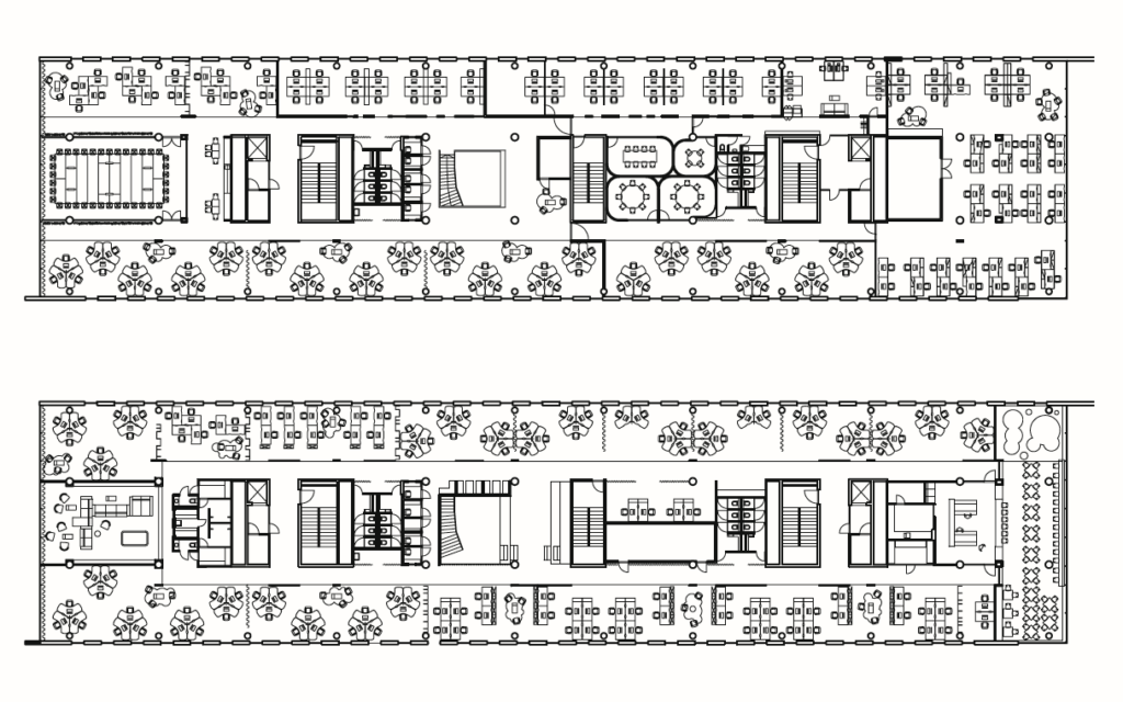
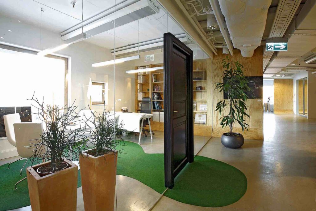
One such inward-looking company that cares deeply about its employees and is actively shaping its work organisation is Proekspert (2014, Pluss Architects, interior architecture by Kuup Disain). The ascetic larch-cladded exterior hardly gives any hint of the bustling life inside. The space seems to be designed to capture a single moment in time. Workspaces are composed into a thick labyrinthine landscape in which a stranger might get lost. It is a varied and fascinating space where every point is different. Jagged walls with occasional built-in furniture or booths are used to cancel noise. There are many knowingly designed places where one can just step aside for a casual chat. The accent of the office consists in the stepped stage, extensive terrace and separate floor with an elegant kitchen, dining area and playrooms.
Looking at the offices of the last decade, one gets a sense of deeper reflection on how companies should organise their work and inspire their workers. This has led to a shift in understanding—what takes place within the environment has begun to affect the environment itself and its fundamental idea, which in turn guides the aesthetic decisions on space.
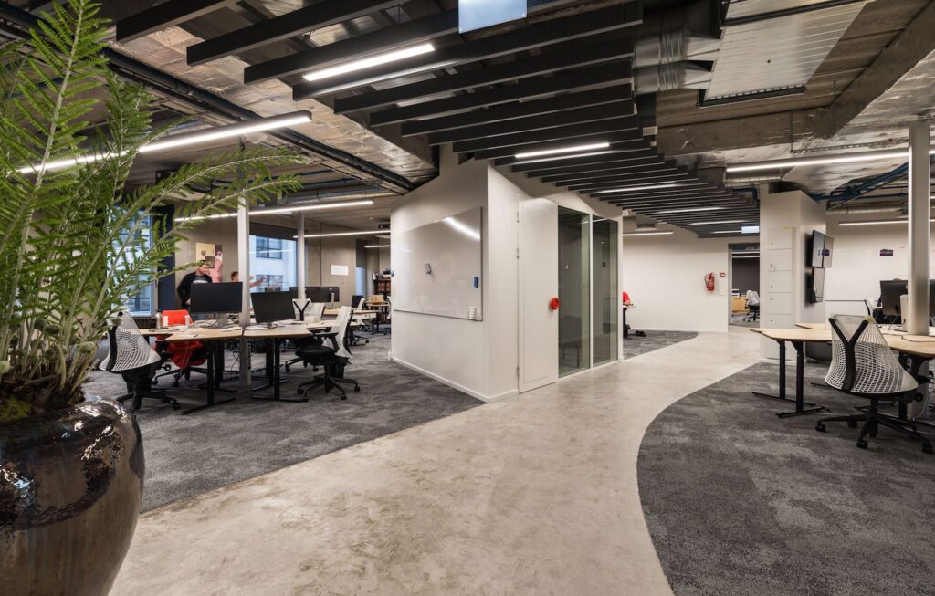

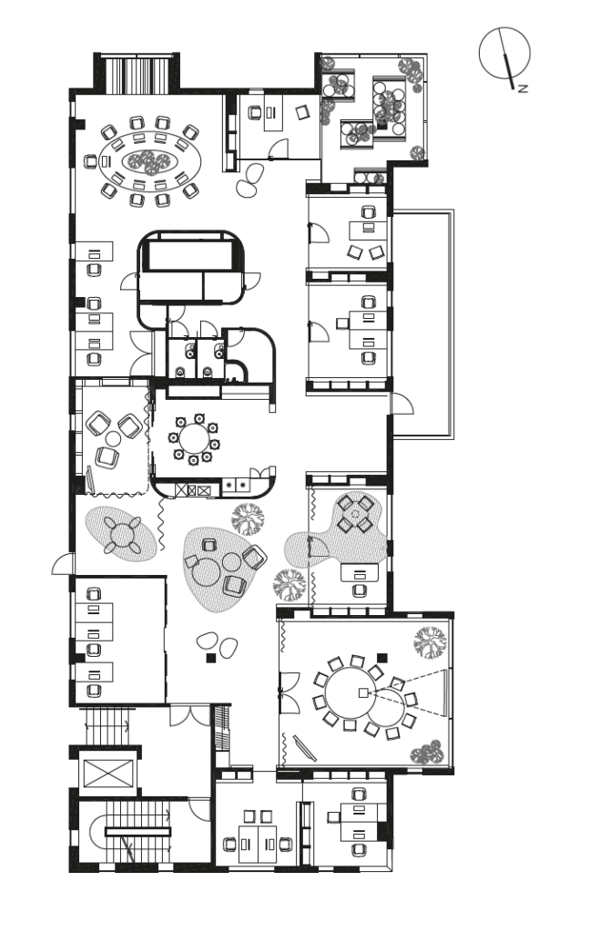
A more open and flexible approach has been adopted by Twilio Estonia office (2016, PIN Architects). The rectangular ground plan of the building is structured by irregularly placed rooms that provide opportunities for collaborating and having quiet conversations. The open areas between them contain gently shaped islands of workspaces. This combination of gentleness and sharpness creates a polyphonic and homely environment. Meandering paths—intentionally similar to natural trails—are formed by occasional cabinets that delimit the work zones. Different forms of work have been made possible.
Another landmark that reflects changes in our work culture is the main office of Telia (2017, interior architecture by Form), where the new building has been consciously designed according to the principles of activity-based office. The activity-based approach originates from the realisation that work is not simply a uniform mass of bustling about, but consists of very different types of activities. Broadly speaking, work can be divided into five types of activity: focusing, collaborating, socialising, learning, recovering. Each of these can in turn be divided into various further activities, depending on the specifics of a particular job, department, etc. For instance, collaboration could mean private conversations, synoptic meetings, quick stand-up meetings as well as brainstorming at the whiteboard. For each stage of work, a suitable place has been designed, which the workers could then choose for the task at hand. In order for this rich space to function, workers have given up personal workspaces. There are fewer traditional desks than there are people. Departments have their own floors or nests where they can feel at home. Personal space has been replaced with Our space.
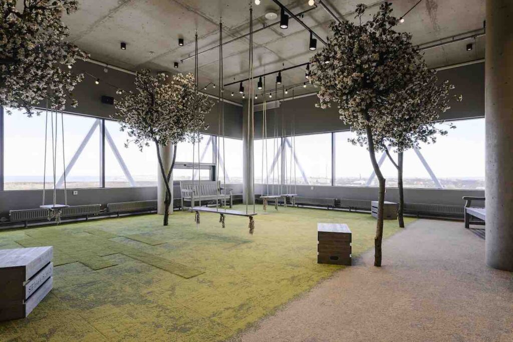
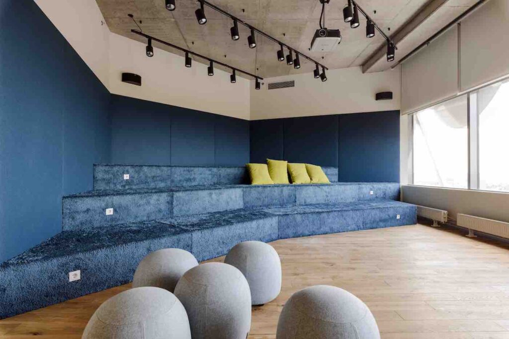
So far, the activity-based approach has been rather new and alien to us. Nevertheless, it is an idea that has been in development for almost twenty years—sometimes justifying itself, sometimes not. The point is that no theoretical conception should be followed blindly, but always be adapted into a version that supports the activities of the particular company the best. Different behavioural practices can be adapted to any kind of space. Nevertheless, it seems that more long-lasting, comprehensive and efficient are solutions where the architecture of the building and its internal operations are thoroughly composed on an intellectual level and mutually supportive.
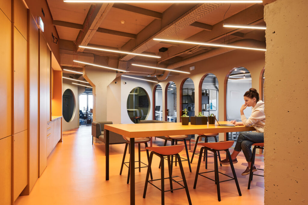
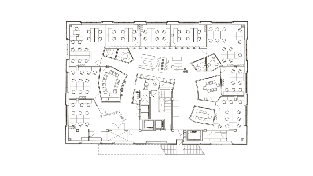
Such an ideologically comprehensive workplace conception is embodied in the Municipal Building in Saue (2020), designed by Molumba—a grand restart to work culture development in Estonia after it was interrupted by the pandemic. The design submitted to the architecture competition was already based on a conception of activity-based work environment, and featured a flexible spatial solution that could be adjusted according to the changing needs of the municipality and work. One significant aspect of this unusually odd building is the mayor’s decision to give up his must-have corner office. It is a minor change in the building plan, but its built form indicates fundamental changes in the organisation’s essence, work culture and administration.
Where to next?
The building in Saue is a good springboard for casting a glance at the tomorrow that is already here. The last year and a half have forced us to rethink our notions of work and going to work. Now we understand (office) work as our personal contract with the employer, the object of which is the result. We have gained the freedom to plan our own time and hence our personal lives, thus integrating our life projects, work and family into one whole. We have gained an unprecedented amount of trust from our employers. Work has suddenly become dispersed, taking place asynchronously at different locations and different times. Forms of work have hybridised, with some colleagues together in a room and others joining in digitally. And the work gets done.
We have already internalised these significant behavioural habits, meaning that there is no way back to the normality of yesterday. We, the office workers, are doing just fine. The situation is rather different for the organisations and companies, who are still in the dark with regard to what kinds of rooms they need today, how many people will return, what kind of work would we be doing in the office, what would we be doing from distance, how to furnish and plan the rooms, and what kind of message should be communicated to the employees. This is a challenge not only for a few, but for everybody. New ideas from architects and interior architects as well as new business models and operating models are eagerly awaited.
Some new opportunities are already beginning to reveal themselves. One example would office hoteling, where workplaces can be rented for shorter or longer periods, just like booking a hotel room. The first of its kind was Plug-In at Maakri street, where LHV got started 20 years ago. The temporary ad hoc solution was designed by Tanel Eigi. Today, there is more competition on the market, and different workspace rentals compete in terms of identity, environment, mentality and services. A great example would be LIFT99 (2019, interior architecture by Kuup Disain, Dokointerior). The environment—or “hub”, as it would like to be called—is a spatial embodiment of its motto—helping stars rise to the sky. There, you can be apart with your team, but still in a way together with the others. Socialising and mutual synergies are important and well-conceived in these rooms.
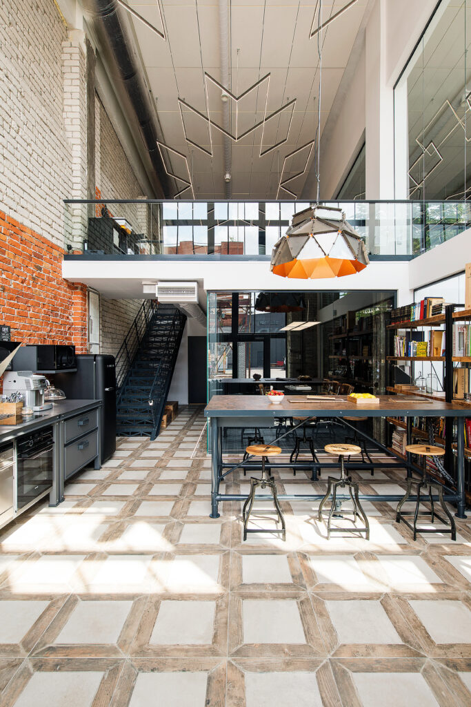
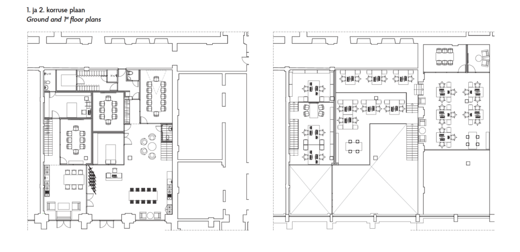
Another new model consists in symbioses between different companies, increasing their efficiency by shared use of space as well as adding flexibility by enabling to rely on each other. Examples of such associations include the cohabitation of design agency Velvet and interior architecture firm Uddu (2017, interior architecture by Uddu), which greets you upon entering with a rustic home restaurant milieu; or Creative Fuel (2018, Tomomi Hayashi, Mari Põld, Ahti Grünberg, Tõnis Kalve) in Kultuurikatel, where every agency has its own nest, but those are then merged by club-like common areas, work areas and rest areas.
I am sure that these kinds of new ideas are already taking shape in many heads, and only time will tell what the current decade is going to look like. At any event, transformed work also calls for new kinds of form and content. With an asynchronous workflow, giving up one’s personal workspace in exchange of freedom does not seem that terrifying anymore. But also in exchange, we ask for richer spaces that better support different kinds of work. Henceforth, the purpose of getting together is primarily going to be collaboration and fostering organisational culture, rather than simply holding meetings. Companies will need to be able to offer meaningful experiences that bring and keep people together. Projecting inward will become more important than projecting outward. Interesting times are ahead for going to work.
MARTIN PÄRN is a professor at Tallinn University of Technology, manager of the Design & Technology Futures international master’s programme and leading partner at the design agency Iseasi.
HEADER: Interior design of Hanspank on Liivalaia Street. Vaikla & Männi, early 1990s. Source: Estonian Museum of Architecture.. Foto: Boriss Mäemets
PUBLISHED: Maja 106 (autumn 2021) with main topic Spatial Revolutions
1 Francis Duffy, The New Office (Conran Octopus, 1997).
2 Krista Kodres, „Ameerika ärikeskus – „Estonian Dream“?“, Maja, 2, 1994, 18–23.
3 Andres Kurg, „Positiivse büroomaja-kujundi otsingul“, Maja, 20, 1998, 12–15.
4 Ell-Maaja Randküla, Maris Takk, „Tehnoloogiafirma kontor Mustamäel“, Ruumipilt 2006, 98–104.
5 Ell-Maaja Randküla, Maris Takk, Karin Paulus, „Age McCanni büroo“, Ruumipilt 2009, 96–103.

