Questions by Anna-Liisa Unt
As part of the programme dedicated to the centenary of the Republic of Estonia, the ‘Good Public Space’ project campaign has renewed ten urban centres across Estonia so far. The youngest of these was recently opened in Viljandi at the beginning of June and awaits visitors. Post-competition work is in process in Jõhvi and Narva, while Tallinn Main Street and Põltsamaa centre have become stuck in a political and bureaucratic vacuum
Renovation of city centres is a decisive impetus for small towns. Populations are in constant and fast decline whereas carefully designed urban space can become the decisive factor for people who are amid choosing a place of work and residence for themselves and their families. This is one of the reasons why I have been living in Tartu for over twenty years.
Last year the Estonian Association of Landscape Architects annual award and the Estonian Cultural Endowment landscape architecture award in the category of architecture were given to the new city centre of Elva. ‘Between the Currant Bushes’ (by Ülle Maiste, Diana Taalfeld, Anne Saarniit, Roomet Helbre, and Taavi Kuningas from the architectural offices AT HOME, NU, ubin pluss, and TEMPT) was recognised as the winner of the architecture competition for the best solution for Elva main street and urban space in the framework of the ‘Good Public Space’ project.
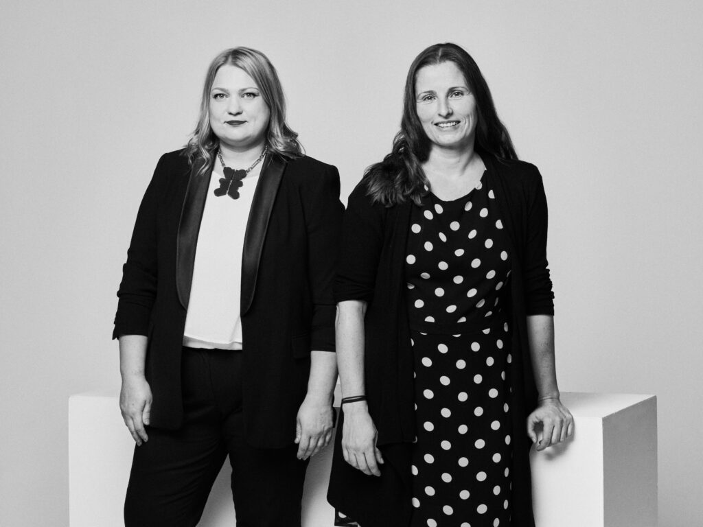
Authors of the construction project for Elva city centre, Diana Taalfeld and Ülle Maiste—what incited you most about the location and the brief of the architecture contest? The competition took place five years ago—how many of these initial thoughts have carried over to the present day?
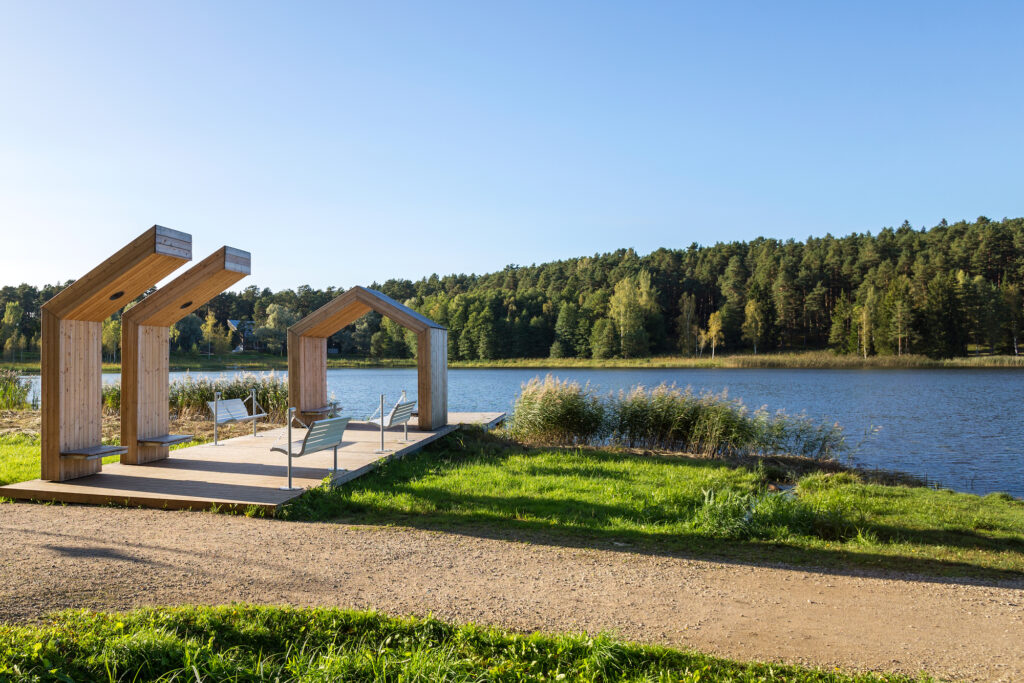
Diana Taalfeld: Elva as a satellite resort town to Tartu is an entirely discreet phenomenon. On the one hand, a resort is something that people associate with change of scenery from their busy daily life, it has a grand air to it, at the same time the lakes near Elva turn the town into a comfy, rustic destination: everything is close at hand, just around the corner. That is where our concept began, like a trip you take to grandma’s place, and the lead element became currant bushes.
Elva is shrinking but at the same time a speedy train connection with Tartu remains, although to a considerably lesser extent. We used this vantage point as one of the main planning impulses for our competition entry. We proposed a spatially extremely clearly defined new connection between the train station and the lake. Easily legible spatial cues communicate hospitality and enable better use of space. Unfortunately, this was part of the fundamental concept that did not come to fruition because the surrounding properties are privately owned, and it was not possible to create a passthrough from behind the hotel toward the lake.
Ülle Maiste: Upon local inspection of the site, we were also concerned by how the active city centre had as if shifted away from the actual centre toward the Konsum grocery store. This node at the intersection of the train station, the lake, the cultural centre, and local government office had high potential but had become less accessible on foot and more open to cars, and the supermarket had become the new activity centre. The building of the cultural centre was being renovated and combined with Kesk Street, was in the process of becoming an excellent node exposed to the sun. That is now the starting point of the linear square.
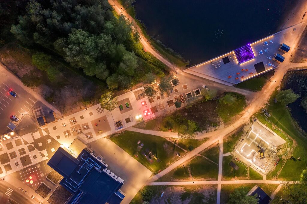
‘Between the Currant Bushes’ stood out for its easily legible urban scheme. Kesk Street, which is the main object of the competition, runs along the lakeshore a mere hundred metres away, but the lake itself is not perceivable from the street. The solution creates a linear square-passthrough from the cultural centre to connect the street and the lake, and repeats the move in another hundred metres, connecting the beach and the train station. A triangle highlighted like this in a town, with the new passthrough, Kesk Street and the new elongated city square as its sides, and the cultural centre-general medical practice-daycare, Arbi beach and the train station as the vertices, accentuates and domesticises the urban fabric, helping visitors find their way around town. I am not well acquainted with Elva and can no longer sense the former configuration. Standing at the beginning of the square, was the lake formerly visible from the street at all?
Diana Taalfeld: The current view was unavailable; the lake was as if non-existent. The cultural centre and the parking lot were there, and a narrow path leading to the bushes. There was no visual connection, many of the visitors were unaware of the existence of a lake behind the trees. Opening that direction has reinvented the concept of Elva city centre.
Ülle Maiste: Reconstruction of the cultural centre was in progress simultaneously with the planning work of the city centre, due to which it was possible to better connect the building, the square, and the surroundings. This was the node where several factors started to work together when we were in the process of developing the solution for the competition entry. The location of the central square was not predetermined in the contest requirements. The area in front of the cultural centre, between the main street and the lake, was occupied by a parking lot, lawn area and a patch of wood, we only had to make slight changes. Essentially, we just cleared out the central square from there, it was a logical location for it.
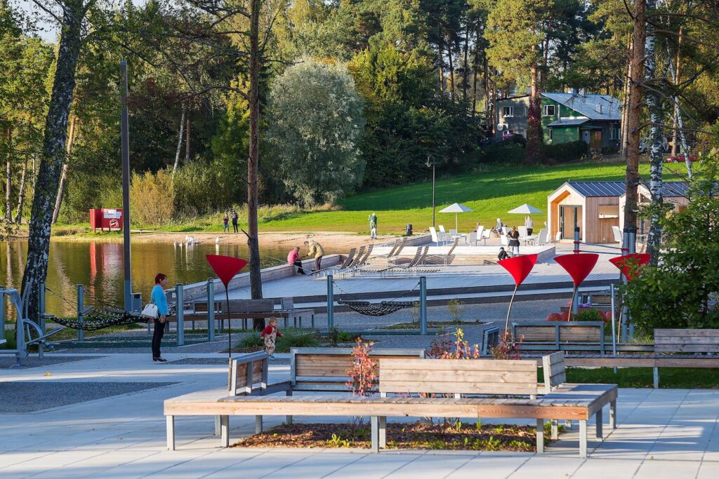
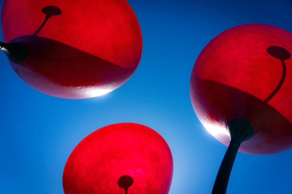
The small forms you have suggested have been sprinkled further away from the project lot into the lake and on the kerbside. It creates a logical and painless transition between the old and the new; in the long run that distinction between the old and the new will fade. This knack softens the contradiction between the brand new and what has been. The added elements are rather modest, low in height and dense in dimension and form, which blends well with the tranquil small-town-resort image. The red, strongly narrative luminaires are unexpected but appear as landmarks and raise the central square above the ground level. From an aerial perspective, the long, organised, and dominant square area is packed back into rather flat and modest perspective and relief in street view. The luminaires and tiny pavilions elevate and spatialise the square.
Diana Taalfeld: We ended up having to cut back on the shrubs and leave out the cherries entirely, ultimately there was not enough of the desired berry-effect. We felt a sculptural object was missing, so we looked for a befitting form and found a luminaire that was perfect for the spot. The double function of illumination and being a bright landmark supported our currant-theme well.
The whole town of Elva and its vicinity have been quite interestingly sliced into bits with drainage canals and ditches. The competition work takes this into account: the new square is placed on top of them and adds footbridges across the ditches for better access. Unfortunately, the plan has not been realised that way. Planting is also rather scarce within the framework of the square, even too simplistic at first glance and after a walk on the site I must admit I felt a bit disappointed, but—it suffices. Landscaping will just require determined guidance in maintenance for it to grow lush. The large lawn areas between the lake and the cultural centre and the excessively organised park area are not paying a compliment to a small-town resort, however, and much stronger principles should be adopted to codesign with nature. Was there anything that you had to throw out or change which you really regretted or something that excessive caution may have worked against?
Diana Taalfeld: The currant bushes and cherry trees caused a lot of heated discussions, we ended up choosing the non-fruit bearing cherries, which blossom but will not cause anxiety over fruit falling on the ground and becoming jelly on the paving. Different types of currants were planted, red, white, black; however, compared to the original idea, the number of shrubs ended up being considerably smaller. The vision will probably become better outlined over the years because the plants are still young and really quite small.
Ülle Maiste: We had to change the original grandma’s garden idea a bit, because not all plants and habitats are well-suited for urban centres. The planting by Kesk Street should have been much lusher but the client fell short of courage; it will probably grow into a better version of itself over time. What we see there is rather a clearer green buffer between the street and the pedestrian area. The drainage ditches by the lake are not full of water on a regular basis so emphasising them on the square would not have made sense.
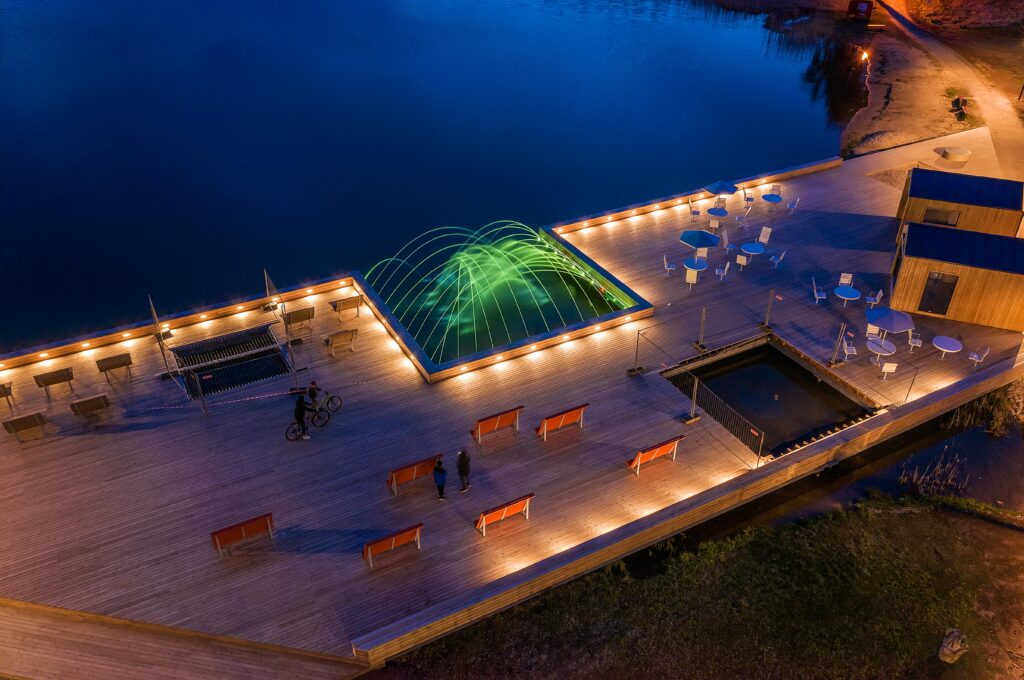
The element that I mostly do not understand is the fountain. It seems to embody both empathy and fear at the same time: a fountain is fully dependent on human activity and impeccable technological aspects which makes it somewhat helpless. If things go well and it is working, all the forcefulness, the splashing make it come across as somewhat aggressive and unthankful towards its creator. Since my view of this is a minority, fountains continue to exist. In Elva, it is a key element of the lake terrace, and it does contain a certain logic. It is lake water that is being showered. What did the jury and client underline in the competition entry, what change proposals were made and what had to change throughout the work process and circumstantially? In the competition entry, the wooden terrace on the beach featured a swimming pool instead of a fountain.
Diana Taalfeld: The client was afraid that the swimming pool would compete with the bathing area by Lake Verevi, it has a similar element. The pool evolved into these net-covered peeping holes, with views of the lake. The project featured a more substantial recreational area around the bathing area, but not all of it has been realised yet.
The elements that the client was most doubtful about were the business modules. Back then there were very many empty lots along Kesk Street and part of the competition work outlined small pavilion-type units that would morph into shops-cafes or various service providers such as shoemaker workshops according to need. The client remained sceptical of the idea, doubting if entrepreneurs and users would be interested in such daring projects. They were meant as rental spaces. A number of these modules were left included in the project, they decided to test the idea. When we handed over the project and construction of the modules began, it turned out that demand was higher than supply. As of last summer, the modules were very much in use.
Ülle Maiste: Completion of the square, activities added on account of the business modules and initiatives taken up by the residents have already impacted the area. Vacant, poorly maintained buildings have been tidied, business has enlivened. Two new office buildings have been built on Kesk Street, a third one will be erected as per winning architectural competition entry.
What would you highlight in your cooperation with the client and the residents of Elva? What differed from the norm, what worked? Locals are valuable sources of useful tricks and habits that usually remain hidden from strangers’ eyes. At the same time, inquiries about future visions and dreams tend to stick to retrospective ruminations without much working value. People usually describe what is familiar from somewhere else, classic, or reflective of something punk and extravagant they might have picked up from a trip, theme park or dream.
Diana Taalfeld: We were lucky to get the client that we did, we were trusted, and everything was finished in a way we all could agree on.
Ülle Maiste: The locals were included in the work throughout the process. We also designed the main square in Viljandi, and while there it was possible to add to public space on account of car traffic, Elva was different in this regard. The smaller the place, the longer the distances which makes dependence on personal vehicles even more actual. Throughout the design phase as well as in the final solution, the small amount of parking spots remained a concern. It seems that at least initially residents find it difficult to adjust to benches and mini-squares on the kerbside—they seem too close to cars. These spots are the more private ones compared to the main square and as soon as vegetation picks up, the potential of these pockets will become more visible. Inclusion of people in the design phase of these projects of good public space is vital. The attention granted by the state itself that signals that the problem areas have been noticed, a programme initiated in response, that your hometown is covered by the media—all this makes people proud of their hometown which is great fuel for success and a warm welcome.
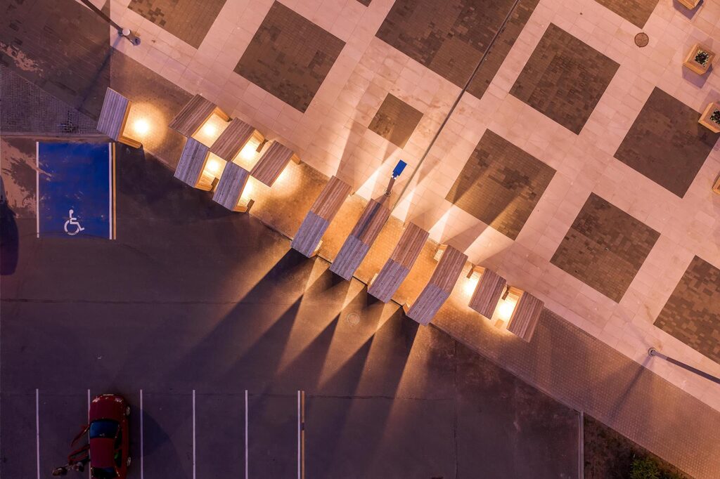
The established centre is still fresh today and therefore feels a bit raw in the middle of the existing structures, as could be expected. A mellowing out will be gradual once the space in between the construed elements grows full. Might designing squares in small towns in the first place be a bit too lavish an approach? A few times a year there is a fair, a procession or two, New Year’s Eve celebration. A live square should be filled with people all the time, outlined by a built frontier, and basted together by pedestrian passages. In small places public spaces like squares remain empty for most of their life cycle.
Diana Taalfeld: That is precisely why the square in Elva is more like an appropriately wide longer treading path. This enabled dividing the square into several zones, so it could be utilised for different purposes, and it would instigate new ideas. The street front is more formal and broader, the middle part features the business modules, the cafe area and sports facilities, and the lakeside zone is perforated with green areas—it is like a transition from town to landscape. This variation ensures abundance of options, something is always happening here.
ANNA-LIISA UNT works a day job as a landscape architect at the public space department of Tartu City Government, at other times she dwells, studies, and works from her home office in Karlova district.
HEADER photo by Marko Hõrak
PUBLISHED: Maja 105 (summer 2021) with main topic Landscape Architecture

