ARVO PÄRT CENTRE
Architects: Fuensanta Nieto, Enrique Sobejano (Nieto Sobejano Arquitectos) and Architecture office Luhse & Tuhal
Project team: Alexandra Sobral, Simone Lorenzon, Covadonga Blasco, Pablo Gómez, Víctor Mascato, Adrián Rodríguez, Michele Versaci
Commissioned by: SA Arvo Pärt Centre
Location: Laulasmaa, Estonia
Total floor area: 2650m2
Structrual engineer: Pike
Mechanical engineer: Hevac
Acoustic consultant: Arau Acústica
Competition: 2014
Project: 2014-2015
Construction: 2017-2018
Construction company: AS Ehitustrust
The centre dedicated to the composer Arvo Pärt is loaded with many different expectations which set very high standards for the architecture. A successful architectural space not only provides a particular set of facilities, but also functions as an abstract machine, a means to contemplate our place in grander schemes of things.
‘Was Arvo home?’ a stranger at the parking lot jokes upon seeing me return to the car from my little walk around the building. I allow myself a chuckle. Can we really expect the composer occasionally to welcome people at the door and take them on tour in the splendid glass building or actually sit in his specially furnished study and compose, with the muted voices of the guests in the background? Will he climb the tower in the morning to enjoy the view over tree tops? People probably do not arrive at the Arvo Pärt Centre, which is not that close to Tallinn, simply to drop by, they come for a purpose and plan their visit ahead. And the centre, dedicated to a living person and his creations, is indeed somewhat like a home as well—if not to the composer himself, then to his music.
The backstory of how this marvellous building came to be in Laulasmaa, close to the composer’s home, has been characterised by a constantly positive attitude. From the outset, the project has been approached with reverence and has found support from all parties, who are numerous, as always is the case with an object of great public interest.
Behind the birth of the centre was its founder’s deep personal desire to make a gift to the public and perhaps also his wish to make peace with the very same public. Since the erection of such a prominent structure cannot proceed without drawing society’s attention in our media-loving world, it is increasingly difficult to observe the building separately from its surrounding information field. No doubt, this building is very much loaded with expectations. A statement of respect and recognition from the Estonian government to the most performed living composer in the world, visits of the world’s top dignitaries beneath the pines, illustrious architects flocking to the competition, lured by the opportunity to create something very special, monumentalisation of culture and the endless celebration of the centennial of the Republic of Estonia, the holy aura accompanying the composer’s modesty, the need to bring together in the same space fame and humility, personal and universal—all that burden of meaning has fallen on the building’s shoulders even before the centre officially opens to visitors in October this year.
How much meaning in this story is assumed by architecture and will it be able to bear the weight of responsibility? Is the new building merely an interpretation of the external, a metaphor of all that sublime and eternal, symbolising that tired expression describing architecture as frozen music, or does it perhaps also possess its own value, independently of signification? Of course it does, a successful architectural space always constitutes an environment possessing particular properties and also functions as an abstract machine, a means to contemplate our relation with something larger than ourselves, such as music or nature. In Laulasmaa, it is possible to experience both.
Iconic yet humble
The terms of the Arvo Pärt Centre architectural competition that was already announced in November 2013 did not leave any doubt that what the organisers were looking for were conception and mood, not a complete building. The centre as an institution dedicated to the study and preservation of the composer’s works had already been founded by his family three years earlier.
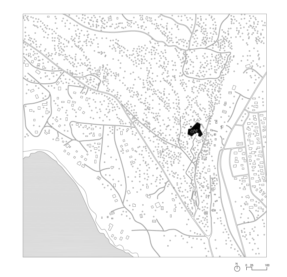
It is said that competitions are a matter of luck, but careful preparation, clearly worded terms and competent judges do ensure a better result than simply relying on luck. At the conceptual level, the client’s criteria were very well worded in the competition task and the highlighted keywords, such as purity, authenticity, simplicity, radicalism, asceticism, airiness, concentration and warmth, were concluded with a beautiful metaphor: we need ‘a pearl, not a mammoth’. Assuredly, the goal was to become neither a tourist trap or overly solemn temple, a certain taste of elitism belongs to classical music anyway. The location outside the hustle and bustle of the capital in a former summer cottage district can also be interpreted as exclusive, exhorting us to find a moment of time in our fast-living world.
Architect Ra Luhse who was involved with the preparation of the competition and also served as one of its judges, has said that the character of Arvo Pärt’s music complicated the task even more and added greatly to the architects’ burden of responsibility: ‘The difficulty lies in that the planned building should be essentially simple, yet also function as a representative symbol, be easily used and fit into the surrounding environment, without harming it in any way whatsoever.’1
What kind of space were they looking for? The competition terms also express the founders’ desire for the centre to resemble a small private college whose goals are to preserve the composer’s creative heritage, to serve as a place for learning, teaching and development of creativity, to facilitate growth and development, such as is characteristic of Pärt’s creations in music, and, discretely yet determinedly, to promote Christian values. Emphasis was also laid on spatial flexibility and creation of a living environment, not a museum—an opposition that certainly does not hold true for modern museums. Flexible and continuous space is the general formula for contemporary public spaces: a changing environment onto which different activities are projected and which is visually related to other similar ‘nests’. Neither we nor probably the creators of the centre can know for sure how the people will start using this space, whether the combination of activities specified in the programme (and in its self-generated income plan?) will actually work and which adjustments and changes it will require in the future. The activities which are all envisioned to take place under the same roof can at times be quite contradictory, some requiring meditative silence and time for contemplation, others being related to larger audiences, children, workshops and the buzz of café life.
The two-stage competition means a greater control for the client over the selection process than it is possible with a single-stage anonymous competition. Why exactly these 20 portfolios out of the 71 total tenders that came in from all over the world were selected, remains for the respective committee to know. In general, all world-famous names qualified to the next round, including Coop Himmelb(l)au, Zaha Hadid Architects, Henning Larsen, OFFICE Kersten Keers David van Severen, Nieto Sobejano and Alejandro Zaera-Polo.
Of the 25 tenders submitted by Estonian architecture offices (some of whom submitted joint tenders), 7 made to the next stage. Earlier, a similar two-stage competition was held in 2009 for the new town hall of Tallinn, but the winning design of the renowned BIG architects was unfortunately never realised.
In June 2014, the winner of the competition was announced: Nieto Sobejano, the office of the architect couple Fuensanta Nieto and Enrique Sobejano from Spain, currently at the top of their fame. By that time, carried by the rising tide of the first decade of the 21st century, the architecture office founded at the end of the 1980s had scored a number of impressive winning designs for museums and cultural objects in Spain, Austria and Germany, Northern Europe so far has remained an uncharted territory for them. According to the architects, they like a certain distance—not knowing too much about the site has sometimes helped them to find a solution to a situation which the locals find hard to solve, be it in this case the seamless integration of the new building into delicate forest.2
According to the jury, they were looking for symbolic value that would be ‘humbly iconic’, as well as good connection with surrounding nature, flexibility of the room layout, sufficient daylight, considering the building’s location in the forest’s shade, and for exceptional aesthetic qualities and acoustic properties of the main hall. Numerous designs featured a cloister-like inner courtyard at the heart of the building, these were, however, considered spatially inconvenient. The highest-ranking of such designs was submitted by the Estonian KAVAKAVA office who claimed the third place.
Nordic house and leather breeches
Nieto Sobejano’s winning design ‘Tabula’ with its low-lying glass structure that meanders between the trees stands apart from the rest. It is translucent and full of light, fluid and organic. The authors have expressed their respect for the creations of Alvar Aalto and, with some imagination, we can see a certain similarity with the famous wavy Savoy vase, that iconic piece of design, inspired by the leather breeches of a Sami woman. Coincidence or not, but only a half a year later after winning the Arvo Pärt Centre design competition, Nieto Sobejano was also awarded the Alvar Aalto Medal, the most prestigious architecture prize of our northern neighbours.
This also touches upon the topic that is ever so fascinating for Estonians: how do we look to the outside world, whether the government-sponsored advertisements of our bogs and wild nature are sufficient for our inclusion in the Nordic imagosphere, or should we put more emphasis on technology and urban culture? What kind of architecture represents us best? It appears that for foreigners the Nordic character is primarily linked to nature and reserved personalities. Enrique Sobejano has echoed the same view later in an interview where he expresses his admiration for the Nordic sensitivity towards nature and architecture: ‘In a way, it’s very close to the Japanese sensibility—silent, not too many words said. But there’s [i.e., in Nordic countries] a certain spirituality in things we tend to take for granted.’3
The lone reindeer sniffing around the glass building in the original winning design is perhaps how they imagined the particular Nordic setting in a hot Madrid office, but the architectural model that was on display in a dimly lit room at the exhibition dedicated to the Pärt Centre at the Aedes Architecture Forum in Berlin was also surrounded by a thick (photo) forest.
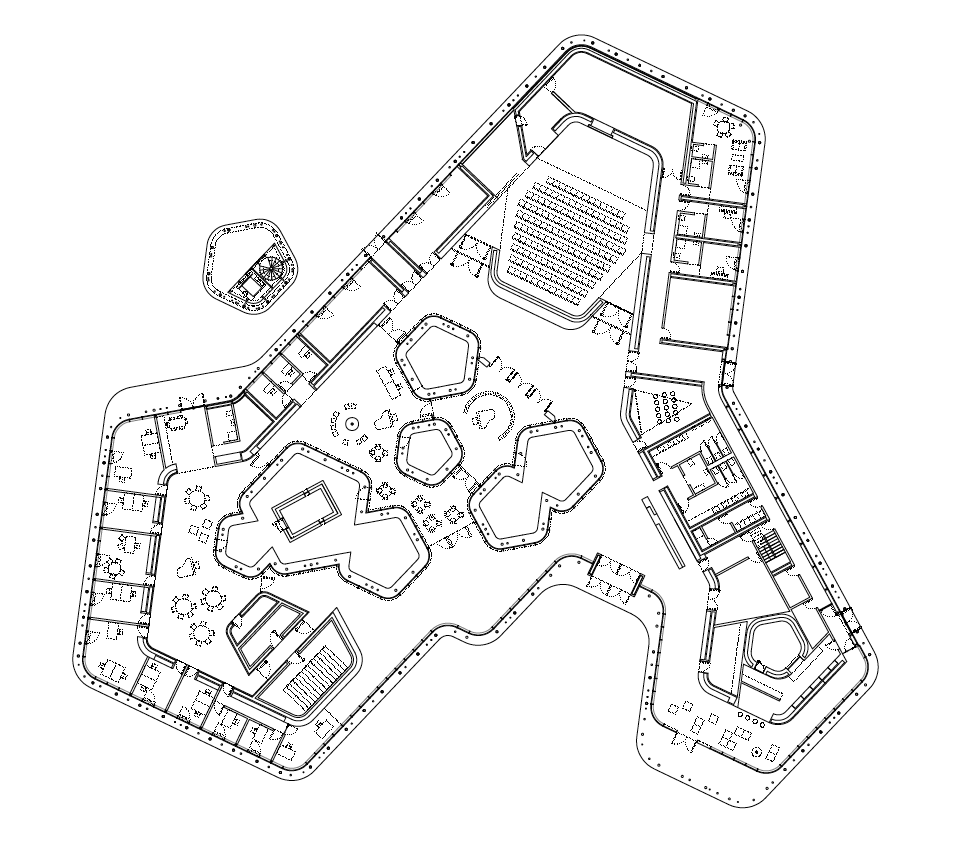
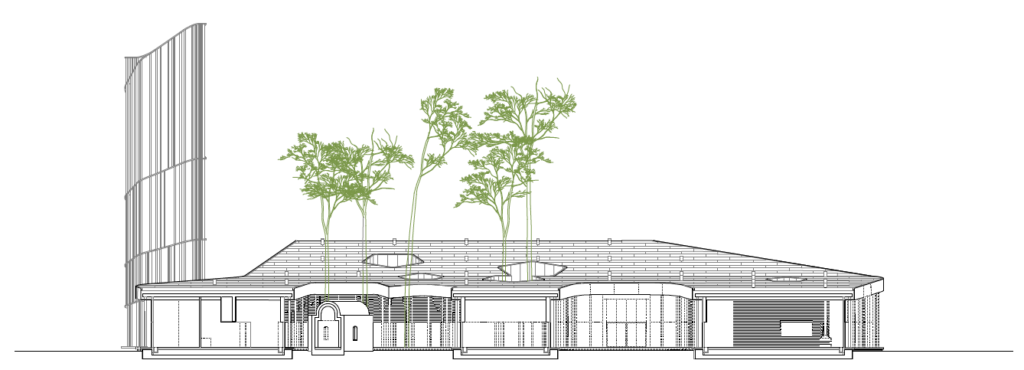
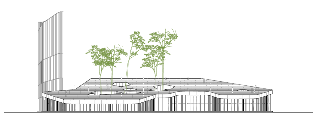
It is no doubt that the focus of the design of the Spanish office lies on the trees of Laulasmaa, the high pine forest with bilberry shrubs, which Estonians are so familiar with, as not a single tree was allowed to be felled in order to make room for the planned building. This resulted in 28 larger or smaller inner yards in the original design, some of which encircled only a single tree. Only after having visited the site as the winners of the competition and having got acquainted with our climate and daylight conditions, the architects admitted that the number and configuration of the inner yards needed some adjustment and correction (in the final design, nine such ‘holes’ remain) and that the sacrifice of a few trees in a land of forests is an acceptable compromise. In ‘Tabula’, we can also see the characteristic roofscape that is recurrent in many other Nieto Sobejano designs as the main architectural element (several of their best creations they have sunk into the ground, giving an emphasis to the roof level)—they have envisioned it as a large platform that undulates according to the height of the rooms. The roof is supported by a forest of slender steel posts.
The second conspicuous element is a certain repetitiveness of an image, seriality of form, flower-like soft pentagrams constantly reappear in the inner yards, in the design of the tower and they also constitute the outer perimeter that meanders in the nature. The architects themselves have called this the ‘economics of the conceptual’, where, in terms of its idea, a design is based on only a few elements, with their repetitions and combinations giving rise to different solutions: ‘We are all aware that this is how life works; everything is based on modules, atoms or cells of some kind.’4
They have also admitted an admiration of Dutch structuralists, for whom a whole consists of relations between elements and the elements themselves are replaceable—thus, compared to the original design, the final building has lost several parts, but a recognisable whole, a balance of relations, has been preserved. The building may be organically nested, in Aalto-style, in the surrounding nature, even the posts may resemble slender tree trunks and the forest connection is never lost on the people inside, but the plan is dominated by tight structure and order, the nature has been disassembled into cells and reassembled according to new rules. No untamed wildness here, every movement and detail in this architecture is a result of an analytical and well-considered step.
No straight walls
‘Tabula’ is not a hierarchical building, its centre changes according to a particular need and situation. In the architects’ vision, there is a single big space for contemplation and learning, exchanging ideas, visiting exhibitions, concerts or a café, or for the enjoyment of a simple walk under the trees. Possibly, no straight walls exist anywhere, the divisions between public rooms are rather relative, marked by views through several panes of glass and an inner yard, or by soft curves around the corner.
Naturally, in addition to glass, the second dominating material in floors and walls is timber. Even the external facade features, differently from the original design, a continuous part of wall that is covered by wood and allows the perception of the glass as a single giant window. The barely 15m2 chapel in traditional Greek style in one of the inner yards is a somewhat unexpected find, reflecting the centre’s creator’s religion and the tolerance of the building’s architecture, its systematicity—the elements in its structure may change and may even belong to a completely different era in terms of their form, but the relations between the elements are fixed and determine the spatial experience of the people walking inside the building. It is also the only place in the building that is completely enclosed, where there is no need to communicate with the outside or to show oneself and where it is perhaps possible to attain a closer connection with Pärt’s music than different exhibitions or shelves of books elsewhere in the building can offer. The second secluded place is the viewing tower erected next to the main building, where one is allowed to soar above the ground level and enjoy the view to the horizon as the humming elevator rises above the tree tops. The tower is a capricious whim, most certainly, but the building must also have something that is a little bit of extra. A beacon for travellers, if you please.
Outside the box
How to create a heritage centre to a living person without giving rise to a mythologised monument or an overly safe environment where all questions have already been answered?
The character of the space and the building in fact plays a significant role in conveying the right tonality for the centre. Already at the competition stage, it was noticed that several designs would begin to dominate over the composer’s music. Nieto Sobejano’s design is open, fluid, slightly pavilion-like and respects both the nature and the users of the building.
There exist only just a couple of centres dedicated to individual contemporary composers in the entire world and Pärt’s centre must certainly find its own way. At the heart of the centre, also providing the initial impetus for its birth, lies the composer’s archive which until now had been accommodated in a modest American colonial-style house next to the new building―not ideal conditions, but sufficient for the base activities of a small memory institution.
Of course, we must think big and the new building creates an entirely new dimension for the activities centred around the archive and the music, as it embodies and imparts a certain worldview and is not without its moment of quiet sanctity. However, public money is involved and the well-oiled planning and building process which resulted in a very high quality building with exceptionally nuanced architecture also proves that the Estonian state needs that centre as well. Culture and especially music continue to be those hard rocks upon which one’s existence can be founded. We need it even more than the old man seen on many competition photos wearing a simple ushanka-hat and walking under the trees, with his back turned to the viewer.
TRIIN OJARI is an architecture historian and critic. Since 2014, she serves as the Director of the Museum of Estonian Architecture.
HEADER photo by Roland Halbe
PUBLISHED: Maja 94 (summer-autumn 2018), with main title Essence and Experience of Architecture
1 Ra Luhse. Pärl, mitte mammut [‘A Pearl, Not a Mammoth’] in Estonian cultural weekly Sirp, 9.07.2014.
2 Tiia Ettala, Francesc Palomeras. Interview with Fuensanta Nieto and Enrique Sobejano: Architects and the secret hidden agenda. See https://www.finnisharchitecture.fi/2015/03/interview-with-fuensanta-nieto-and-enrique-sobejano-architects-and-the-secret-hidden-agenda/.
3 Libeskind & Nieto Sobejano in Dialogue. See https://magaceen.com/en/interview/libeskind-nieto-sobejano/.
4 Rafael Gomez-Moriana. Quietly Brilliant: Nieto Sobejano Arquitectos, 2012. See https://criticalista.com/2012/01/26/quietly-brilliant-nieto-sobejano-arquitectos/.


