VÕRU CENTRAL SQUARE
Architecture competition announced: 30.12.2014
Results published: 07.04.2015
Winning entry: „Urban Gadget“
Author: Villem Tomiste (Stuudio Tallinn)
Team: Risto Aim, Mirko Arras, Kaija Arroval, Helen Batista, Edgar Kaare, Kristo Klementi, Raiko Palm, Siim Porila
Construction project manager: TREV-2 Grupp
Gadgets: RMK-Invest
The square was opened in June 2019
The sci-fi square with a compelling formal expression attracts your attention and engages you in play while testing the user’s readiness to participate in spatial design.
Võru
The central square in Võru is the fifth square completed in the EV100 programme “Great Public Spaces”. Altogether four squares were completed last year with four more waiting for their reveal this year.
The aim of the competition in Võru was to find the best spatial solution for the central square and the streets surrounding it. There were altogether seventeen entries for the jury to consider.
Võru is known for its linear planning and well-preserved historic wooden architecture. The area between the central square and Lake Tamula is taken up by one-storey timber buildings in regular lines. The housing bordering the central square has been densified and modernised at different times, so the environment does not provide quite so idyllic feel anymore. Considering the surrounding architectural disorder, the central motif suggested by Villem Tomiste – circle-arch-ring – offers a very clear solution. It is simple and striking, in clear contrast to the narrative Tamula beach promenade playing with various forms that was completed in 2009.
The square is surrounded by buildings of various architectural style and function: St Catherine church, Võru Secondary School located in the 18th century manor building, SEB bank office, former fire station, Võru County building. With all the numerous overwritings over the years, the outdated square had lost its identity and function, the town lacked a core, a town square. It had become a gloomy wild park studded with tall trees. The entire area was characterised by abandonment and chaos.
What does good urban space consist of? Or a good square? It is an inclusive space on human scale. It has good views, it is a meeting place that is safe, sunny, shady, lit, versatile and effortless. All the given features can also be found in the new central square in Võru.
A new changing square
The town square in Võru seems to include two different parts. The first is the tranquil area around the church with a delicately set monument to the victims of MS Estonia ship disaster with the respective information module. A steel strip separates the green areas from the paved surfaces. The second part is a playful bright and airy space with wacky elements. The solution provides constant change much like life in the 21st century in general. There are no fixed scenarios carved in stone in this part of the square.
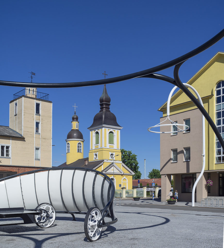
The new central square gives some public space back to Võru. And furthermore, Võru is given back a square in its most classic form – a prominent space lined with buildings on all four sides. It is an urban space liable to change, with its prominence providing various possibilities and food for thought. With the new square, the slogan of Võru “A Town unto Itself” has been realised in its purest sense. The solution stands out from the rest of the squares completed in the EV100 “Great Public Spaces” programme for its monochrome range of colours and forceful geometry. The entire system of urban elements is built on rings, arches and wheels.

The buildings surrounding the square function as the scenery for the supple urban space. The spaciousness in front of the buildings has been restored. Most of the buildings are in use and thanks to the completion of the square, probably also the empty ground floor premises will soon be filled with activities expanding further to the square. Various urban gadgets are scattered around the granite-paved square and the surfacing solution feels calm and airy creating a kind of neutral floor. The author explains in his letter of explanation, “The black pavement redirects Katariina Avenue to the former manor house, the façade of the present school building. The course of the avenue is widened on the square with a splash pad fountain planned in the middle.” Standing on the site, it seems that the reference to the closeness of the lake could have been marked even more clearly.
The decision to bet on moveable elements subjected to a common arch motif to form the basis for a functional urban space is clearly different from the approach taken to other squares. The new central square is particularly impressive in the dark when the area is roofed with hanging rings of light. It lacks narrative dominants specific to the space as well as massive patterned surfaces. The architect wished to create an area that would divide the town square into a stationary urban space and a dynamically evolving programme including the development of urban gadgets.
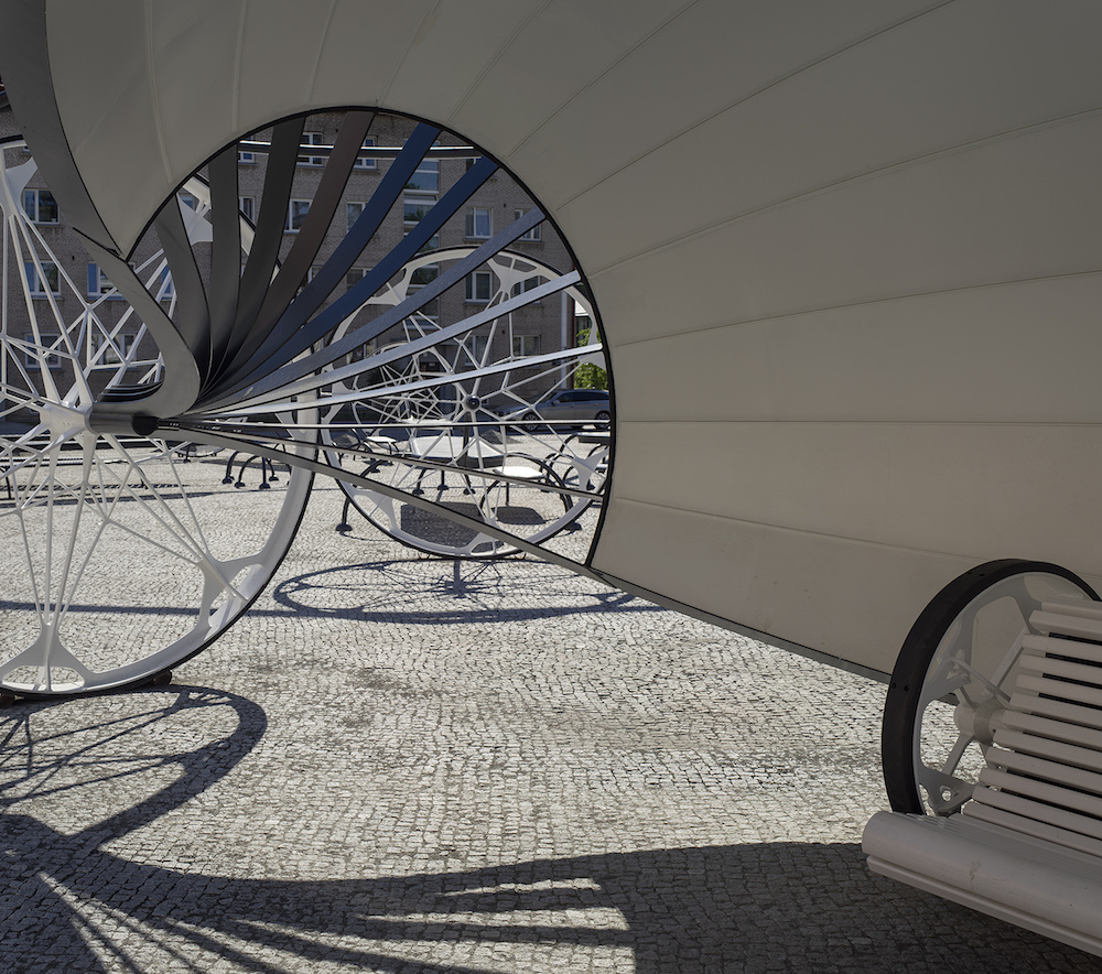
Six urban gadgets on wheels were completed for the opening: a seat, ping-pong table, stall, flower stand, shelter and bus stop. New objects will be added according to the needs of the square. The idea of urban gadgets is realised in keeping with the vision of the competition entry. The small objects based on the wheel motif arouse emotions and form such a strong dominant image that the comprehensive whole and the areas meant for people seem to have been forgotten in the pre-opening bustle. It will most probably take time for the local people to get used to the new visual identity of the place – there is no stereotypical small-town solution with clearly delineated seating areas and no sculptures, flowerbeds and lines of shrubbery speaking to the popular taste. The moveable objects allow to create countless spatial situations and squares that all function differently according to the purpose at hand. The seats may be moved by one person while other objects require the common effort of a group of people.
Larger than life
The uniqueness and the entire concept rely on the small objects. Then again, the word “small” seems a bit inappropriate in the given context. The larger than life volume of the lanterns and other objects is an intriguing yet often also disputable technique. Similarly in Võru, the general overdimensionality has an unexpected effect but the combination of two simple materials – painted steel pipes and white timber – lends a liberating rather than suffocating feel to it. Thanks to the given elements, the square in Võru seems like the setting of a faintly sci-fi fairy-tale where standing in the right place can take you to a whole different world. Sitting in the cocoon-shaped bus pavilion or standing by the giant wheel of the market stall can easily make you feel miniature. It is quite remarkable that such a square was built in a small town in South-east Estonia marked by a shrinking and ageing population.
The author has had the imagination and determination to solve the challenges stemming from complex small objects with utmost skill that has generally also yielded very good results. In terms of its formal language, the street furniture on the square cannot be classified into traditional categories. With every step, the spiral pipes and giant wheels proclaim their playfulness. Some of the solutions may be considered debatable from the user’s point of view, for instance, the abundance of various arches. At times, all the overbearing arches, rings and wheels get in the way of their usability making the function a mere illustration. The strictly geometrical forms are such strong images that the realisation and position of the small objects in the urban space must be implemented with the highest precision. The given urban gadgets mostly consist of various mutually connected arches coming together in a wheel with the practical function grafted in the middle.
It may happen, for instance, that people in all the shopping commotion come to stumble on the market stall construction. Similarly, it would have been reasonable to use the traditional seating height common to street furniture. The ageing society includes increasingly more people who prefer average seat height or higher. Joining the ping-pong table with the arch does indeed add to the formal integrity, however, gets in the way of its function and ease of use. On the other hand, the moveable cart with edible plants is a truly attractive and modern find.
The few formal issues and somewhat curious solutions to details are probably due to the technical capabilities of the manufacturer rather than the incompetence of the author. Time will tell how practical and reliable the urban gadgets are.
A square for the people
When designing a central square, it is highly important to consider what the space means to people and the town. Will there be space for the future users of the space – children, students, elderly people, tourists? Does the space speak to the users and let their imagination run wild, does it let them alone for a moment? Ideally, the town square should be a place that makes you stop for a while and enjoy your time.
In case of poor design and quality, there is a risk of imposing restrictions on the users prescribing their every move and consequently they may not relate to the environment.
Citizens of Võru now have an ultramodern new central square. The former untamed non-square has become a fresh urban space prompting discussion and providing various activities: you can just sit, listen to concerts, play ping-pong or go for a walk. If necessary, the square may be cleared of the furniture or reorganised as appropriate.
I sincerely hope that the architect’s idea to include local people in the creation of further urban gadgets and the development of the town square will come true. It would not hurt if some brave citizens took the first step and moved a bench nearer to the view corridor or path that he likes most. Or enjoyed their picnic at night under the light rings. Or children steered the ping-pong table in front of the school etc. It would make the square come to life, open discussions and create interest in changing the space. This way, for the first time in Estonia, everyone would have the opportunity to create their own square and be actually involved in shaping public space.

MARIA PUKK is a designer and landscape architect working at architecture office OAAS and teaching environmental design at the Estonian Academy of Arts. She was also a member of the jury of Võru town square architecture competition.
HEADER photo by Paco Ulman
PUBLISHED: Maja 97 (summer 2019), with main topic Architecture is an Art of Space


