Architecture: Raivo Kotov, Kaur-Lembit Stöör, Martin Tago, Maia Grimitliht / KOKO Arhitektid
Landscape architecture: Eleriin Tekko / KOKO Arhitektid
Interior architecture: Kärt Loopalu, Kadri Kaldam / KOKO Arhitektid
Engineering: Allar Nõges / Neoprojekt OÜ
Commissioned by: Astri Kinnisvara OÜ
Construction: Mapri Ehitus OÜ
Area: 16 309 m2
Net area: 19 200 m2
Project: 2014-2016
Construction: 2016-2017
What were the goals that you set for yourselves during the design process of the new market and which were the main challenges you faced?
Essentially, our overarching goal was the modernisation of the Baltic Station market. A valuable contribution was made by the Telliskivi Neighbourhood Association who conveyed to us the opinions and proposals of local residents. One interesting task which we had to deal with and which required a lot of improvisation was the temporary relocation of the old market to the neighbouring lot for the duration of the building of the new market. This was the beginning of the Depoo market and the food alley at the Reisijate Street. Having regard to the importance of the old market and the general development trends in retailing in Tallinn, the property developer was clearly on the same page with us: what we intended to create was a market and not a shopping centre. During the preparatory analysis stage, we and our client visited the markets in several large cities in order to build an understanding of modern marketplaces and their functioning. We experienced the density of Camden markets, packed with nooks and crannies, and the spaciousness of Borough Market, from which we took our inspiration while tackling the task at hand. We realised that there runs a line beyond which excessive design and orderliness begins to restrict the free diversity that is characteristic of a marketplace setting. The central challenge in terms of form, function and later also construction was the marriage of the old historical storage buildings and the new structures as to form a new cohesive and functioning whole.
What is the gist of the new architecture, without which the market could not be what it is?
The principal activities at the market are selling, buying and interaction between people. A good market is packed with people and is an environment that deserves to be explored, full of freedom, change and surprises. In order to facilitate all of this, we needed to create a spatial structure that would be flexible with regard to the location of functions and possess an unobtrusive design. We aspired to achieve an environment that would be adaptable, full of light and friendly.
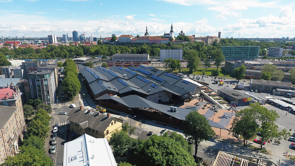
The most crucial architectural element is the roof that covers the buildings and the outdoor areas and brings together different activities. The functioning of the market is decided by how the customers, vendors and different activities find their place therein. It was our desire to create an architecture that, when filled with content, would give rise to a special atmosphere.
Much of the success is owed to the client who was open to our ideas. All in all, we can say that the project was realised in its entirety. The large and complicated project was a tough nut to crack for the construction company, but they were up to the task.
The market is very well integrated with the surrounding city space—one entrance faces the Baltic Station and the other opens towards Kalamaja, and a system of outdoor terraces that can be passed by in a number of different ways can be found on the side opposite to Telliskivi Creative City. How did you envision the market’s role in relation to the surrounding city space and what gave rise to the idea of these sizable outdoor terraces?
The market’s neighbourhood (Kalamaja, Pelgulinn, Telliskivi block, the railway station) has undergone swift development during the last decade. The old market was becoming an anachronism and change was only a question of time. The market lies on the everyday routes of many people. It is located at a public transport hub and, due to the proximity of the port and the Old Town, we can also expect tourists to visit this market. It was our goal to create as many entryways to the area as possible. The design of the area between Reisijate and Kopli Streets as a public walkway in the shape of a system of terraces was motivated by the wish to make the building observable and accessible from all sides. The building essentially lacks a backyard—it lies hidden beneath the area covered with the terraces. We were fortunate to have the opportunity to consider the implications of the future vision for the neighbouring Depoo area and to think through the connection between these two public spaces. In the direction of the Old Town, an important entryway is created to the Depoo area from Telliskivi Street. This is public space which extends in the direction of Reisijate Street and connects to the market’s terraces. Another important route of pedestrian movement lies from the Depoo area towards the market. During the design process, the client’s willingness to contribute into the development of public space was apparent—the squares and terraces form a part of the entire milieu. The large size of the outdoor areas follows the tenet that a market must be a pleasant and comfortable place where to spend time.
Several critics have expressed their nostalgia for the old Baltic Station market and bemoan the gentrification of the market. Although this criticism cannot be directly aimed at architects—architects inevitably create new design and the preservation of old content in new form is probably impossible and possibly controversial. How much did you think about the phenomenon of the old market? What parts of the old market did you try to preserve and what parts could not be retained?
We were aware of the nostalgia factor and the fears in relation to the market’s overhaul. Skeptics were already convinced even before the work on the design was complete: oh, yet again another shopping centre. Certainly, the old market was a peculiar anachronism. I daresay many fans visited the market as a theme park, as if to gaze into the frozen past, and not at all as a place where to buy fresh produce. As a local resident, I personally envisioned the place as a summertime farmer’s market where to buy fresh fruits and vegetables. With cold weather, the conditions were dismal, for both vendors and clients. Many of my acquaintances expressed their worry regarding all those old ladies who sell the produce which they grow on small patches at their summer cottages. Will they disappear? This question was discussed during the design process and today the market’s management offers a discount rate for pensioners who want to rent a stall at the market. The old ladies have not disappeared, but have blended in with the general market crowd. Numerous vendors from the old market are still there. Avoiding the marginalisation of poorer people in certain city districts, dealing with poverty is a matter to be addressed by both local and national policies as well as by planning decisions, it is difficult for the architect and the property developer alone to wield decisive influence here.
The structure of the new market (the old historical storage buildings, the layout of the outdoor market), integration with the city space (entrances) and the directions of pedestrian flows are still based on the old market. We have transformed the entire area into a more open, intuitively readable and friendlier place.

LEMBIT KAUR-STÖÖR is one of the KOKO architects and authors of the new market.
Photos Tõnu Tunnel
Published in Maja’s 2018 winter edition (No 92).


