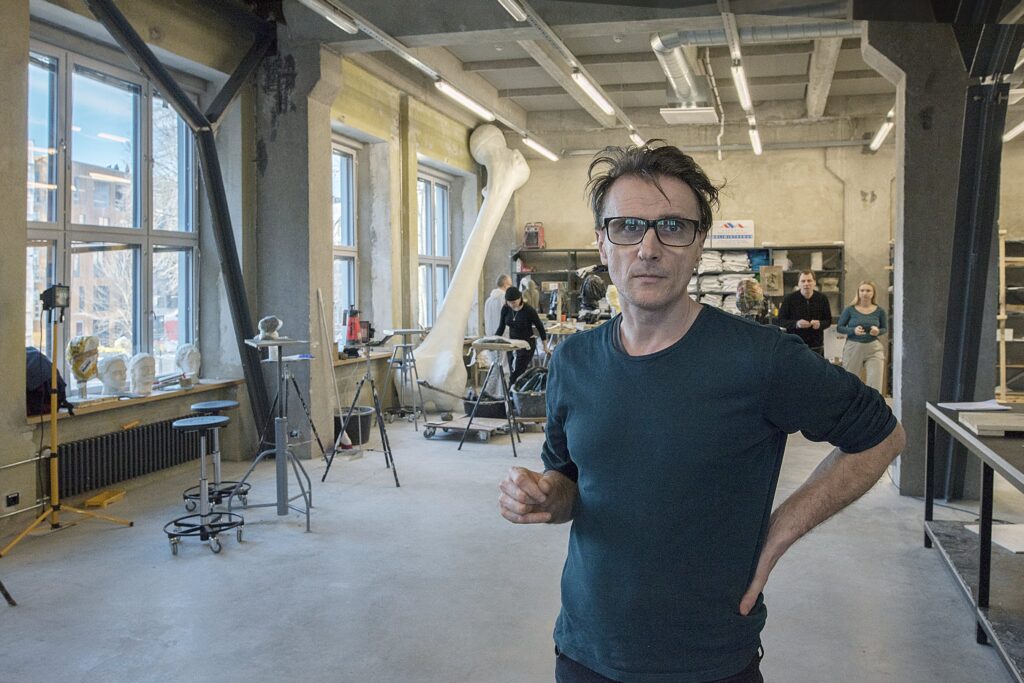
ESTONIAN ACADEMY OF ARTS
Architecture: Joel Kopli, Koit Ojaliiv, Juhan Rohtla, Eik Hermann, Kalle Komissarov, Rene Sauemägi (KUU Architects)
Renovation of original building facade by Eugen Habermann: Katrin Etverk, Ketlyn Tänavsuu (Katrin Etverk Architects)
Landscape architecture: Karin Bachmann, Mirko Traks (KINO Landscape Architects)
Interior architecture: Tarmo Piirmets, Raul Tiitus, Birgit Palk, Inna Fleisher (Pink)
Structural design: Tom Arula, Tõnu Peipman, Piret Lindma, Andres Sokk (Engineering office Printsiip)
Commissioned by: Estonian Academy of Arts
Location: Põhja blv. 7, Tallinn
Constructor: Astlanda Ehitus
Total area: 4 429m2
Enclosed net space: 12 300m2
Competition: 2014
Project: 2015–2017
Construction: 2017-2018
Love is emanating from this building.
The new building of the art academy on the edge of Kalamaja in Tallinn has architecture which is carefully thought through and gives a positive boost to the future of Estonia’s principal institution providing higher art education.
Dirty laundry
The purpose of the following text is not to rip off band-aids from old wounds, but before delving deeper into the new building, it is necessary to point out that a considerable amount of “dirty laundry” from the saga of EAA’s premises still needs to be cleaned – several questions remain without an answer for the general public. What role did the EAA’s management and the Minister of Education and Research at the time (Jaak Aaviksoo) play in the escalation of the situation? How did it become possible that the previous building that had housed the art academy for a century was literally wiped off the ground? Did Mr Aaviksoo as Minister really threaten to shut down the academy?If so, how can a minister intimidate an independent university in a democratic state? Was the neighbour fighting for her right for sunlight really a figurehead for someone who remained hidden from the public or merely a house owner standing her ground in defence of her interests?
What was the role of the State Real Estate Ltd. in reorganising the EAA’s properties and the associated finances? Why is the overall impression such that the art academy came out as a loser economically? Do cultural and educational institutions still have a place in contemporary urban environment? What should be the responsibilities of the juries of architecture competitions and how should they be compiled in order to avoid situations where projects of the winners turn out to be economically and practically infeasible (this is exactly what happened to the 2008 winning project of the first architecture competition won by the Danish firms SEA and EFFEKT)? There are plenty of other complicated questions, answers to which I shall let investigative journalists or other better informed persons unveil.
Change of values and attitudes
Planning the new EAA building on the historic lot at Tartu Highway 1 in downtown Tallinn ended in a fiasco that tarnished the reputation of the academy and influenced the quality of its educational activities. Demolishing the historical school building, discarding the old property and abandoning the 2008 project by Danish architects, brought along a change in terms of not only space but also values, attitudes and mentality. The ambitious project by the Danish architects was a fruit of the so-called boom period – the project proposed a shiny, iconic, expensive, representative building. In the post-boom conditions and after the decision to swap the EAA’s property, however, it became obvious that the new location calls for a more sustainable and sensitive approach on both a symbolic and practical level.
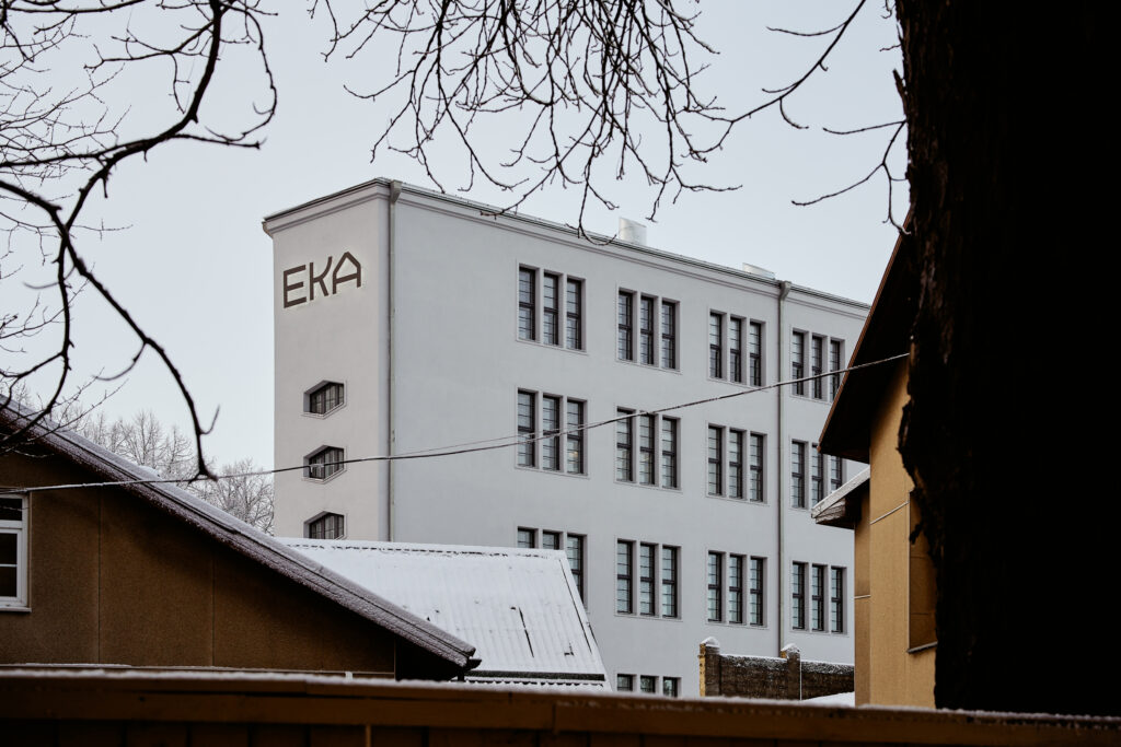
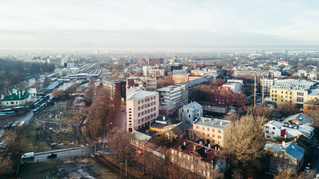
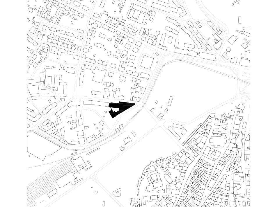
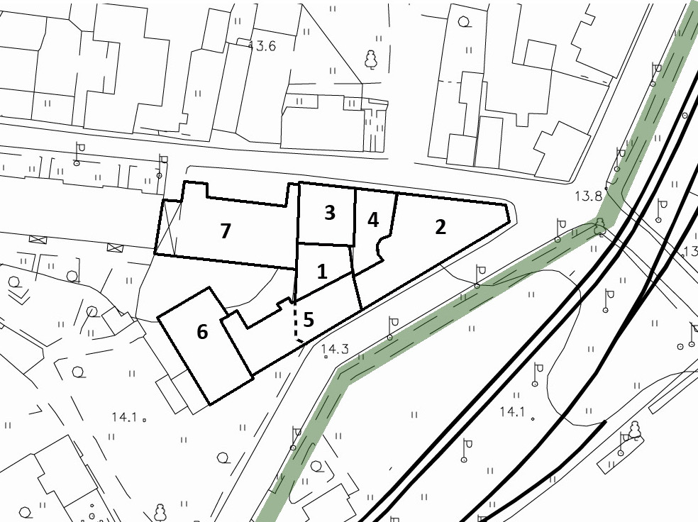
By the time of the new architecture competition in 2014, and after careful consideration, the EAA had selected and acquired the former Rauaniit factory complex on the edge of Kalamaja, situated in the immediate vicinity of Skoone bastion, Baltic Railway Station and Telliskivi Creative Hub. Competition requirements were composed by architect Toomas Paaver, whose meticulous description and contextual analysis placed great value on the existing spatial relations of the current urban space and the intricate factory building, which had been completed in multiple stages. Most of the historical building stock, especially the corner volume from 1929, designed by architect Eugen Habermann and under heritage protection, had to be preserved. Several volumes not under direct protection received a note of recommendation to be preserved.
The new starting point for the architecture of an art university was thence all but a “tabula rasa” – the intricate, fragmented architecture of the factory complex was to be seen as an opportunity, not a burden. The competition requirements included a detailed description of the different parts of the factory ensemble and recommendations which parts to preserve and which parts to demolish if deemed necessary. The document by Toomas Paaver also featured a new traffic scheme for the area around the building. Introducing wider footpaths ensured a more amicable and inviting image for the school building within the cityscape.

Architecture, moderate yet discernible
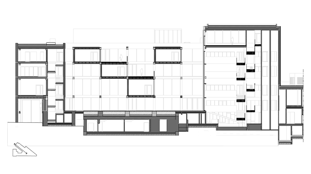
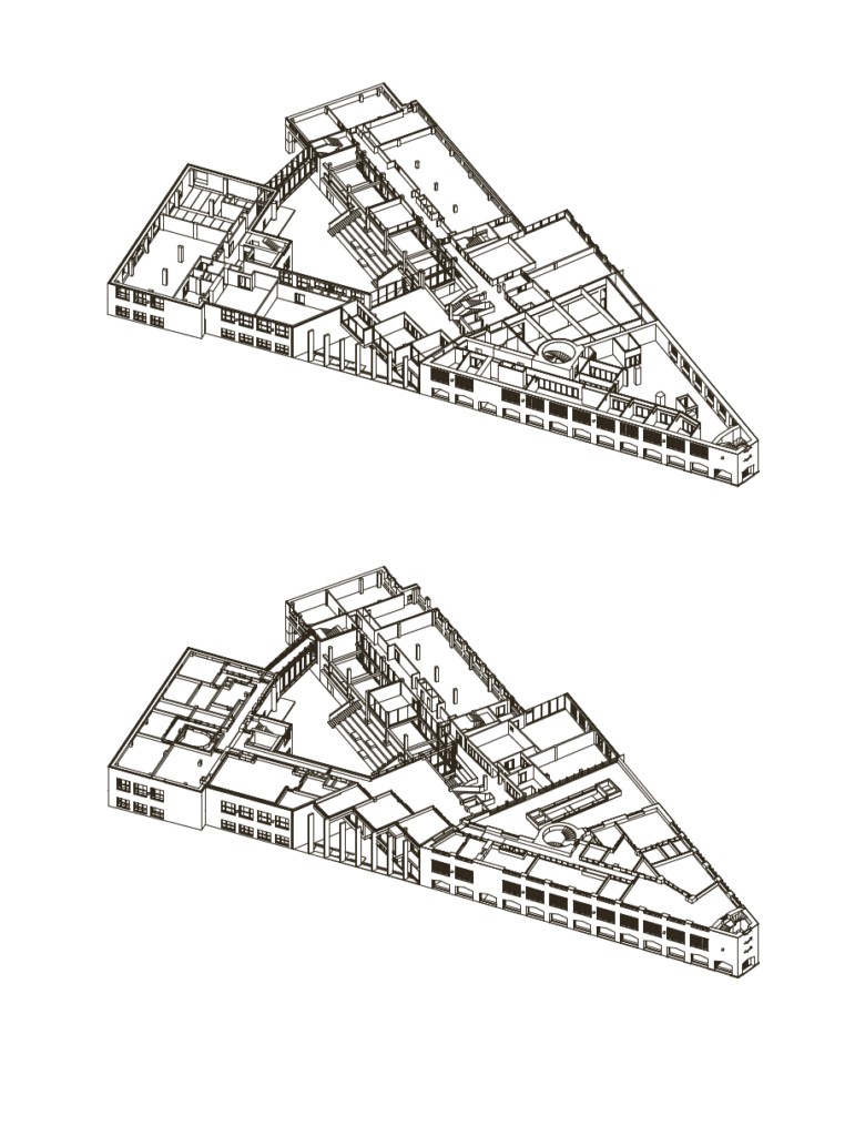
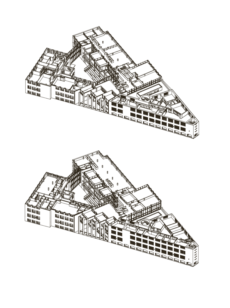
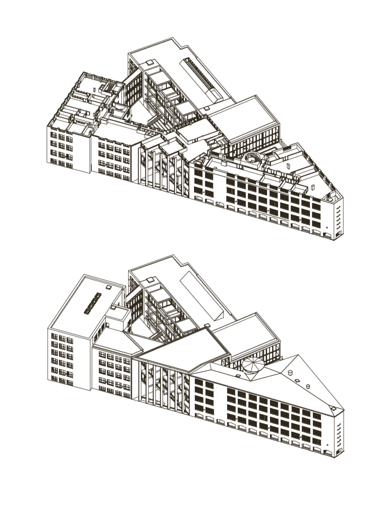
The winning team, KUU Architects (Koit Ojaliiv, Joel Kopli, Juhan Rohtla), in collaboration with philosopher Eik Hermann, proposed an entity composed of surgically precise incisions and carefully considered additions that were void of the ostentatiousness and obtrusiveness of a building trying to make headlines in the city. On the contrary, the new ensemble has a calm, sensitive approach to the historical environs and cityscape, yet it supports active use of space that is flexible for various daily practices. Compared to many other competition entries, the idea by KUU Architects had more effective indoor logistics: the different parts of the building were joined by a new central atrium/foyer/stairs-space and an additional gallery-bridge. Walking paths between different lecture rooms, offices, workshops and public and semi-public halls would be of sensible length and help maintain visual contact between the hallways wrapping around the courtyard of the building.
The new EAA building does not exceed the old one in terms of square metres, but the new building is indeed compact,logical and coherent with its positioning of different functions. The lack of a large assembly hall is somewhat surprising but this is sufficiently replaced by the central auditorium of the building that can be connected to the adjacent gallery whenever necessary. The foyer, gallery and cafeteria are all open to citizens – an inspiring gesture by the academy as it helps diminish exclusivity and symbolically extends a hand to greet its neighbours.
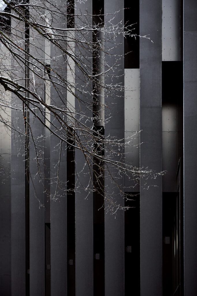
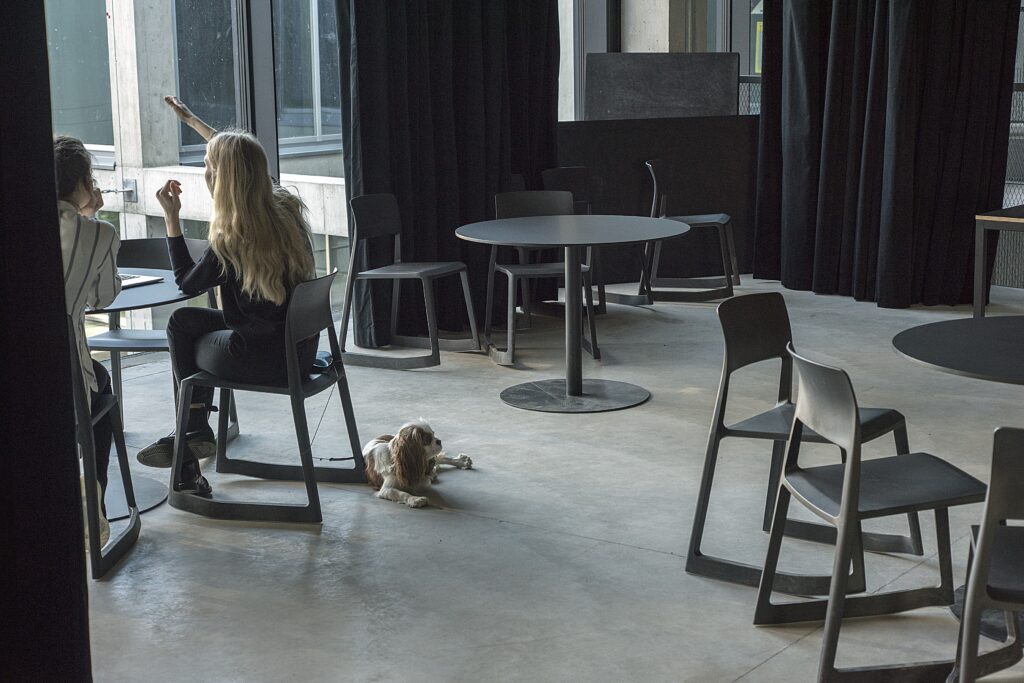
In addition to considerations in spatial layout, choices pertaining to materials and surface finishes deserve special attention. Since the beginning of the competition, the architects stressed the need to create a space for the EAA where making mistakes is allowed and experimenting strongly recommended. This concept of an unfinished space is more abstractly expressed in some of the cross-applicable rooms (for example, the open middle platforms where curtains enable morphing the space into separated classrooms), but more concretely in the decision to leave the historical walls without a finish. For as often as we see old, stainy, rimose walls exhibited in retro-lust or even as fetishised kitsch, the new EAA building exposes these surfaces naturally – creating a feeling that this school has been operating here for a long time, seeing student works hung on its walls for decades. In a recent enjoyable discussion with the architects and EAA employees, many revealed having déja vu -experiences – the rough, abrased spatial indents and imperfect wall surfaces occasionally remind people of the old house on Tartu Highway. Yet, it is not a romantic longing, rather a pleasant coincidence – the architects did not anticipate this kind of spatial reference, at least not consciously.
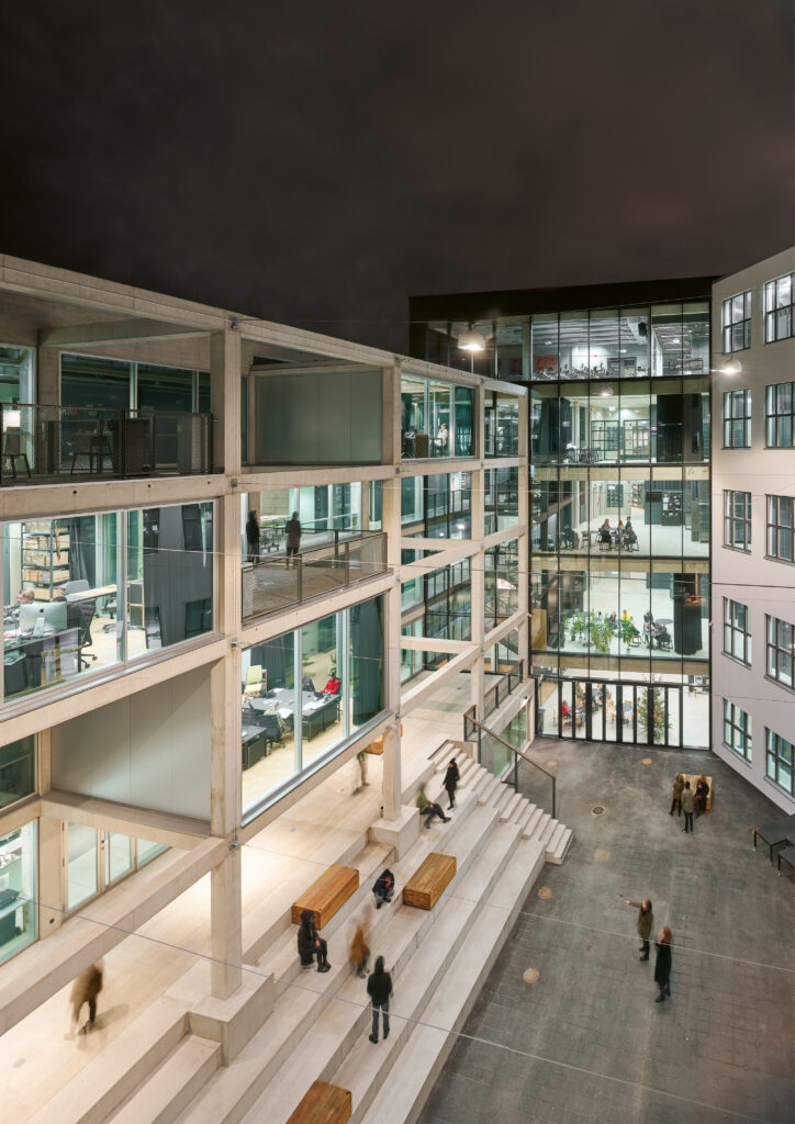
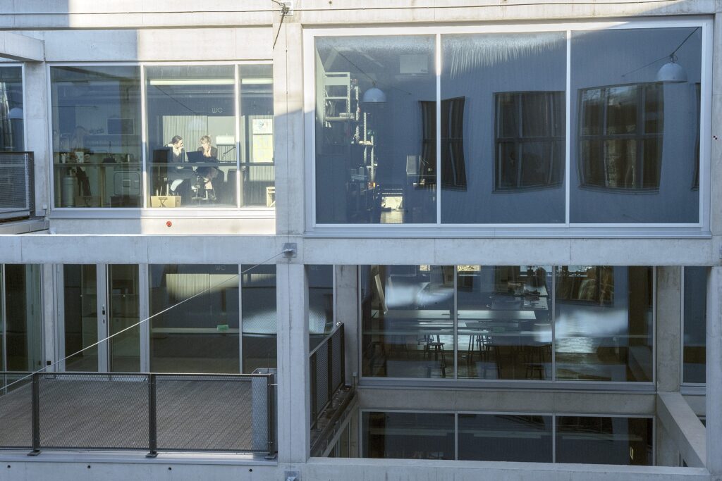
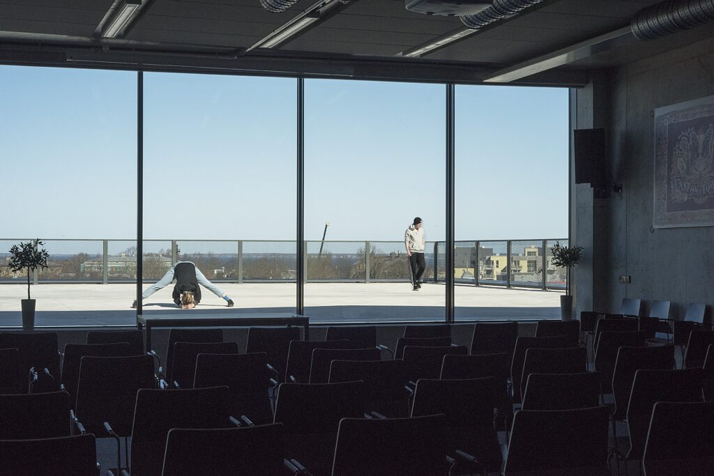
The new building, despite being modest in its architectural character, does not lack a certain luxurious touch. This is implied not through expensive materials but rather through spatial gestures. Two multifunctional terraces with wonderful views of the old town and the Gulf of Finland open from the rooftops of the edifice. A light-filled auditorium next to the northern terrace seems to be a space where giving and listening to lectures is as great as it sounds. The school’s inner courtyard hides a massive concrete framework with exciting rhythmic tectonics, a structure that partially involves rooms already in use but has been left largely partitioned – leaving an impression that should the need for extra space arise, it is possible to implement the auxiliary “boxes” and build them to suit a need. True, in a private discussion the architects confessed that making additions is mostly unlikely because the load capacity of the beams and complications with thermal insulation may prove seriously challenging. Nevertheless, the “framework” of the courtyard creates a background – a kind of three-dimensional backstage – for the open air terraces situated on the lower level that form an ideal place for having lunch or organising concerts during a warmer season.
The previously noted urban situation is additionally noteworthy because the new EAA building is accessible from both Põhja Avenue as well as Kotzebue Street. The main entrance invites people coming from the old town and the Baltic Station, whilst the Kotzebue entrance is more convenient for those approaching from Vana-Kalamaja Street. Urban commuters may find the windows enclosing the new library on the ground floor of the Habermann-building rather attractive, especially at nighttime. This corner of the building forms a small city square on the street area. It is unfortunate that this inviting corner door only serves the purpose of an emergency exit – it has an appealing look from the direction of Põhja Avenue and it would be the easiest access to the library. Compromise is sometimes required to meet safety regulations, but there is no shortage of openness in the remainder of the building.
Societal role and future potential
To me, the new EAA building represents the kind of Estonia I want to live in – open, flexible, friendly, non-heroic, adaptable. The story of this building exemplifies how enough will and trust can make even Estonians work together successfully, find solutions to complex problems and intricate regulations. The new EAA building and the architecture therefore carry a message of adaptability, creation of trust, a willingness to co-operate, and tolerance. Love was put into it and love emanates from it. The architecture is modest and humble yet constructive, non-demanding yet forward-looking. For me, these core values signify something inherently European: a mindset that is secular, humanist, liberal. Values that have faced adversity in recent years in societies with long democratic traditions, and now in Estonia as well.
The new main building of the Estonian Academy of Arts is a powerful tool for local culture and self-determination, as well as international self-validation: bright in spirit and concrete in form. The new academy building signals that the EAA is an educational institution targeting knowledge and quality, and not an education “factory”. A bold comparison can be drawn between the new EAA and a phoenix risen from the ashes – the academy’s people, spaces and competences create a powerful mastermind, an engine driving local education, culture and society, awakened and sensitive to change. The new main building of the EAA has established a significant prerequisite for strengthening the position of the art university in Estonian society as well as in the international educational arena. Who ever said that architecture does not influence society?

CARL-DAG LIGE is an architecture critic and EAA alumnus (BA in Art History, 2006).
Comments
Kaja Pae: The key to a good winning entry of an architecture competition often lies in the well drawn up competition brief, I believe this also happened with the new building of EAA. What were your considerations when preparing the competition brief and what was it based on?
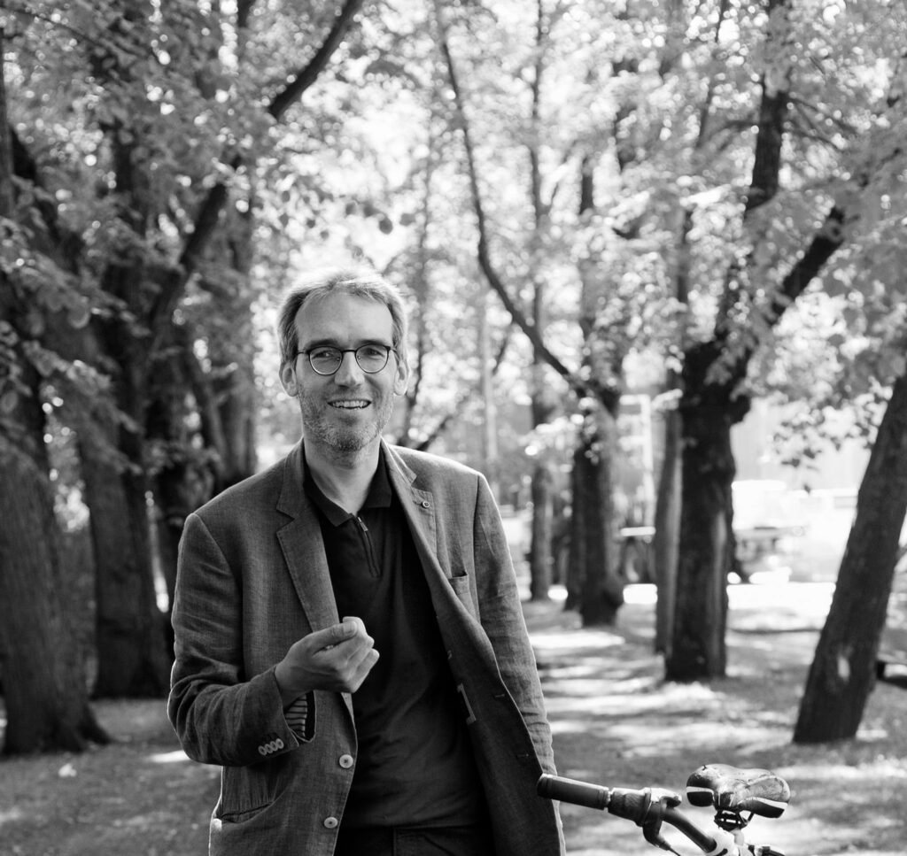
Toomas Paaver, author of the competition brief of the new building of EAA
In my opinion, the point of the competition brief is to provide the basis for fitting the particular building or reconstruction into the more general process of spatial design, including the enrichment of the public space as a comprehensive system. The aim of any construction should be the improvement of space in its entirety and for everybody, not merely for the users of the constructed building. The competition brief can take the participating architects and the jury through the values of the given space and also the aspects affecting people’s living environment and the development of the surroundings in interaction with the spatial programme of the new building. In case there are restrictions set for the solutions, it is reasonable only in the light of the given considerations and in a flexible manner. It is better to give architects the creative freedom to decide on the issues of volume. They should be able to focus on the building, its users and the designed solutions. If the competition brief takes care of the surroundings, other people and the current values, it will improve the work of the participating architects and the jury. A good competition brief can essentially function as a detailed plan and sometimes does it even better as the formal freedom provides the solutions with further possibilities.
When compiling the competition brief, it is important to make sure that all the relevant aspects can be reasonably solved. For instance, based on the general spatial structure, I had no doubts that the main entrance would be exactly at its current location. It was clear that the given spot allows the creation of a compact core with the staircases and lifts connecting various levels in a way that the former parts of the building, both street spaces and the courtyard are firmly linked creating an easy access to all areas. KUU Architects managed to solve it even better than I could have imagined. It is reasonable to set the brief so that such schemes could be executed without undue difficulties.
At the earlier stage I was expected to prepare a seemingly logical resolution to take the road traffic away from EAA building and move it closer to the tram line. If we had gone along with the given goal, it would have brought about such complications that the execution of the entire project would have been postponed to an unforeseen future and there would be a kind of a temporary cramped sidewalk in front of the academy making no favour to the effective interaction between the building and the surroundings. I proposed a simpler and more reasonable option – the sidewalks along Põhja Avenue and Kotzebue Street were widened by about 3 metres at the expense of the roadways that immediately provided the surroundings of the academy with street spaces with natural proportions. In this respect, it was important to draw the general arrangement plan for the architects, as the object of the competition was the building, not the street.
I also considered it important to think about the parts of the building that were not under heritage protection, as there were never any doubts about the value of the historic part by E.Habermann even without my contribution. It was possible to retain the parts from the Soviet era with a stronger structure, especially the six-storey block along Põhja Avenue and the fallout shelter in Kotzebue Street. There were financial hesitations about that, but then why do we need them at all? I believe that the beneficial effect of such parts on the final result tends to be somewhat mystical, albeit discernible. It may be reasoned in different ways, for instance, the new parts of the building are subordinated to the constructional logic of the new era, while the old parts will remain unique and complement the whole. We may also say that people are used to the old parts as they are and thus they cannot generate any external antipathy. And perhaps it was the interweaving of various parts that inspired the architects more than an empty plot.
These are just some of the examples of the issues considered, but in conclusion I would like to point out that over a decade, two detailed plans and one competition brief had been drawn up for the plot of the academy at Tartu Road 1. Each one of the three set a particular form for the building that the architects were to follow. However, none of them made any effort to consider the small and seemingly meaningless aspects such as the current parts of the building, the fine structure of the surrounding public space or the nuances of the nearby living environment that I focussed on in the brief for the building in Põhja Avenue. In this sense, the initial conditions of the two developments were based on different ways of thinking. And when comparing the end results, I tend to have more faith in the more general principle that the improvement of living environment is not based on strict rules or prescribed forms but primarily on understanding the current space and appreciating its every user followed by the freedom to design the future space.
Kaja Pae: What is it like to work in the new EAA building? How would you describe its effect?
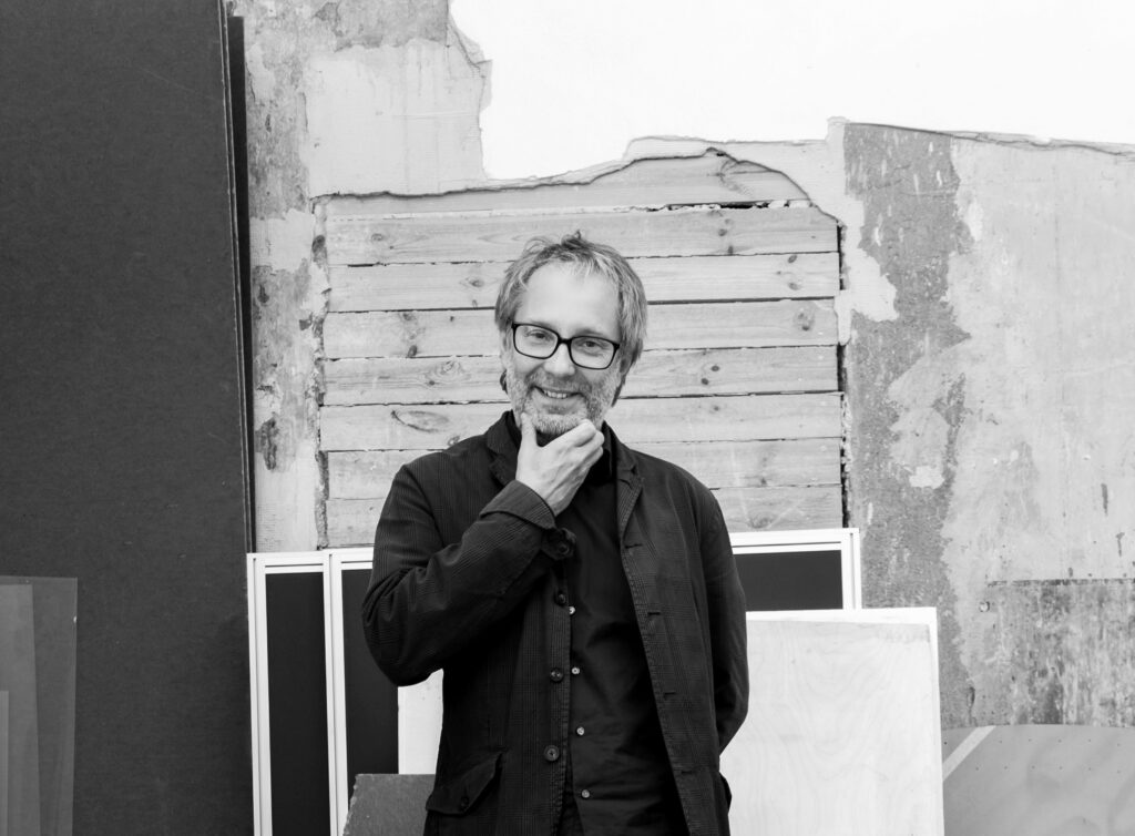
Toomas Tammis, Professor of Architecture at EAA
The significant change brought about by the new building was cognitively anticipated and rationally presumed but its completion has nevertheless exceeded the expectations.
First of all, after so many years, EAA is once again in a building that is designed and constructed for the academy. Here it is important to stress that the Academy of Arts is not merely a school with its classrooms, library and administration, it is also a highly complex ensemble of more than ten workshops and labs with different requirements as well as student work areas tailored to various specialities. Such a patchwork of historic and state-of-the-art technologies together with a myriad of ways of working and teaching has been finally provided with a generally comprehensible and specifically well-functioning spatial form that in itself is already a considerable achievement. Of course there could be more studio facilities for students (for instance, our long-standing dream of individual work spaces for every architecture student is still unfulfilled), but the size of the building was determined long ago by the Ministry of Education with a spitefully small random number (it was almost a half of the size given in the competition for the building in Tartu Road). However, the limited space is very well organised and at long last, also the frequent and chance encounters between the specialities can take place again. The resulting mutual support as well as the new and interesting infosphere is more enriching that we could have expected or that we remembered from the old building. A small space is a good connector.
In addition, the surrounding Kalamaja district has undergone radical changes in the past decade, providing a new and refreshing urban background with its recently opened Baltic Station Market and also Telliskivi Creative City that has drawn various people here for some time already. It is a city where the leading roles are played by pedestrians, cyclists, trams and trains instead of cars, where the bars and restaurants are diligently searching for their distinctive identity as well as customers with varying spending power, and where people walking in the street represent a cross-section of most of the society. There is lightness and brightness in such a city which is largely based on the sensible coexistence of differences that evolves over time and partly also by chance – although it may be facilitated, it is difficult to plan it.
All in all, the new building and its location have a kind of a dignified feel – it is great to come and work here. It exudes the currently perhaps somewhat ephemeral sentiment that art, design, architecture, restoration and the respective research are needed in the society. And it feels quite good to live and work with that sentiment.
HEADER photo by Tõnu Tunnel
PUBLISHED: Maja 96 (spring 2019), with main topic Spatial Diversity

