In connection with the Estonian 100th anniversary celebrations, the Union of Estonian Architects in cooperation with local governments organised a series of town square architecture competitions. “Great Public Spaces” competitions have an unprecedented historical value – the improvement of the quality of the spaces between the buildings has never been approached so systematically. The first of the fifteen squares are completed and ready for use.
How did the innovations suggested in the winning entries transform into projects and from paper to space? The small-town context always tends to have a somewhat reductive but hopefully not a trivialising effect. The highly literal images and obvious narratives (silhouettes of flowers, animals and practical objects, coat of arms and national symbolism) appeal indeed to the people but would be a highly dubious way to conceptually organise the space.
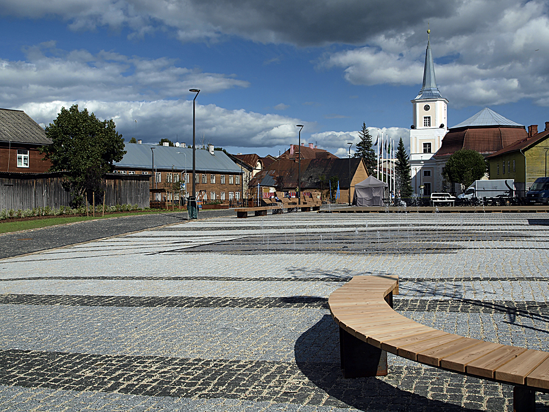
THE CENTRAL SQUARE IN TÕRVA
Architecture competition began: 18.11.2014
Results were announced: 19.02.2015
Winning entry: “Mulgi kuurort“
Authors: Novarc Group and Architect Must (Mari Rass, Ott Alver, Alvin Järving, Illimar Klammer)
Engineering: Novarc Group
Constructor: Merko Ehitus Eesti
The square was opened in early spring 2018
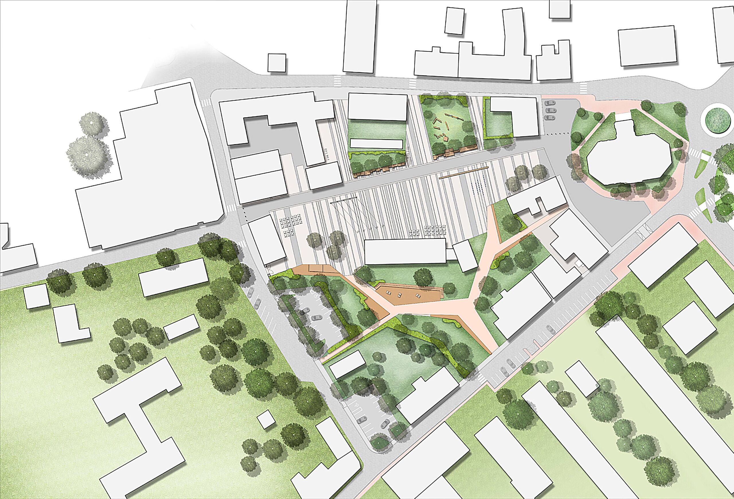
In addition to the town square of Tõrva, the organisers of the architecture competition were also looking for a solution for the adjacent Nooruse Park and the green area around the Veskijärv Lake, or rather for a way to connect them into a functioning system, a tourist axis, so to speak.
For a temporary resident of Tõrva, who has a summer house, let’s say, near Koorküla, the supermarket Konsum (a more urban alternative to Patküla village shop) stands for a place where to see people once or twice a week, sense the urban feel, drink coffee at a café and enjoy a pie. For years, the parking lot in front of the historic tavern was the meeting point of exactly such long-term guests to chat and eat an ice-cream between the parked cars. Albeit uncomfortable, spatially and functionally it was the only possible option. So, already the first glance at the winning entry taken with the trained eye of personal experience said: it’s the right choice.
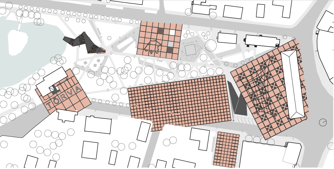

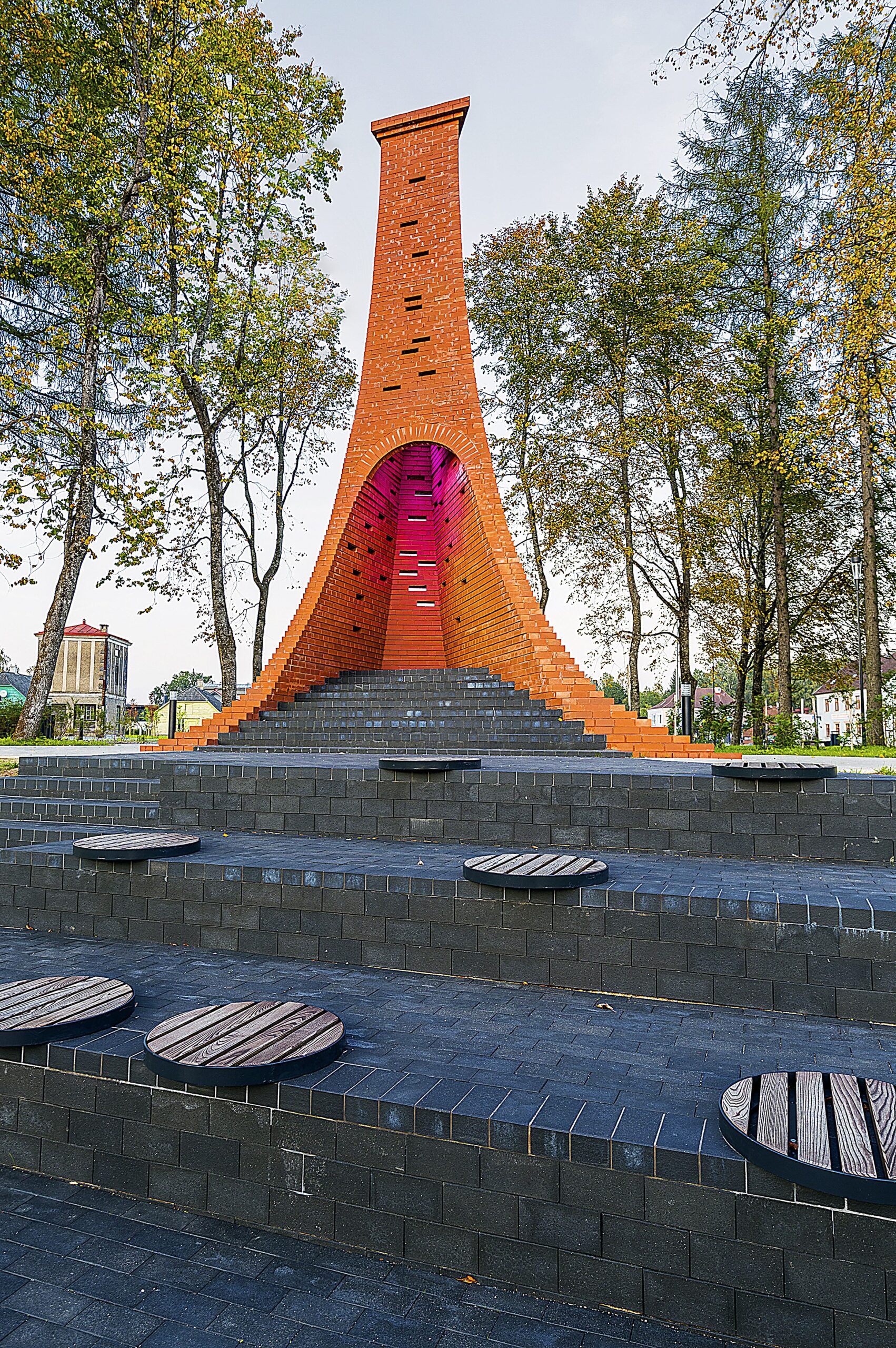
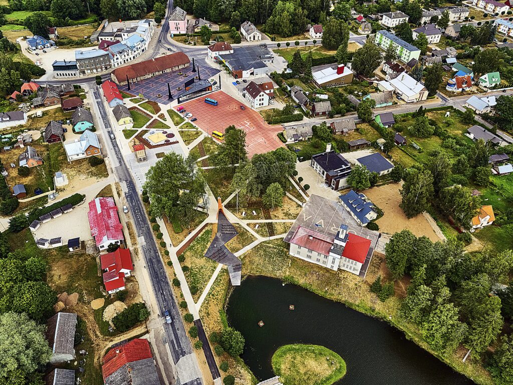
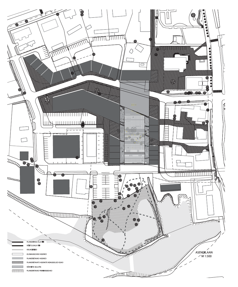
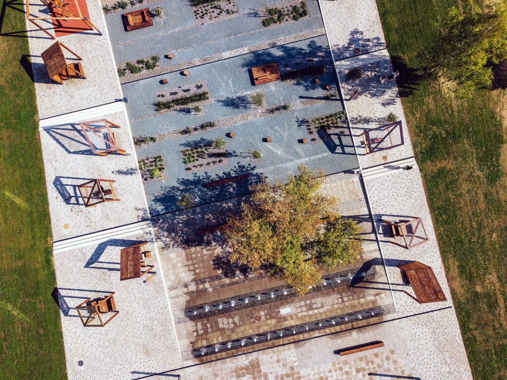
The town square of Tõrva constructed according to the winning entry is primarily very logical: the use of space is clear without further instructions. Probably due to the fact that the large square is not entirely bordered with housing to rely on its supporting walls, the existing space was divided into several smaller places. In most cases, chopping things into parts and dividing by functions have a negative effect and usually fend off rather than facilitate relationships, but in the context of Tõrva it is the only possible approach. Shifting it into smaller sub-squares does not allow it to come across as a disproportionally elongated stone mass that otherwise would have, no doubt, been generated. The new external space is halved by the new bus station pavilion opening to every direction that was included in the competition brief. The so-called guerrilla square or the social episodes taking place in the parking lot have remained in the same logical place while the parking area causing the inconvenience has been shifted to the other side of the bus station. Also the county government building has been linked to the new structure that otherwise tended to drift away from the entire square area. Nooruse Park and the lake have been joined with the square system with a clear and simple path network with the sculptural tar chimney and well-functioning steps with views over the lake marking the captivating seam in between.
There is a sufficient number of decorative elements on the square all originating from the same style book and thus generating a comprehensive overall impression. Yet, the too obvious symbolistic solution Tõrva=tõrv=tar and the local mulgi pattern in the surface raise certain doubts: perhaps the too directly objectified symbols in the external space tend to consider the users of space somewhat one-dimensional? Much like boat-shaped benches by the sea or rose bushes in Roosi Street, also the drops of tar appear either as a parody of the name magic or as a literary simplification underestimating the public. The high-quality external space, which the town centre of Tõrva with its adjacent area undoubtedly is, is not created thanks to the symbolism but despite it, as its structure is the only conceivable option.
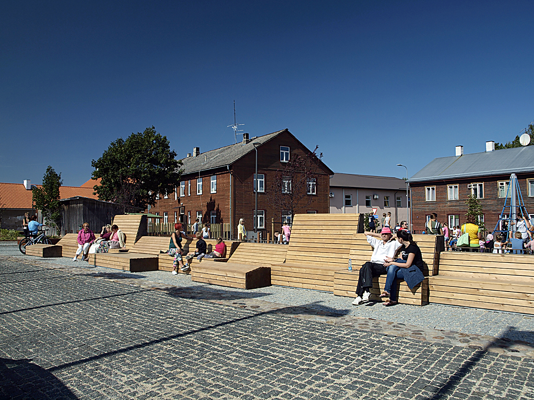
This year for the very first time a Christmas tree was set in the new central square, or actually several of them. One of the most beautiful elements of the square (and highly impressive in the context of all Estonia) is the so-called light roof – the outdoor lighting network of ceiling lamp typology covering the square area. Also in daylight, the net filtrating the sky makes the space cosy, almost semi-private, while in the dark the roof consisting of light “constructs” a radiating space below it dealing in its own innovative way with our main problem of external spaces – the climate. Such a “room” with an inviting illusion of warmth, full of light and disconnected from the surroundings without any borders will certainly create a new event space for the locals.
THE CENTRAL SQUARE IN PÕLVA
Architecture competition began: on 30 October 2014
Results were announced: on 29 January 2015
Winning entry: “Puulinn”
Authors: Egon Metusala (Metusala Architects), Kaie Kuldkepp ja Helen Rebane (Nüüd Architects), the competition phase included Liis Uustal and Vilve Enno
Engineering: Keskkonnaprojekt
Constructor: YIT Infra Eesti
The square was opened in summer 2018
The competition for the design of the town square had already taken place in 1999. The winning entry of the competition for the detail plan of Põlva town centre and the draft for the central square was never realised and somewhat surprisingly also the problems in the surroundings have largely remained the same almost 20 years later. At the time, the author of the winning entry Toomas Paaver highlighted a number of bottlenecks that formed also the background information for the terms of the new competition.
Namely, the location of the square still comes across as the hinterland of the town, as the perceivable centre seems to end there – leading to the watery valley surrounding River Orajõgi that is enclosed by the woody edge of the cemetery. There is no passage through the area and the nearby buildings with the active and prominent facades are positioned away from the square with only their backs turned to it. The design of the square cannot rely on any key building either, as all commercial and public buildings are located elsewhere. On the other hand, the development of new buildings has been challenging due to lack of active investment interest.
The brief of the competition is intriguing: the competition area is actually considerably larger than the actual future central square and the participants can freely choose the exact location for the square. The entries are thus expected to provide also a vision for the urban space and volumes around the square.
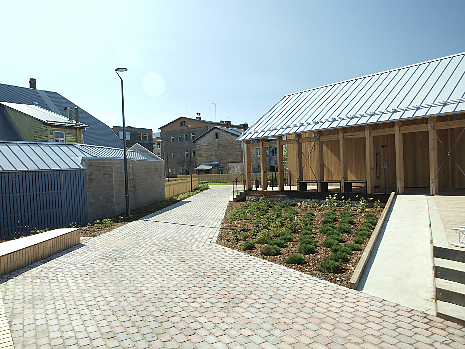
The winning entry placed the square in the area connecting the intersection of Kesk and Võru Streets and the stream within the quarter. Although its connecting purpose is initially criticised by the jury, it functions well in the final project. Or actually, as well as it can in this situation: the square remains hidden around the corner for visitors passing the town. For local people, on the other hand, the event space is clearly and understandably stitched to the existing surroundings.
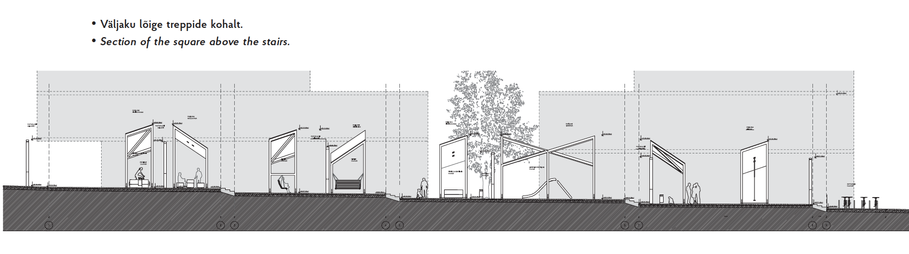

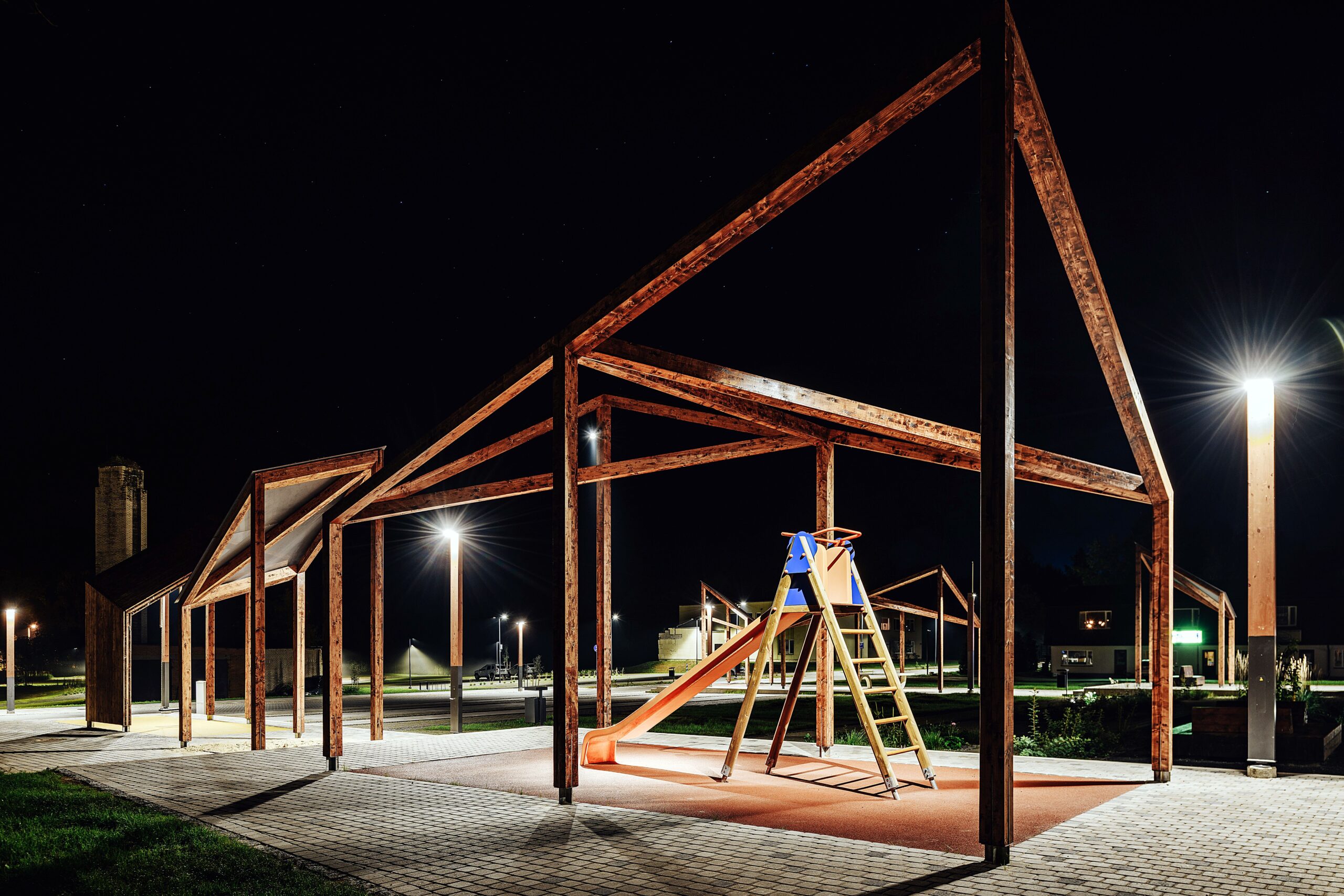
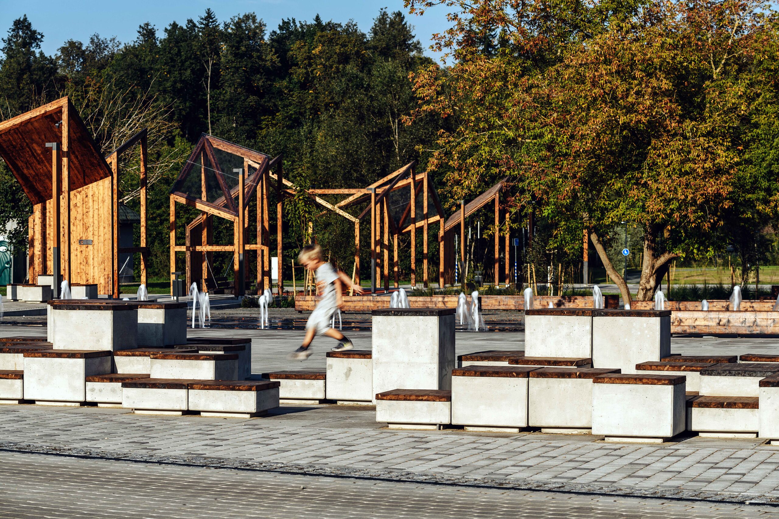
Due to the brief, the solution at first seems to have no context: the square is not generated out of the space left or created between the buildings as would be logical, instead it has landed there, trying to accustom people with itself while waiting for the actual space. In such unfavourable circumstances, the plane (arranging paths and overburden) would not be enough to create a square and it thus comes to have slight frames. The bristling frame (this must be the “Wood Town”?) is quite a good alternative for creating a spatial feel. Perhaps the contours of the polyhedra tilted in slightly too nervous angles are less than perfect: they are somewhat too large to create a comfortable feel when standing underneath them, while they remain rather too small to accentuate the surroundings with indiscernible dimensions – on average then, they are almost appropriate.
The randomness and lightness of the given architekton makes a better impression in the competition entry than in its constructed form. The light roofs on the cubes, however, make the square considerably more practical, although they remain perhaps too high to provide proper shelter from rain. We can only hope that the initial idea of the interim space can be retained when the borders of the square are housed – as if the structures growing out of the building. One of the strengths of the final outcome is certainly the way the middle of the square between the cube rows is spatially activated. It is true that in a small place like that the locals cannot fill the square with their activities on daily basis. Thus, the greenery and small objects function well in the role of the necessary extras.
So, there is a framework for a new event space, but the lack of context of the whole thing is nevertheless unexpected. The square does not seem to take a sufficiently central location to create the feel of a square even if the buildings do appear one day: the natural daily paths do not cross here. The brief has thus provided the prerequisites for the creation of an attraction, not a practical local space. If a passer-by indeed finds himself in the square, he is pleasantly surprised – as if discovering a great secret.
THE CENTRAL SQUARE IN VALGA
Architecture competition began: 30.02.2015
Results were announced: 8.05.2015
Authors: Gianfranco Franchi, Chiara Tesi and Rea Sepping (Franchi Associati, Italia)
Engineering: Keskkonnaprojekt
Constructor: YIT Infra Eesti
The square was opened in August 2018
Valga is an exemplary specimen of a shrinking town in Estonia. After Jiří Tintěra became the city architect, the abandoned urban space brought about by the diminishing population has received systematic and firm treatment. There have been architecture competitions to bring local public institutions, such as the school, back to the town centre, also a bold and unique plan has been devised to demolish buildings with little architectural value and a considerable amount invested in the improvement of the urban space as a living environment. The town square of Valga is a part of the plan to make the town centre denser and bring life back to the centre.
When talking about the new town square solution, it is impossible to overlook its location at the heart of the historic 8th quarter. The choice is bold and forward-looking. Definitely a bypass made by the steady hand of a surgeon. The rundown and somewhat obscure backyard is now a well-maintained contemporary open space. The pocket has been turned inside out with its core brought out to be viewed, the lining patched and decorated with a lovely fabric – the periphery has become the midpoint.
A cosy external space on a human scale with small nooks appropriate for a small town has been created between the historic buildings with former small yards giving it further structure. The square certainly benefits from the highlighted play of the recesses with functions given to them, it gives the square both visual and emotional bulk. The striped pavement brings the various parts of the square together. On the one hand, a logical choice: children, ping-pong players, performers on the stage and people lying on the benches at the edge of the square can easily go about their business without disturbing each other. Then again, in case of such a clear functional division, there is no meeting point for the users. For example, if you come to the square with children, the small ones need to remain in their enclosure at one end of the square while parents are playing ping-pong in the other recess without any visual contact. Time will tell if and how such a rigid functional division pays off. In the background of the intimate pocket square recesses, the central part of the square becomes vast and bare as if without any anchors. The fountain is the focal point of the space in summer but in winter it seems to disperse a little.
The weakest point of the solution is the small objects. As there is no deliberate core of the space or accents, the given role is taken by the circularly placed benches with the rear side of their backrests (which does not have the best constructional or visual solution) becoming too dominating over everything else. Similarly, the sad and rather battered-looking market stalls seem somewhat inappropriate and out of context in front of the church at the edge of the square. There were considerably more green areas in the backyard of the 8th quarter, part of it has been maintained and skilfully enriched with various species and slopes, part of it has been forced to make way for other functions, such as the playground. Unfortunately, we cannot avoid childish symbolism here either as the local government’s wish to mark the square as its own is clearly visible. What else could be suggested by the wagtail, the logo of Valga, in the form of rusty steel cut-outs on the pavement and bins?
The location of the central square also has its disadvantages. The former private gardens now seem to open to the most important place in the town, it seems as if they also unexpectedly dropped out of the pocket when the spatial situation was turned inside out and found themselves in the unusual limelight. The abrupt transition between the public and private space without a semi-public buffer zone will probably not make the life of the nearby residents more comfortable or leave them any breathing space.
To acknowledge the comprehensive solution, it is important to highlight that together with the square, also the sheds, garden fences and firewalls have been reshaped in the same mould. It all creates a visually complete whole.
It is said in the statement of the architecture competition results in 2015 that the winning entry “Totem” charmed the jury with its simplicity, clear vision and sense of space, it lacked any ambition to grandeur but perceived the present space and the town’s needs very well. And this is precisely what the square looks like: simple, clear and highlighting the existing.
KARIN BACHMANN, MERLE KARRO-KALBERG and ANNA-LIISA UNT are landscape architects, also the guest editors of Maja’s winter 2019 edition.
HEADER photo by Tiit Veermäe
PUBLISHED: Maja 95 (winter 2019), with title Drift